PROJECT
mental and physical well-being.
SUMMARY
RESPONSIBILITIES
- Product Design
TOOLS USED
- Illustrator
- Photoshop
TIMELINE
ORIGIN
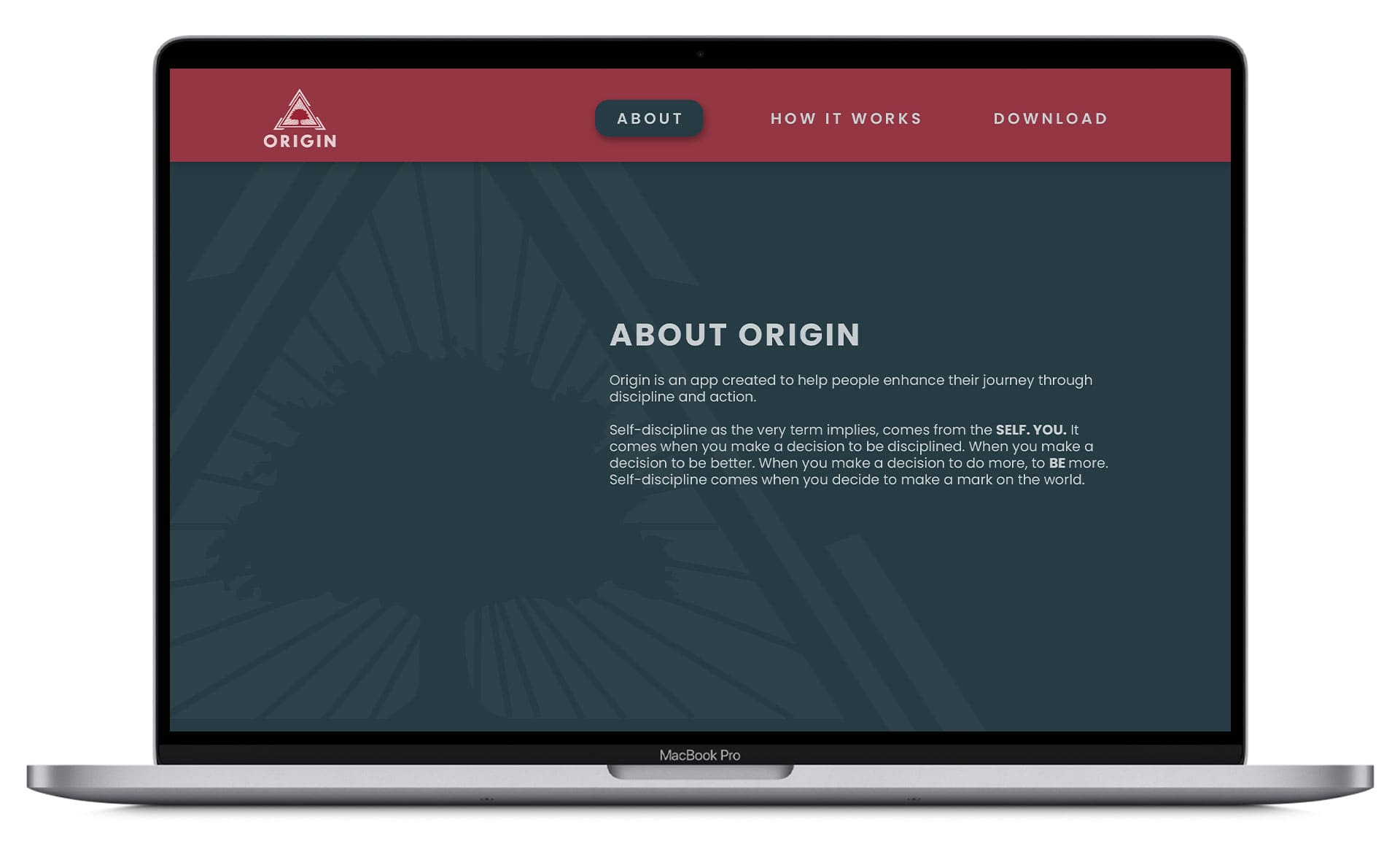
Origin is a holistic well-being app based off of the book ‘Discipline Equals Freedom’ by American author and retired United States Navy officer, Jocko Willink. Origin's approach is geared for the person who wants to reach goals, overcome obstacles and become the best version of themselves.
It is designed to create disciplined, systematic, yet dynamic daily routines that help you reach your life goals with a sense of purpose, and to help you get the most out of your day without wasting time.
Freedom is what everyone wants – to be able to act and live with freedom. But the only way to get to a place of freedom is through discipline.
CHALLENGE
The user base for this project consists of people in the 18 and up age range, and the main features of this project consist of awareness and guidance. Origin needed to be easily understood by people without any specific knowledge about mental and physical well-being.
SCOPE
To ensure the project went as smooth as possible with little error I laid out my plan to create some order and executed each step to create a unique solution that would distinguish Origin from other mindfulness apps already in the market.
DISCOVER
DESIGN
PRODUCT
JULY
AUGUST
SEPTEMBER
OCTOBER
BRANDING
Brand Identity Pillars
DISCIPLINE
There is only hard work, late nights, early mornings, practice, rehearsal, repetition, study, sweat, blood, toil, frustration and discipline. There must be discipline. Origin will get you on the path of discipline and keep you on the path.
HEALTH
When bad food is tempting you, calling your name, and enticing you with it's sugarcoated lies—get angry. Get aggressive. Stand your ground in the battle and fight by saying NO. Hold the line for your health, your mental toughness, and to exercise your will.
ACTIONS
There are all kinds of benefits from physical training. You will be healthier. Get some exercise done and pay attention to your mental state. You will feel more aware, sharper, and smarter. Origin will show you the way to the path of mental and phycial well-being.
DISTINCTIVE LOGOTYPE
The logo mark is a blend of an oak tree and rays of light enclosed in a triangle. It's based on the inner strength within you and symbols that perfectly reflect the approach to the matter of growing, self-development and targeting your goals.
ICONOGRAPHY
TYPOGRAPHY
COLOR PALETTE
RESEARCH
Most people are living life on cruise control, they fail to see it and allow the circumstances and situations of life dictate how they live, without purpose.
There are reasons why mental and physical health are so important
- Mental health affects physical health
- Builds confidence to lead better lives
- Makes a disciplined lifestyle easier
- Gives you a psychological edge
- Feel more aware, sharper & smarter
- Overcoming fear & taking next steps
Reasons why we try to workout our mind and body
Reasons why we don't take care of our mental and physical well-being
Not sure when and where to start
Meditating and working out can be difficult and straight up overwhelming for some people, particularly if your mind is constantly wondering, but what most people don't realize is that making the decision to act now will actually keep that under control.
USER FLOW
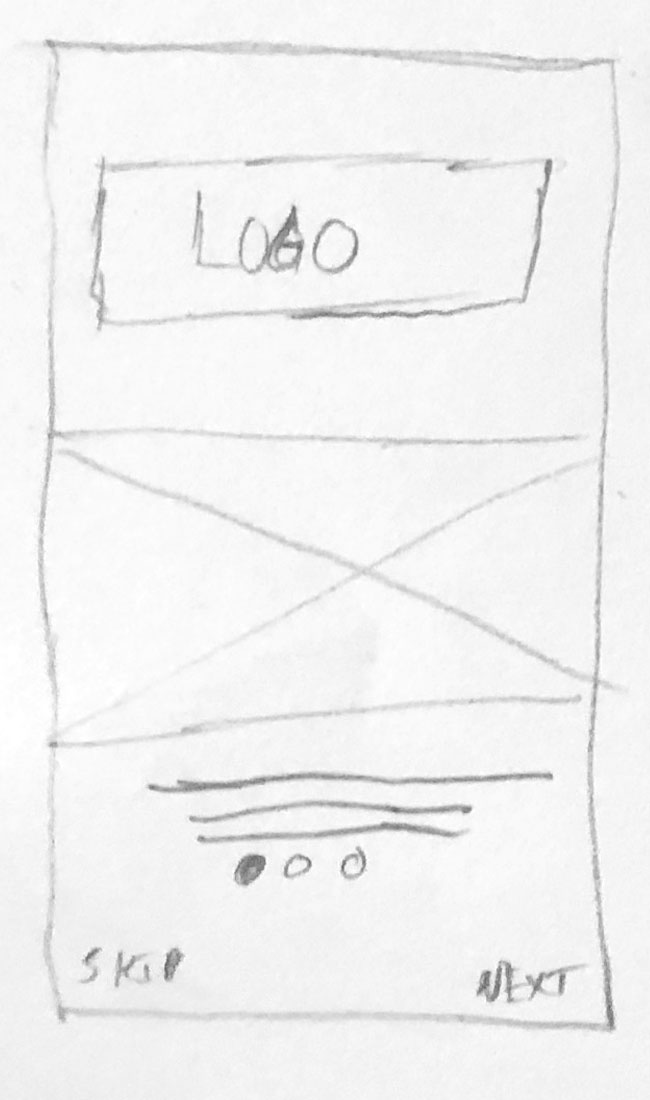
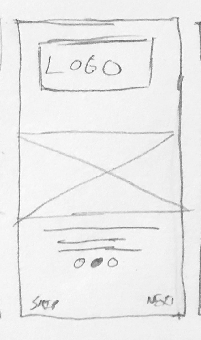
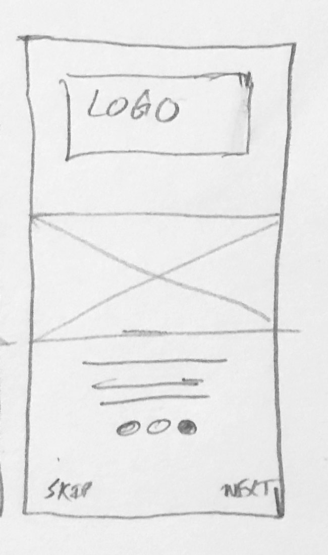
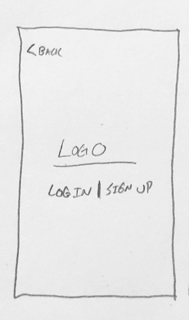
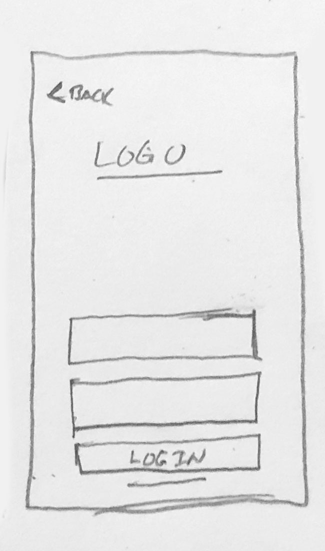
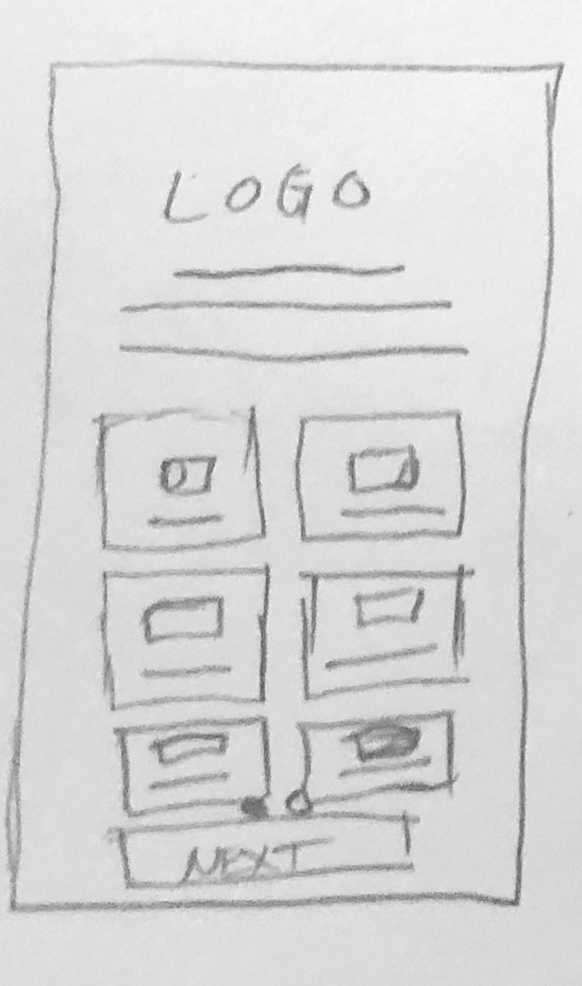
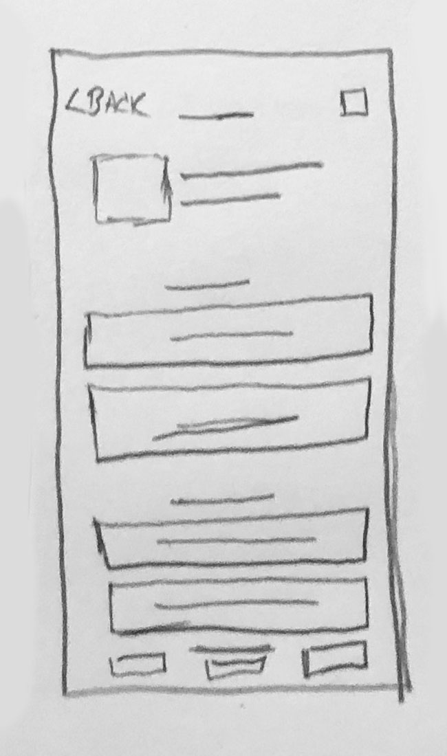
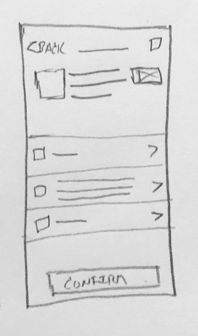
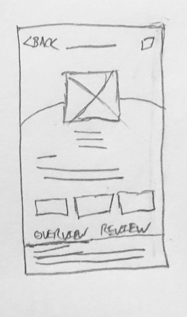
WIREFRAMES

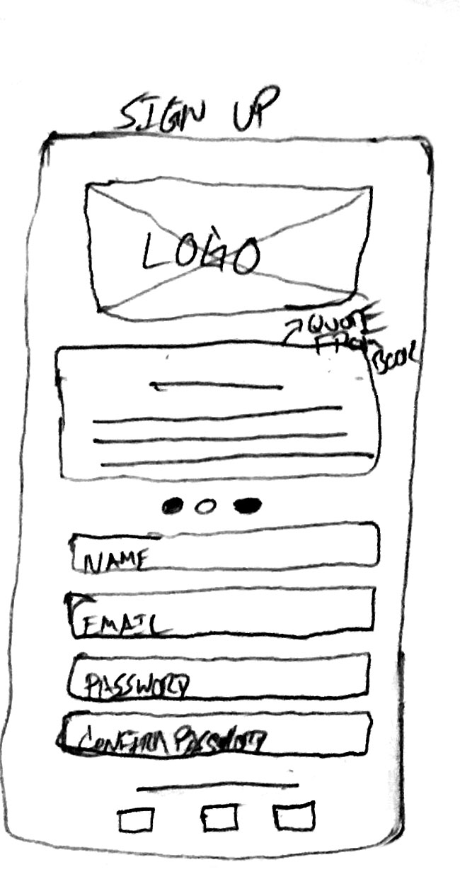

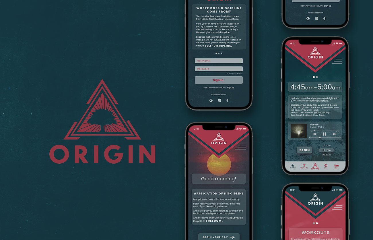
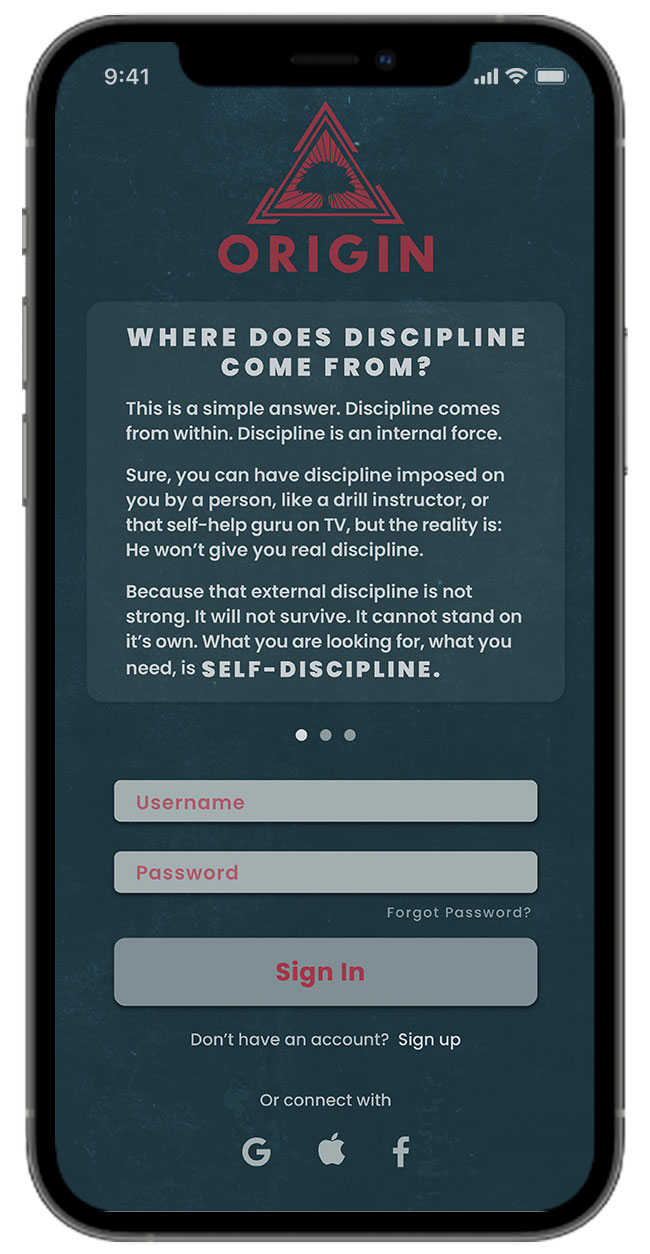
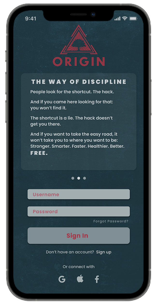
ONBOARDING
Simple and intuitative registration for all types of users.

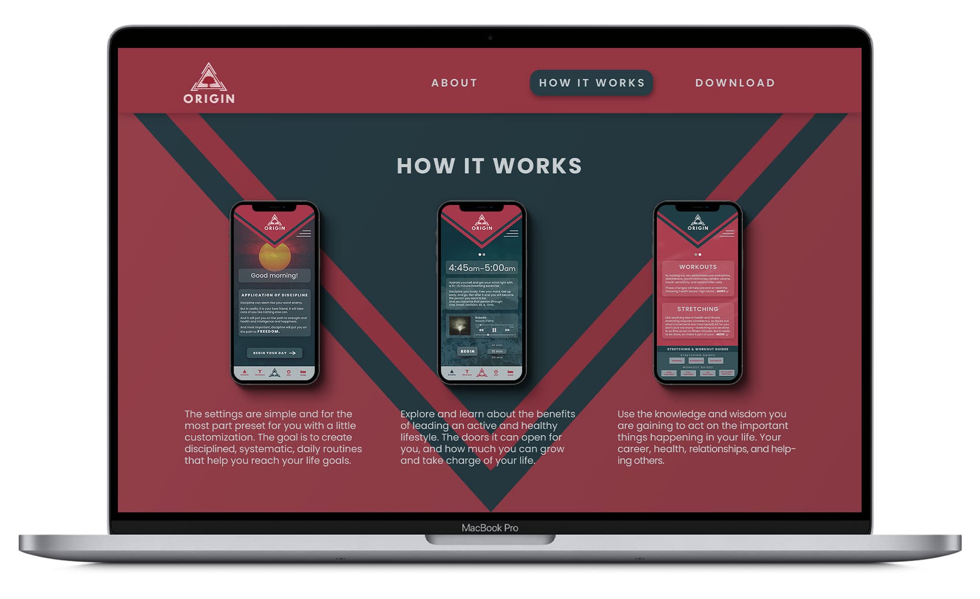
HOME
Daily dose of knowledge for those who strive for more
Morning is the foundation for all change. Keeping a strong mind relies on how you start your day. Origin can help you transform your mornings with powerful words of encouragement.
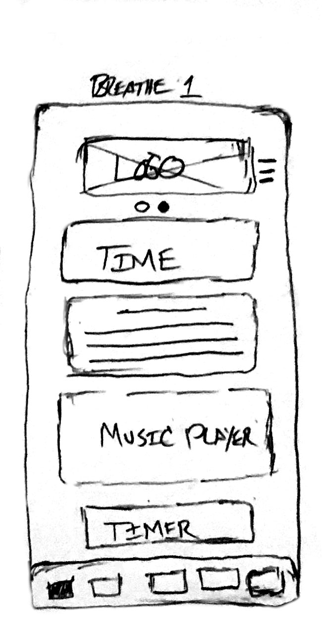
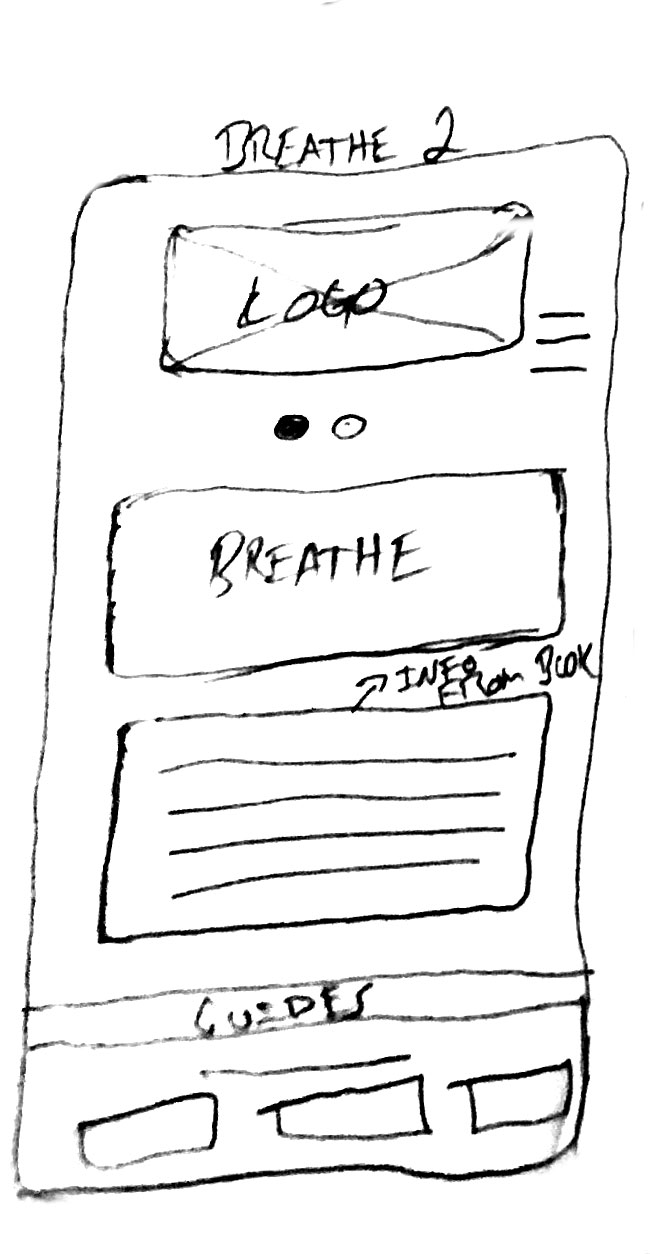
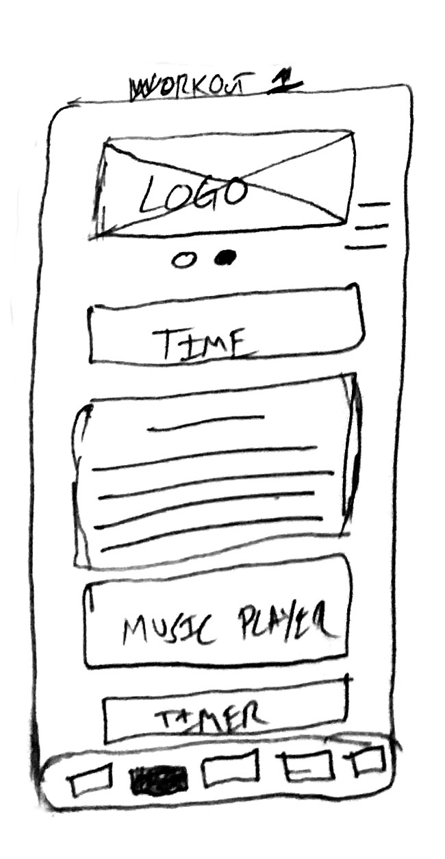
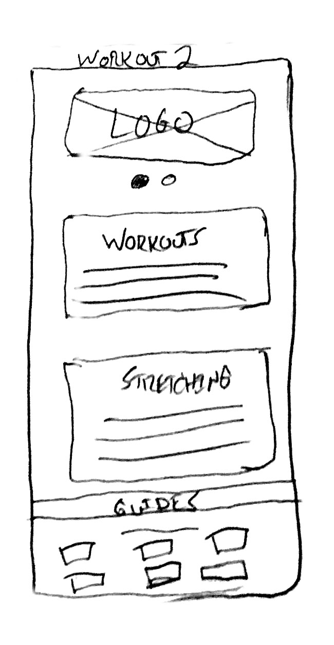
BREATHE & WORKOUT
Start with the basics and build your well-being foundation
Origin's mission is to help open your mind to life-altering techniques for personal growth. Learn more about breathing, stretching, working out and how beneficial these habits can be for your overall health.
HOURS IN BETWEEN
Maintaining your discipline after the physical activities
Discipline doesn't end after meditating, working out and eating right. Origin will remind you of the important things that need to be done before and after work.
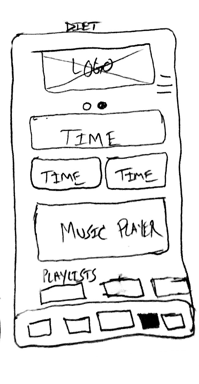
DIET & SLEEP
Diet and sleep must be a priority to maintain health
Get valuable insights on clean eating, getting enough rest and what having a proper balance between the two can do for your phyical and mental well-being.
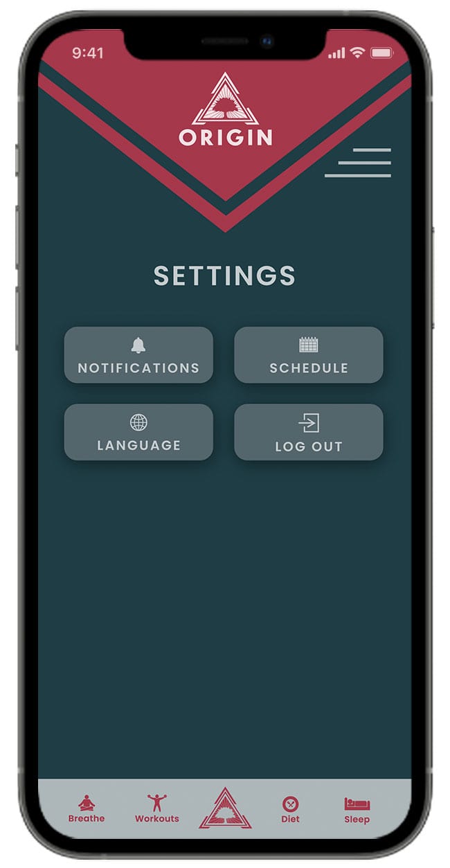
SETTINGS & NOTES
Access to a huge selection of tracks curated for breathing exercises, studying, focus time and customized playlists for working out. Note taking is encouraged to release your thoughts and new ideas. Customize time settings for your activity sessions.


WEBSITE

RESULTS AND
TAKEAWAYS
A hi-fi prototype was developed. It lacks some custom transitions and animations. By keeping it at this stage, I’ve been able to test the idea and assess the risk points. This project has been a great experience and introduction to the UI/UX design process and will mature with time as my skill sets become sharper with more experience.
NEXT STEPS
1. Extra Features
I will add more options and features to the current prototype. In particular, I feel that after completing your physical activites the app should include more opportunities for the customer to be able to keep track of their progress.
2. Improved Prototype
The UI elements will need to be modified over time, I'm looking forward to seeing what the design aesthetics will turn into.
3. Usability Testing
I will pursue more usability testing on the updated and enhanced features of the prototype.
LEARNINGS
Lessons were learned and perspective was earned. I began understanding the tedious process of creating an application and the scenarios that need to be thoughtfully crafted in order to create an experience that will keep the user engaged.

PROJECT
patients and practitioners.
SUMMARY
RESPONSIBILITIES
- Product Design
TOOLS USED
- Illustrator
- Photoshop
TIMELINE
Telemedicine has showcased tremendous growth in recent years. The global market is projected to grow at a compound growth rate of 25.8% during the 2020–2027 period.
MEDCARE
With the market for telemedicine expected to grow quickly in the coming years, patients and practitioners are opening up to the concept of remote treatment.
MedCare aims to be a part of this growth by creating an easier and faster way for patients to interact with their health specialists.
UNDERSTANDING
THE PROBLEM
Users need a way to receive trusted, professional, and affordable medical advice without actually going to a doctor’s office because they need an informed opinion, but don’t know if their concern warrants the time and money associated with a traditional medical experience.
CHALLENGE
MedCare has a very clear target, a target that needs an extremely easy and fast to use solution. Reliability was another key point: the easy to use booking & canceling process solves the usual appointment scheduling-related anxiety and builds trust from the first appointment. This was important for an app for which the target audience could potentially be the entire population.
SCOPE
To ensure the project went as smooth as possible with little error I laid out my plan to create some order and executed each step to create a unique solution that would distinguish Origin from other mindfulness apps already in the market.
DISCOVER
DESIGN
PRODUCT
NOVEMBER
DECEMBER
VISUAL DESIGN
LOGOTYPE
The logo mark with it's modern, flat, and bold look is designed to be clear and concise. My idea was to keep it minimal and meaningful, with one glimpse you know you're on the right path if it's healthcare you're seeking.
ICONOGRAPHY
COLOR PALETTE
TYPOGRAPHY
RESEARCH
To better understand the needs of the healthcare specialties and their pain points, I defined a series of questions and began researching the problem.
- Who are the users that are using or will use the telemed app? What do they use now that’s similar? Do they know what telemed is capable of, and its benefits?
- What are the available apps out there? What apps do they like? I did a competitive analysis, to understand those pain points.
- I analyzed customer comments on existing telehealth apps to get a better understanding of what shortcomings they currently have.
Competitive Analysis
- The top players in the global market are TeleDoc Health Inc and Amwell.
- The rising healthcare costs and increasing goverment initiatives are the key factors driving the global health market.
- The increasing number of start-up businesses is the key trend of the market.
Understanding Target Users
Consumers remain interested in telehealth, with 66% reporting they are willing to use it. Unsurprisingly, the younger demographics are most open to telehealth.
- 74% of 18-34-year-olds say they are willing to use it.
- 72% of 35-44-year-olds say they are willing to use it.
- 52% of seniors say they are willing to use it.
Sources
- Telemedicine Market, Size, Share, Growth & Trends - Fortune Business Insights
- Telehealth Index: 2020 Consumer Survery - Amwell
- Digital Health Consumer Survey 2020 - Accenture
USER FLOW
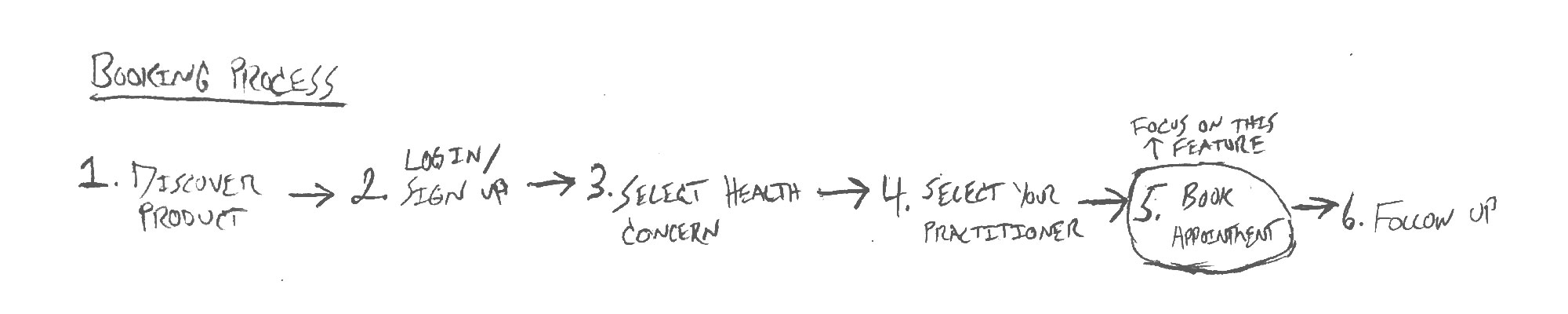
Creating an easy user experience was very important to fully understand and clarify the concept. After researching I found that it would be enough work for the user to find their specialist and getting to know who they are. The booking process that follows should be just as easy as it was to find them.
WIREFRAMES
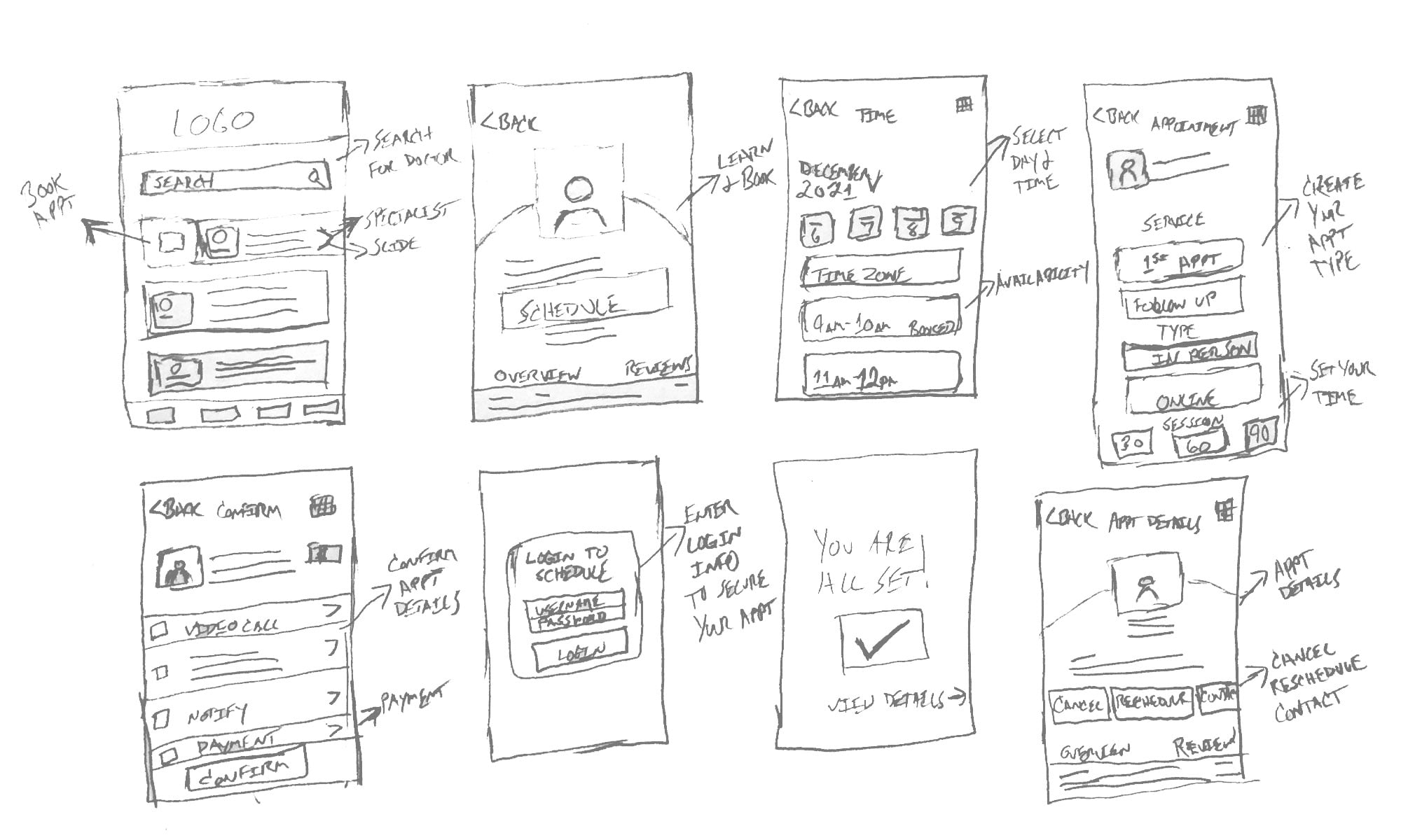
Once the flow was confirmed, I began to sketch out the screens with their main features. I later converted them into mid fidelity wireframes using Figma.


While iterating on the booking process. I explored many ways that I could solve booking challenges. Sketching them not only helped me think through and develop my ideas, but it made it easy to get explain the idea to others.
ONBOARDING
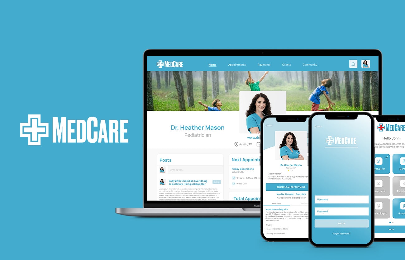
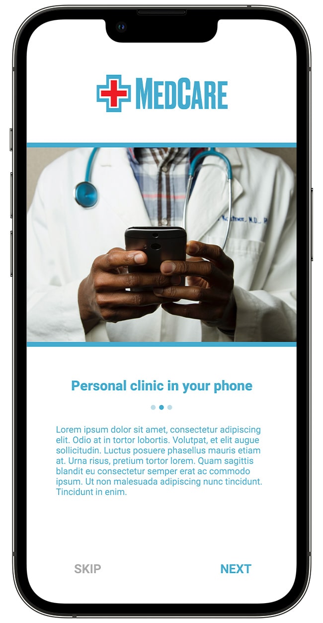
The welcome screens empathize with the user by showing common people living their daily life, and educating them on the 3 key features of the app.


SIGN IN OR REGISTER
Select the category that aligns with your medical needs
Simple sign in or sign up process. Select your health concerns to help you quickly and easily find the right specialists for you.
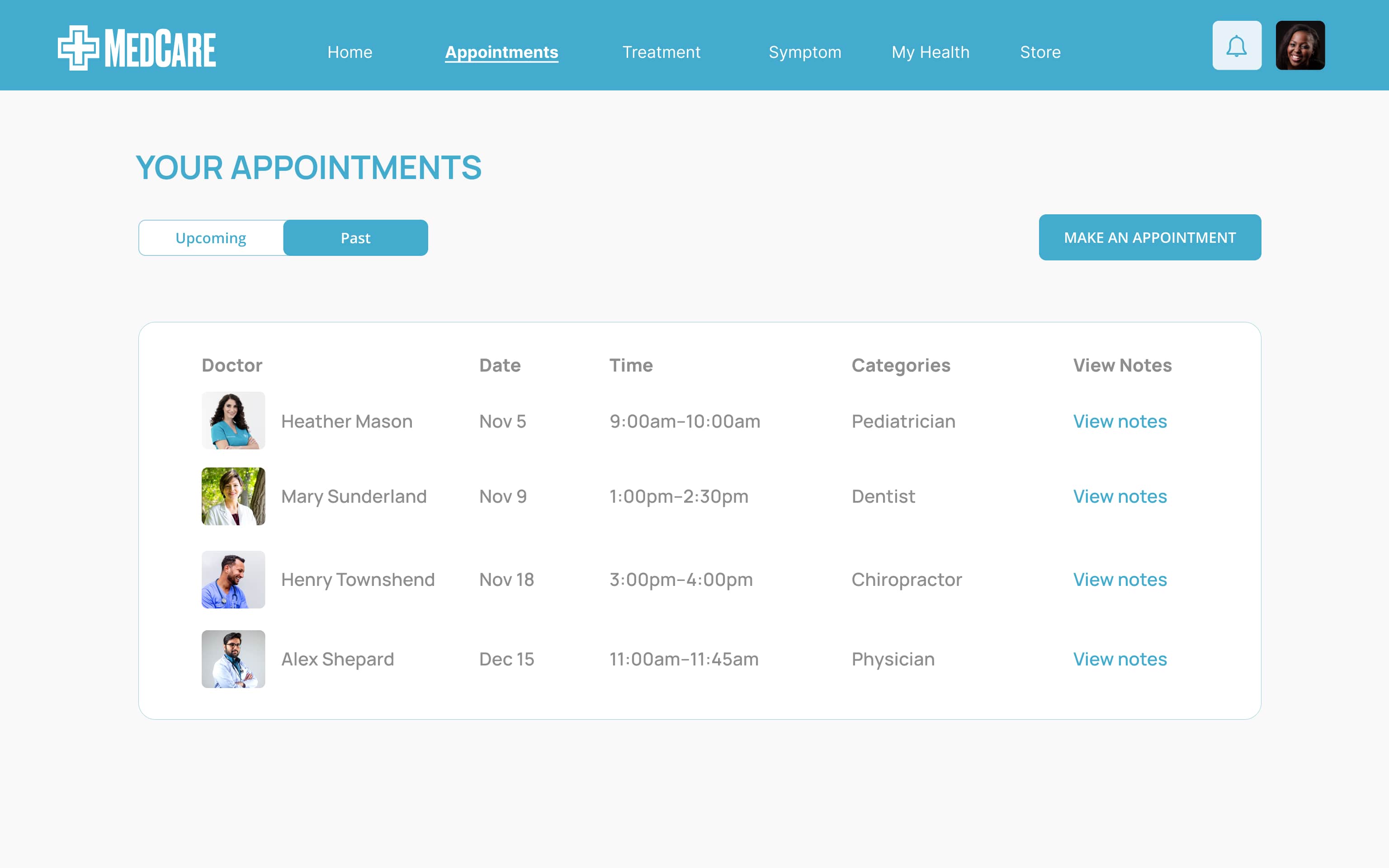
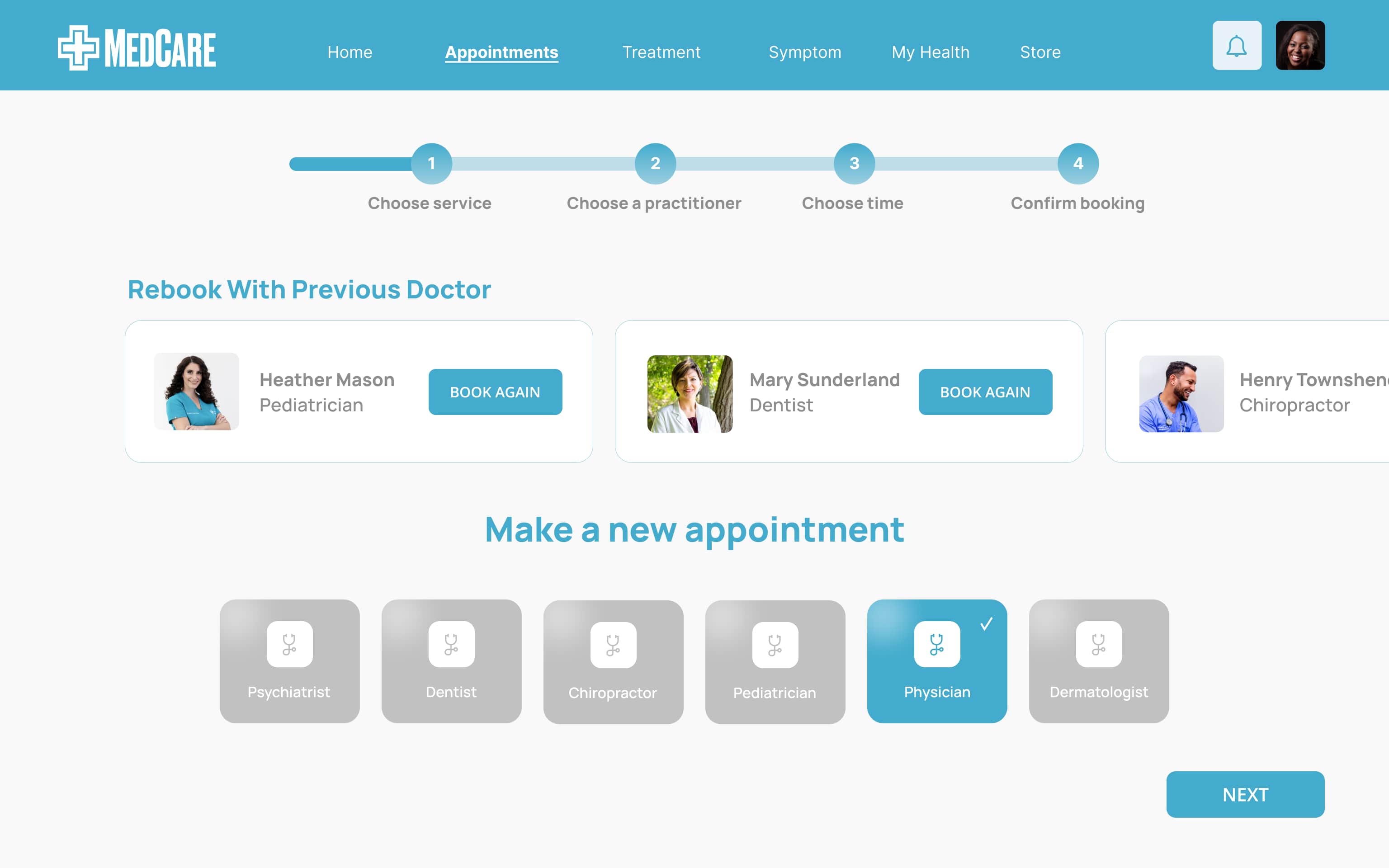
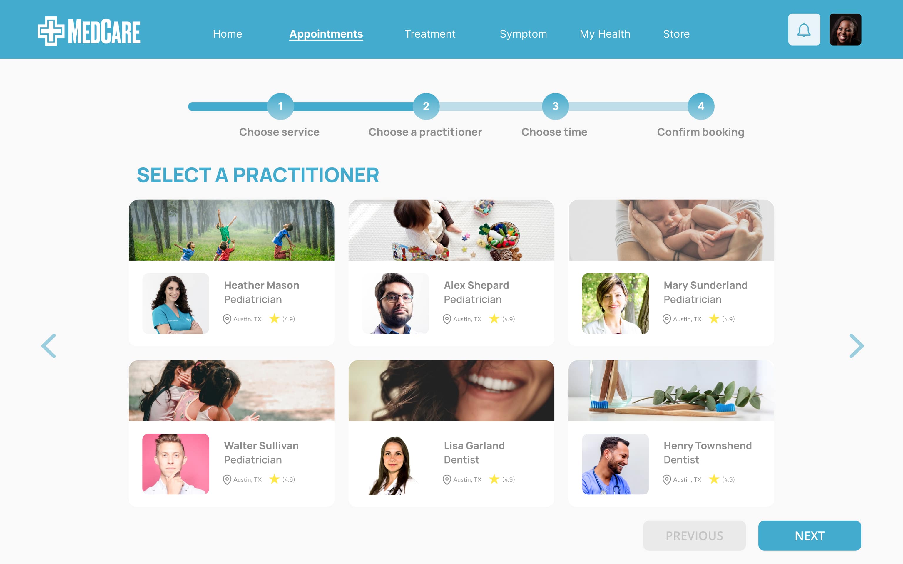
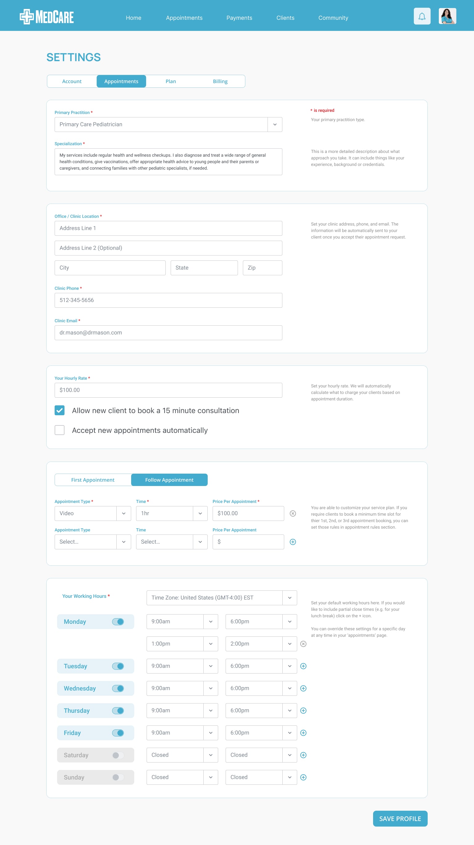
BOOK YOUR APPOINTMENT
Intuitive booking process to secure your appointment
Patients can book an in-person or, an online consultation. Once selected, patients are then able to choose the best time by the available time slots.
CONNECT WITH YOUR SPECIALIST
Easily reach out to your specialist with three options
Patients can call, text message, or video chat. They can also share documents and photos that would aid in their appointment.
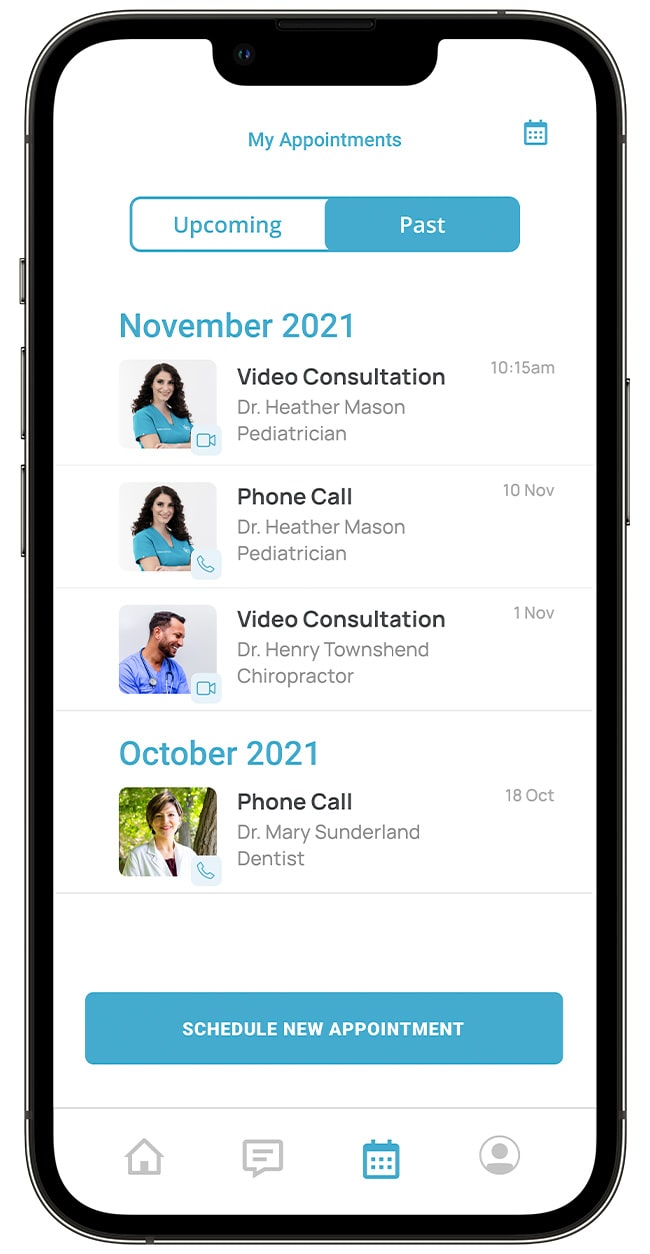
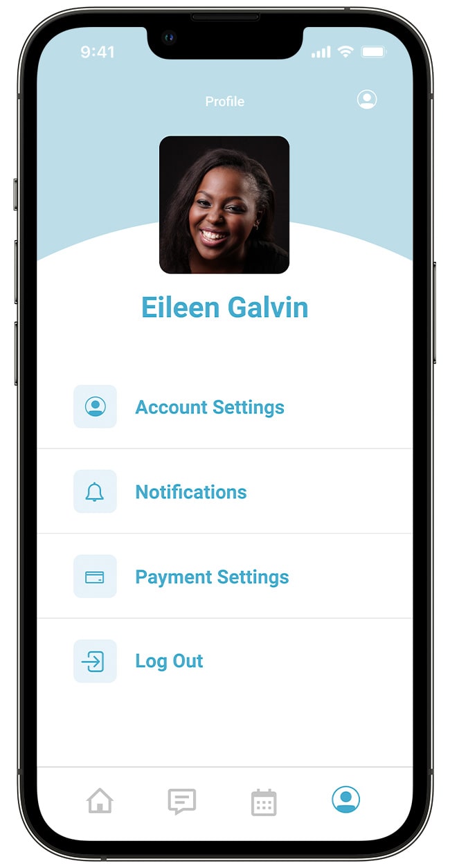
APPOINTMENTS & PROFILE
Easily communicate with your specialist. Text or video-chat, and share photos or documents that would aid in your appointment.
PATIENT PORTAL
I wanted the hub of the app to revolve around booking an appointment. This was the primary feature of the product - I wanted to make sure the core offering was clear.

PRACTITIONER PORTAL
The practitioner portal will allow the user to set time for their practice. Time will automatically be converted to the correct time in the user's time zone on the app.
RESULTS AND
TAKEAWAYS
Designing functions that span multiple platforms allowed me to both think on the mobile screen and design from a system perspective. I began to consider more factors, such as consistency, scalability, and design conventions to make sure the design solutions can be adapted to all platforms. Through this process, I was able to maintain the consistency of the design language while maintaining the same user experience on the entire platform.
NEXT STEPS
1. Improved Prototype
The UI elements will need to be modified over time, I'm looking forward to seeing what the design aesthetics will turn into.
2. Accessibility Considerations
I will pursue more usability testing on the updated and enhanced features of the prototype.
LEARNINGS
During the research process of this case study I began to understand the power of asking the right questions. Who? What? How? Why? I was able to clarify the problems, goals, and get better design results.
collection of web & graphic design work
PRODUCTION DESIGN
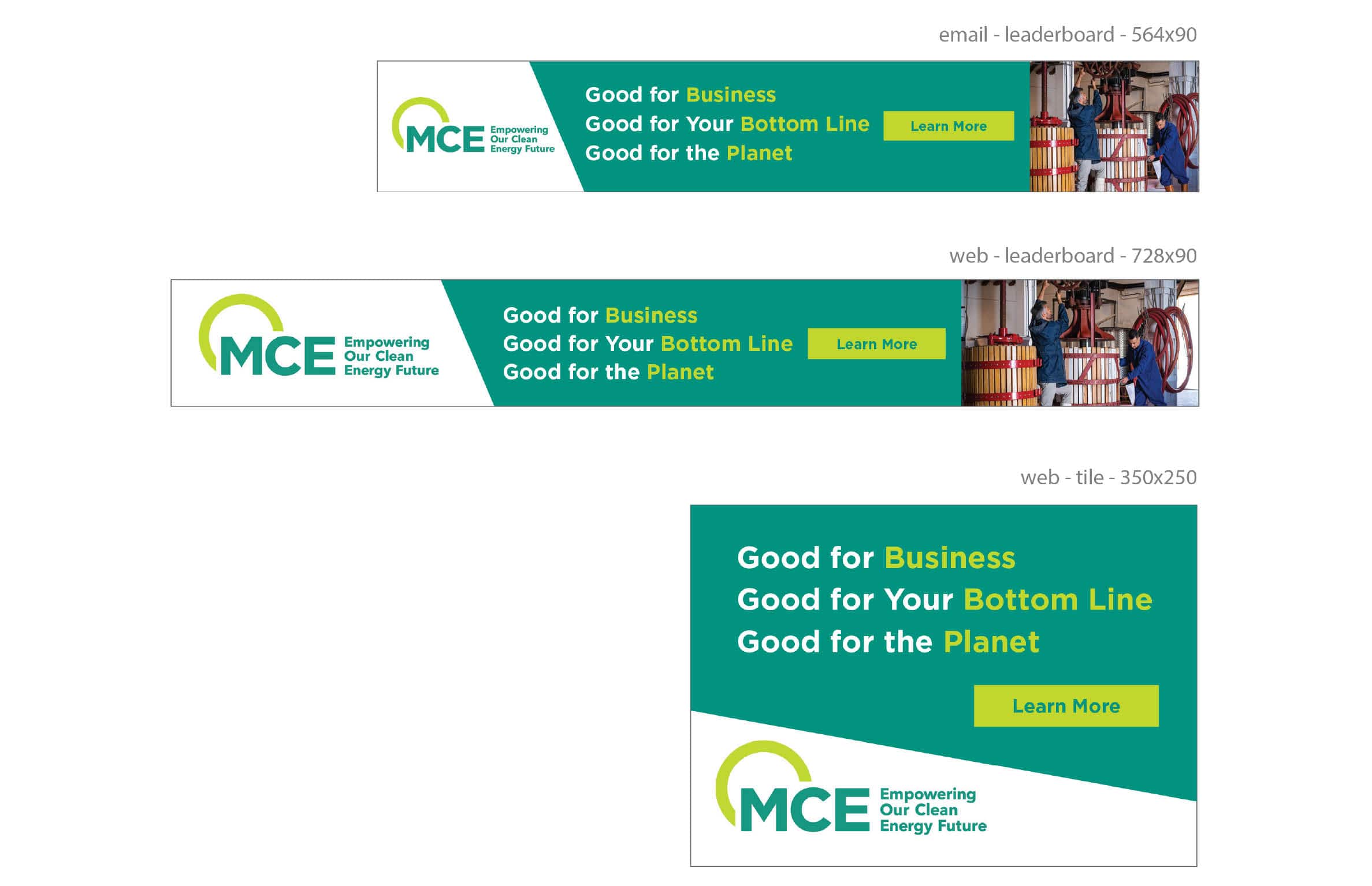
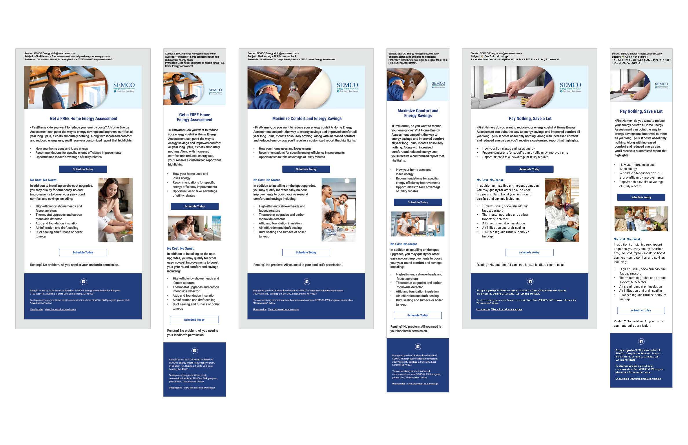
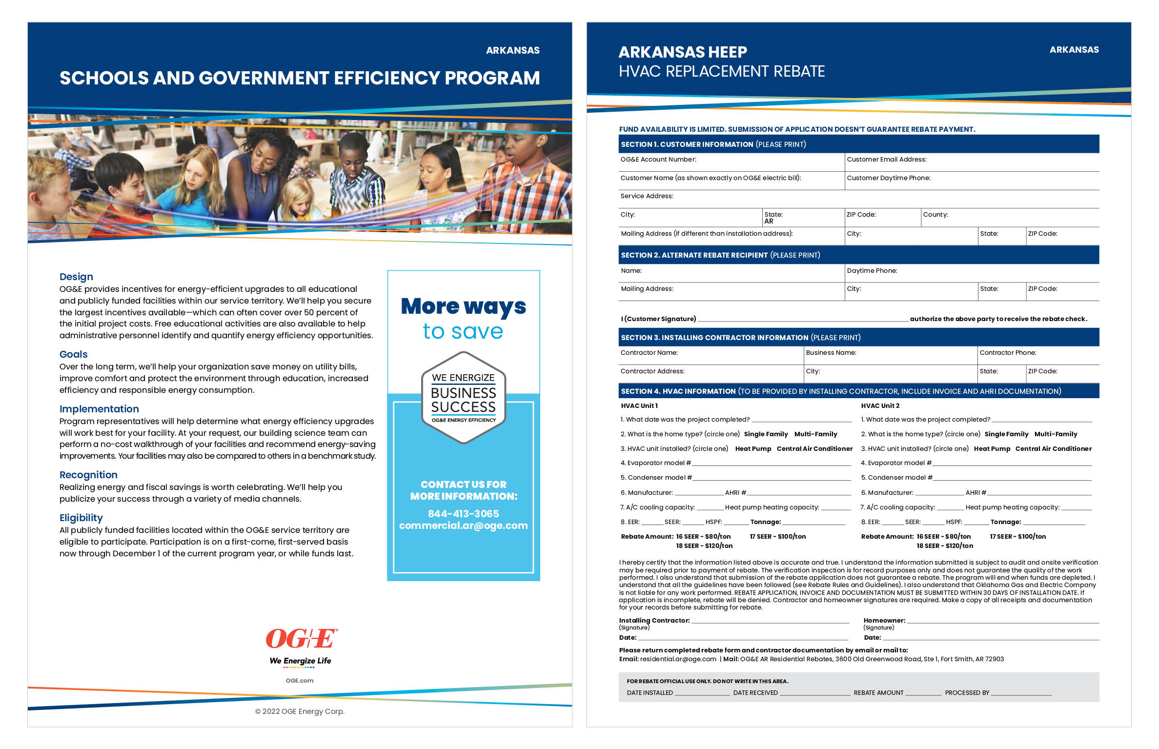
CLIENT: CLEAResult Consulting, Inc.
INDUSTRY: ENERGY
DATE: MARCH–SEPTEMBER 2022
TOOLS USED: INDESIGN, PHOTOSHOP, ILLUSTRATOR, XD, AFTER EFFECTS, ACROBAT, MICROSOFT OFFICE, SAAS EMAIL TEMPLATES
This job was 6 month contract to help other designers with their workloads. A lot of the design work included edits made to digital and print assets after review, building new templates based off of established brands by following their style guides, creating emails by using premade templates, and rebranding design assets for the company's clients.


This gig was a great introduction to working in a corporate environment. I learned much when it comes to multi-tasking and deliverying quality work with little error. The work was steady and diverse depending on the client's needs. Some days were spent on digital and some print design.

During project kickoffs timing would be discussed for copywrites and designers, any questions from creative would be answered, resources would be made available, all other information would be provided, and any design insights or suggestions we were wecome to ensure the project was complete by the set deadline.


This opportunity really helped with time management, sharpening my skill sets, and communicating with a big team to keep everyone on track with a project's progress.


BRAND DESIGN & ILLUSTRATION
CLIENT: CUNA MUTUAL GROUP
INDUSTRY: INSURANCE AND FINANCE
DATE: SEPTEMBER–DECEMBER 2022
TOOLS USED: ILLUSTRATOR
As part of the Single Brand Transformation icons were combined from different areas of the business to create one library. With an initial set of icons to start with in one color palette, my task was to make any necessary edits, and colorize the icon sets in four additional color palettes for wide range use. Once the main objective was complete I created a visual representation to categorize all of the icons together.
The client's goal was to simplify and unify their toolkit and bring together areas of the business to make a cohesive brand look, feel and experience for all of their audience groups.
PHASE 1: As groups of blue/blue icons arrive, create dual color reverse, single color deep blue, single color black, single color reverse icon sets.
In total, 207 icons were designed, edited and converted into four color palettes.
PUBLICATION DESIGN
CLIENT: WAUSAU SUPPLY CO.
INDUSTRY: WHOLESALE
DATE: OCTOBER–NOVEMBER 2022
TOOLS USED: INDESIGN, PHOTOSHOP, ILLUSTRATOR, ACROBAT
Publication design was a big part of my career over the past decade. I really got to know the ins and outs of this creative process, and how to complete a project in a timely manner.
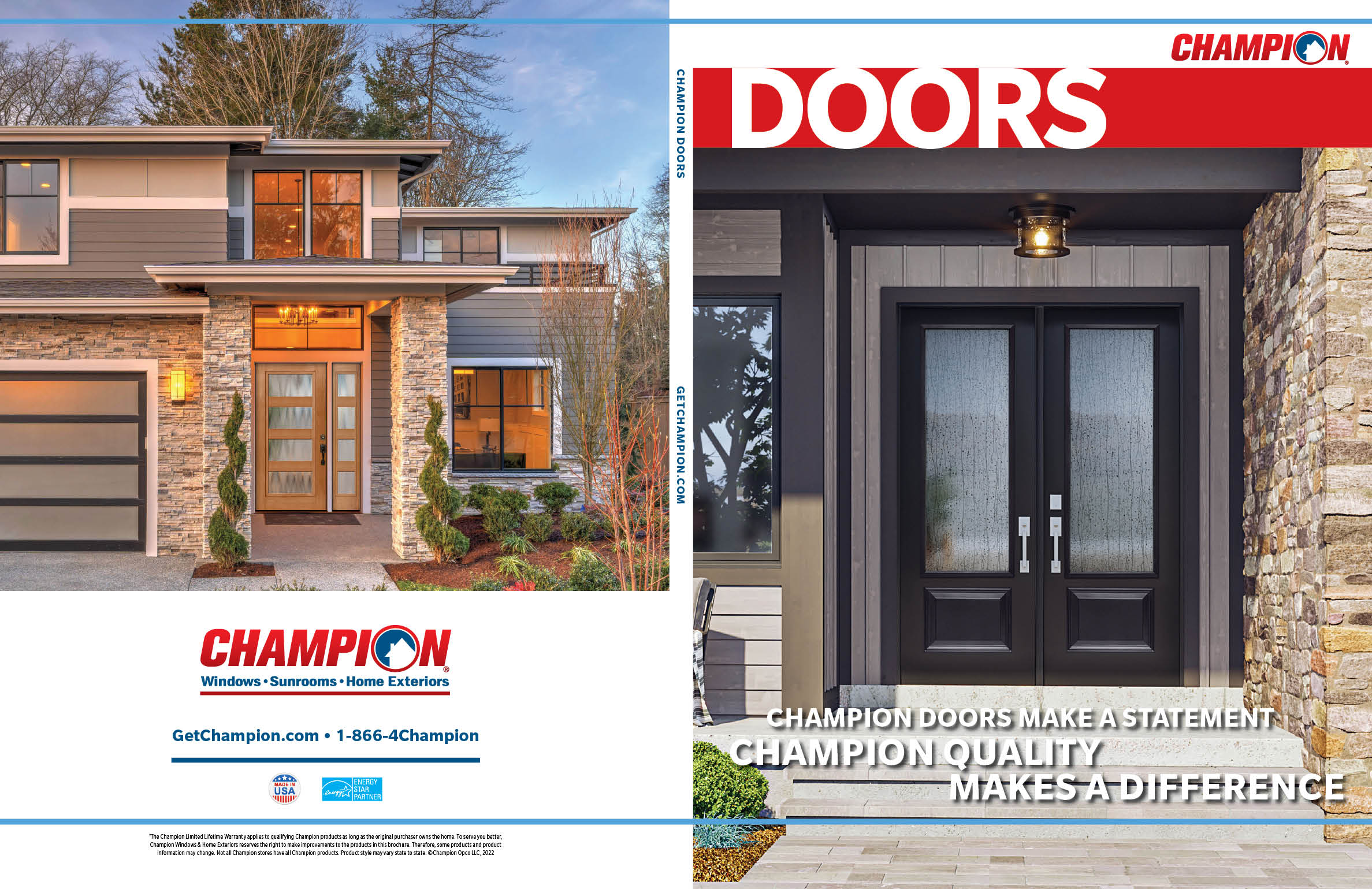
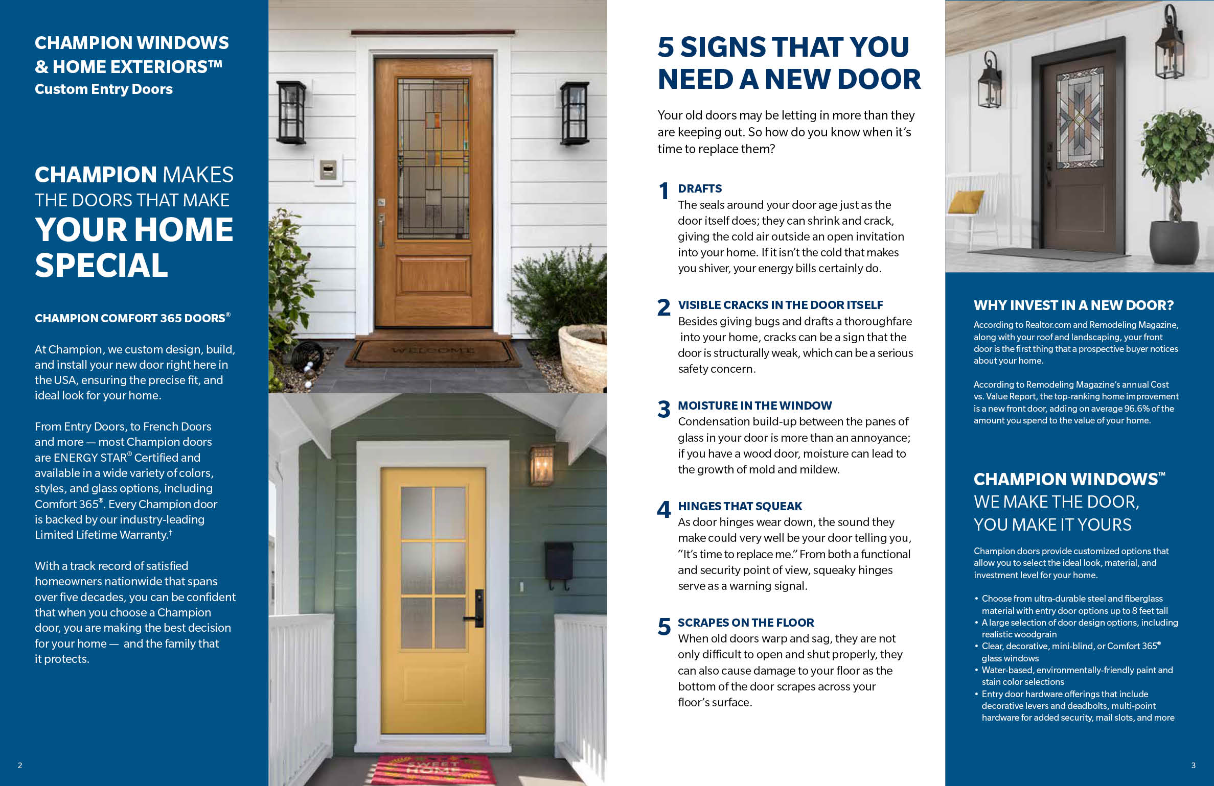
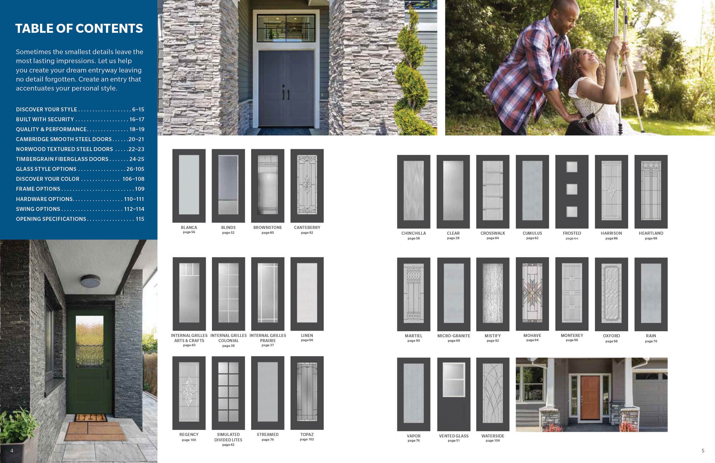


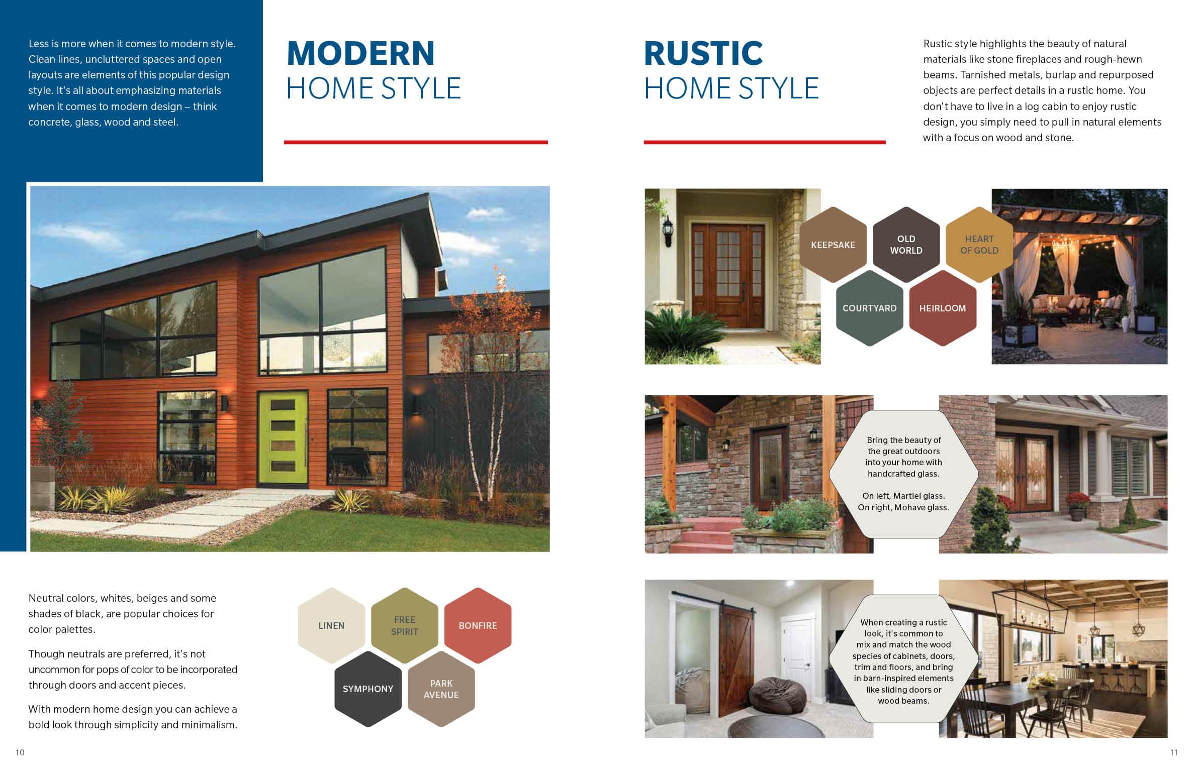

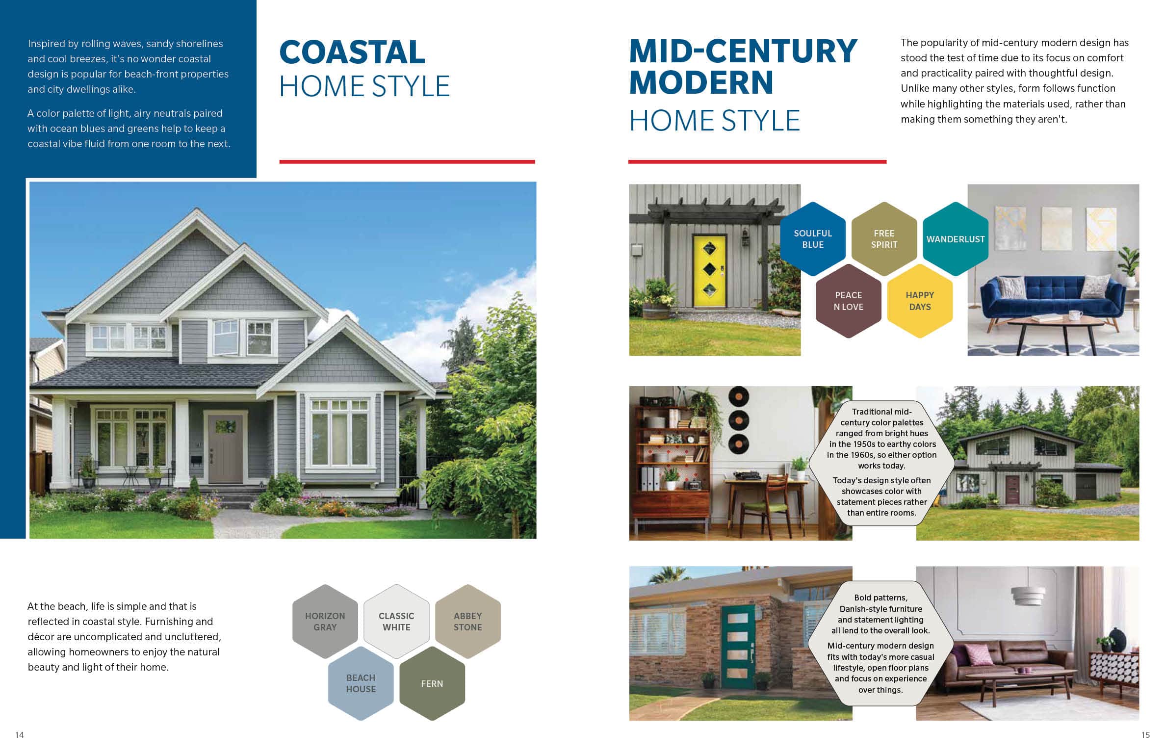


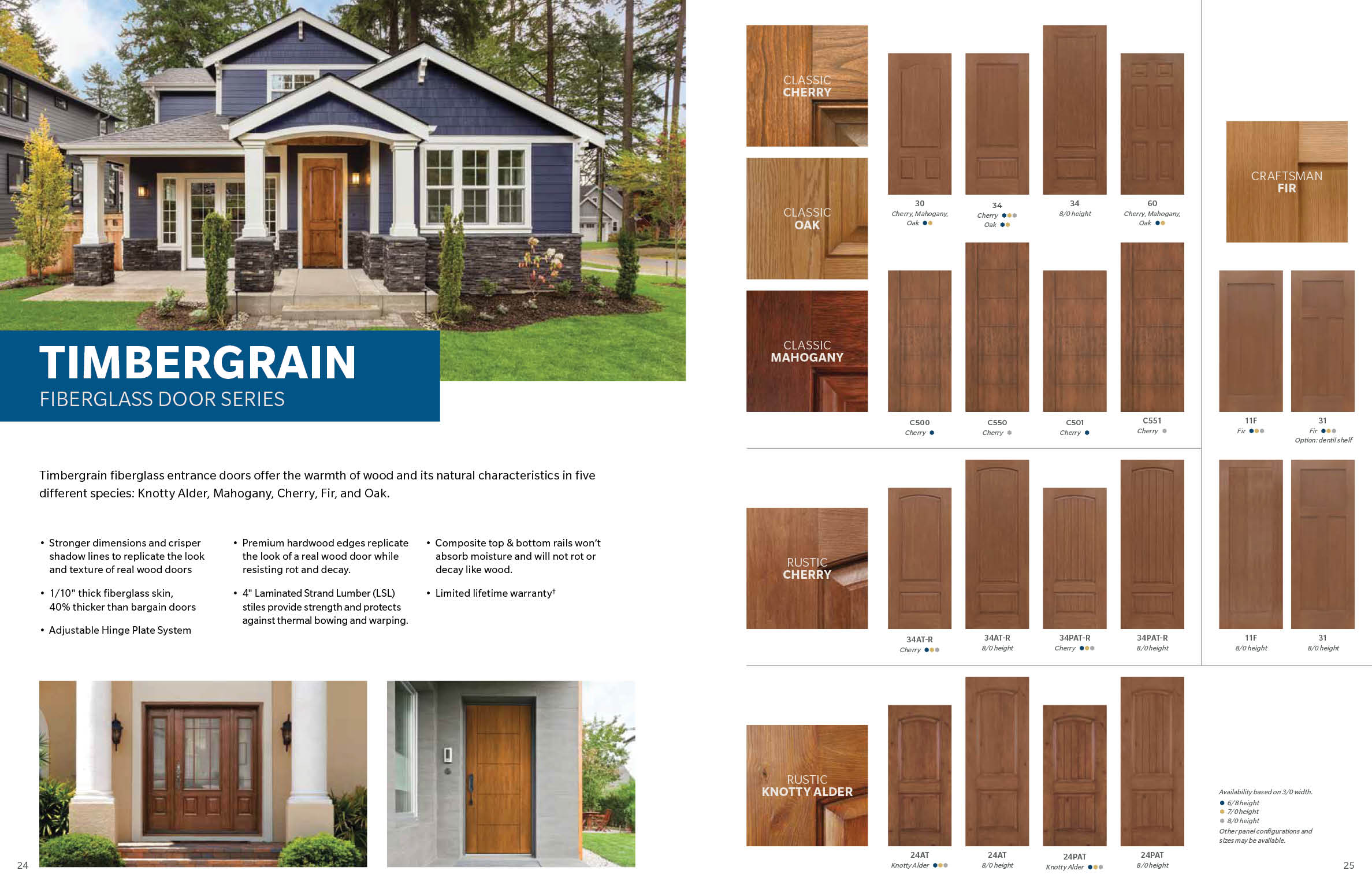
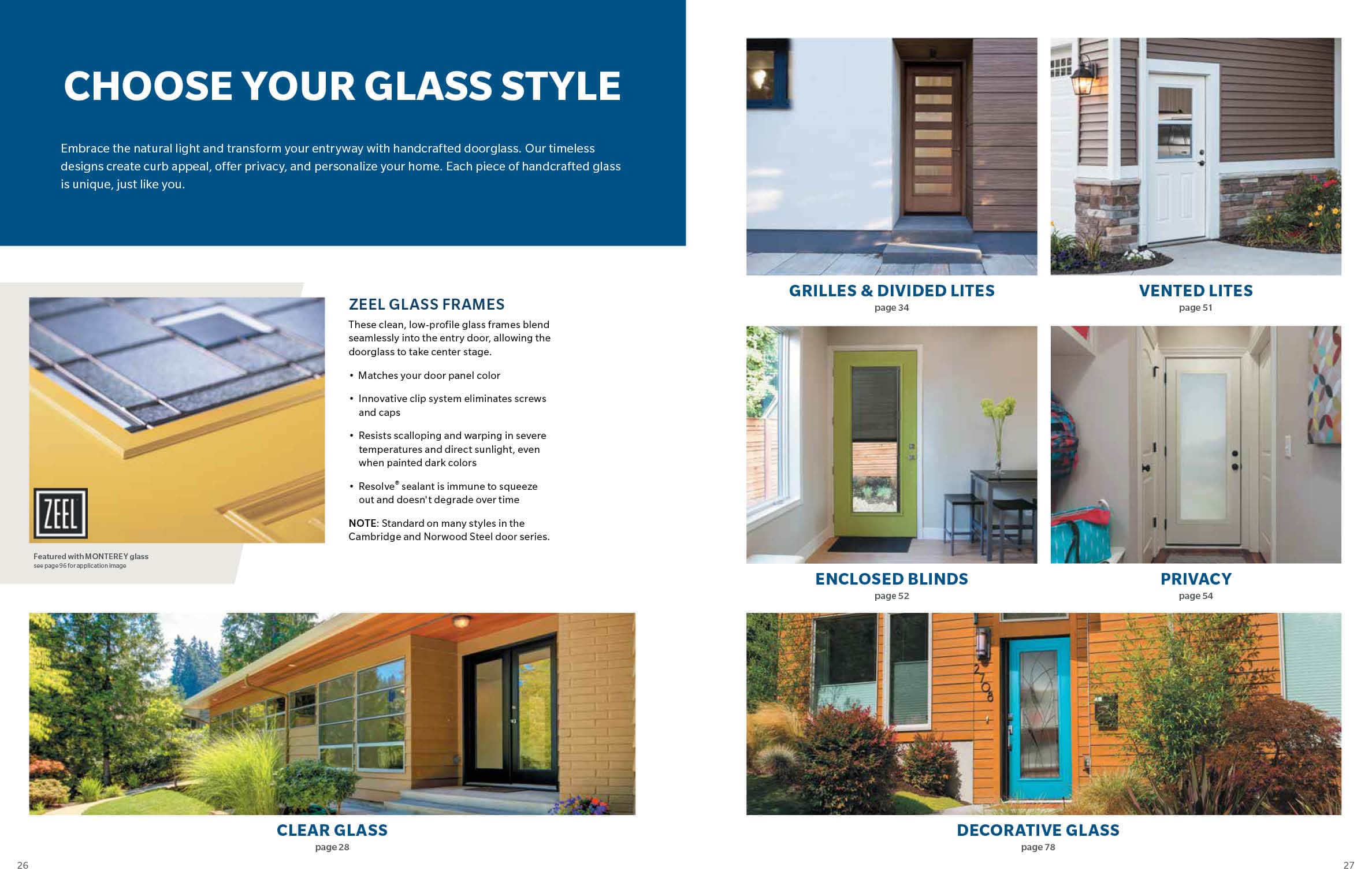
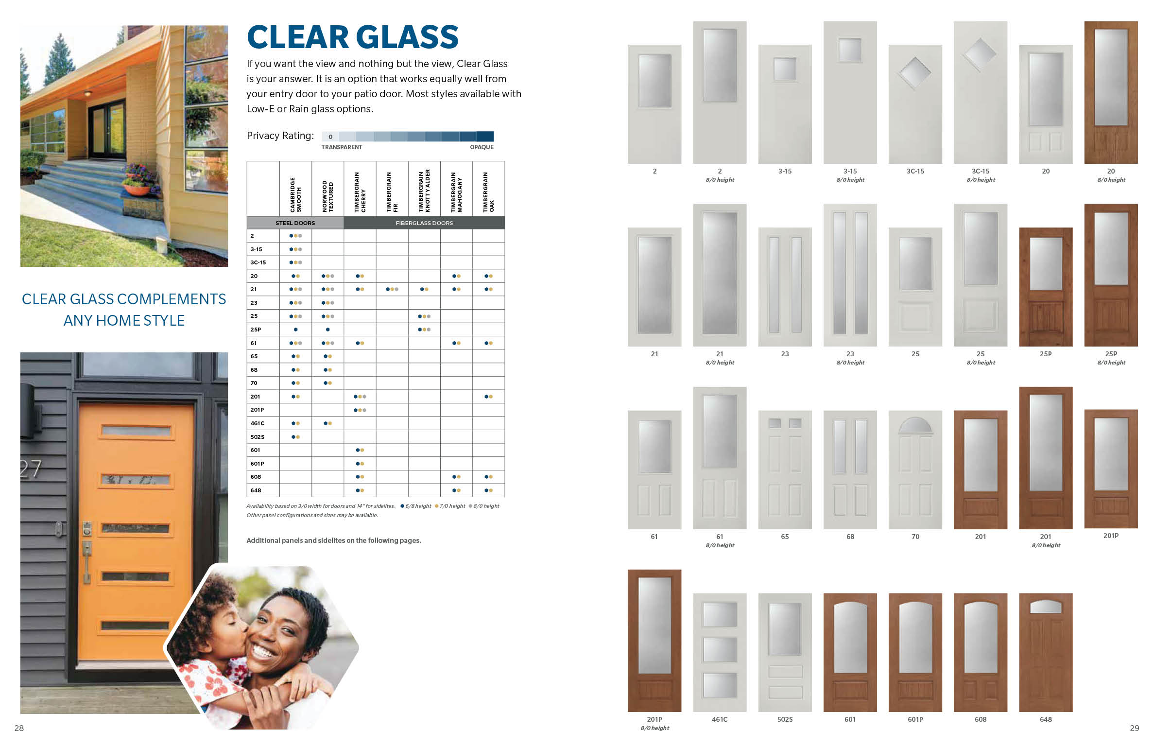
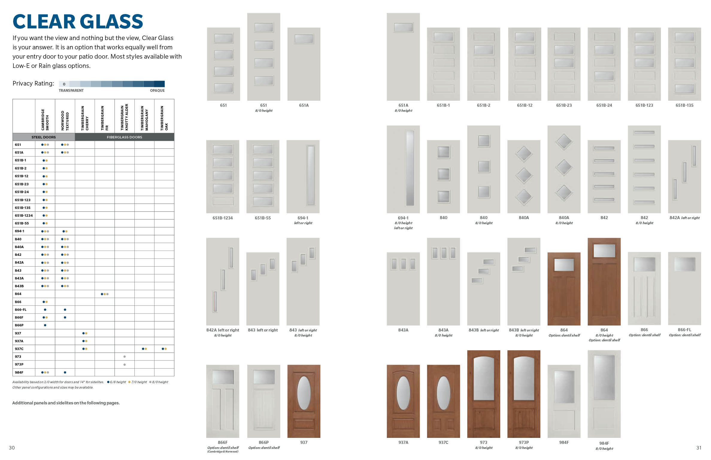
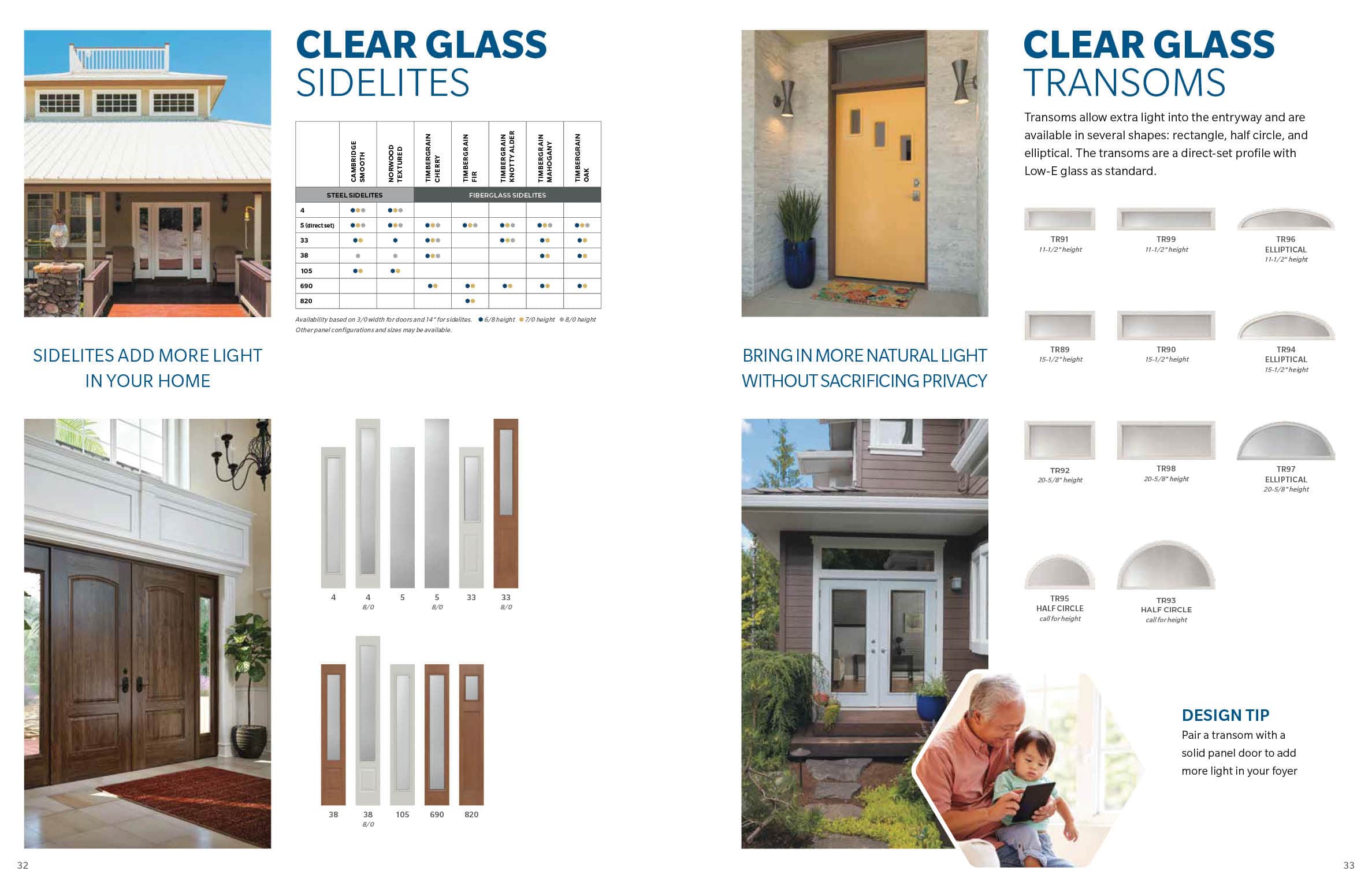
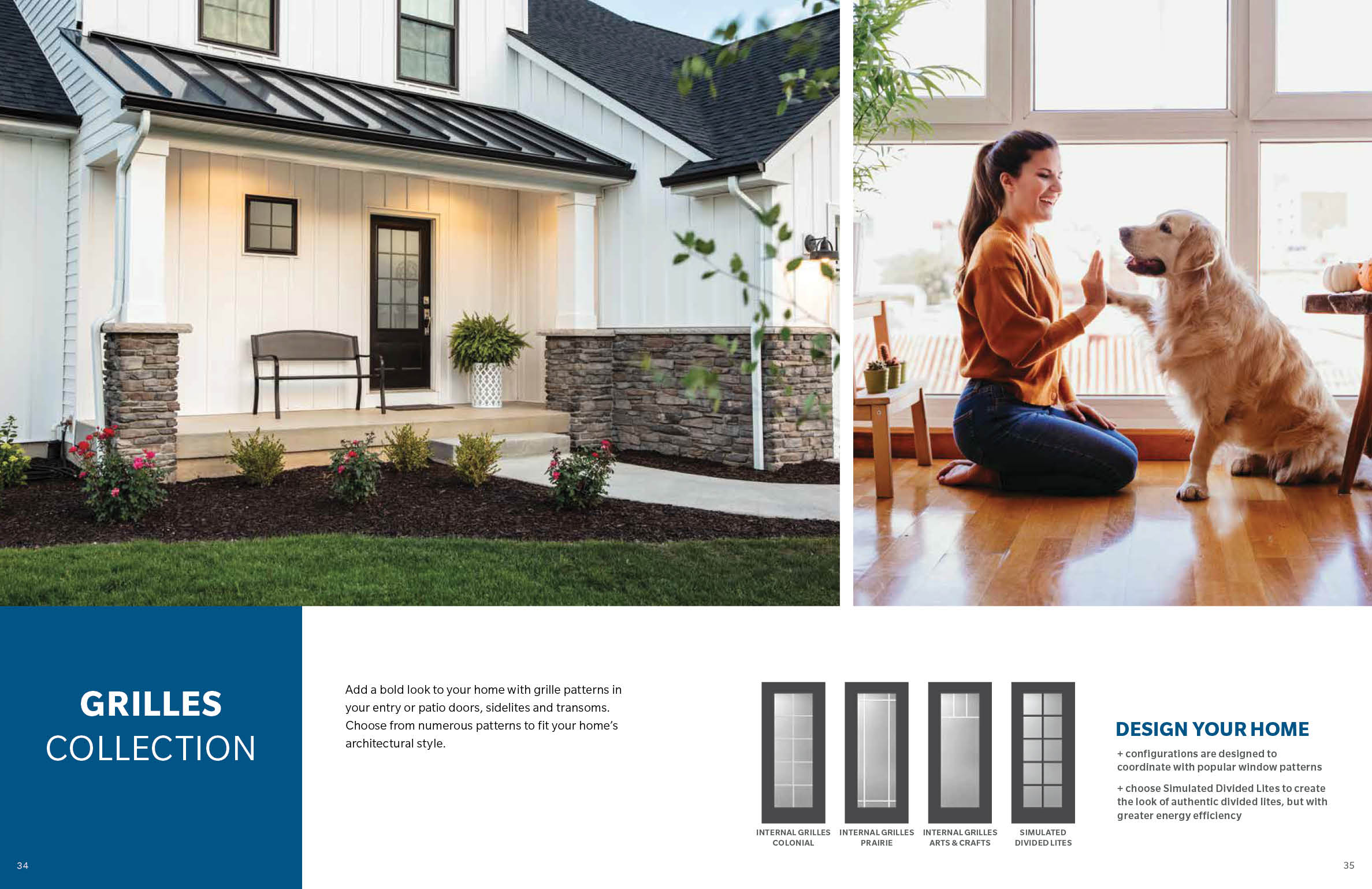
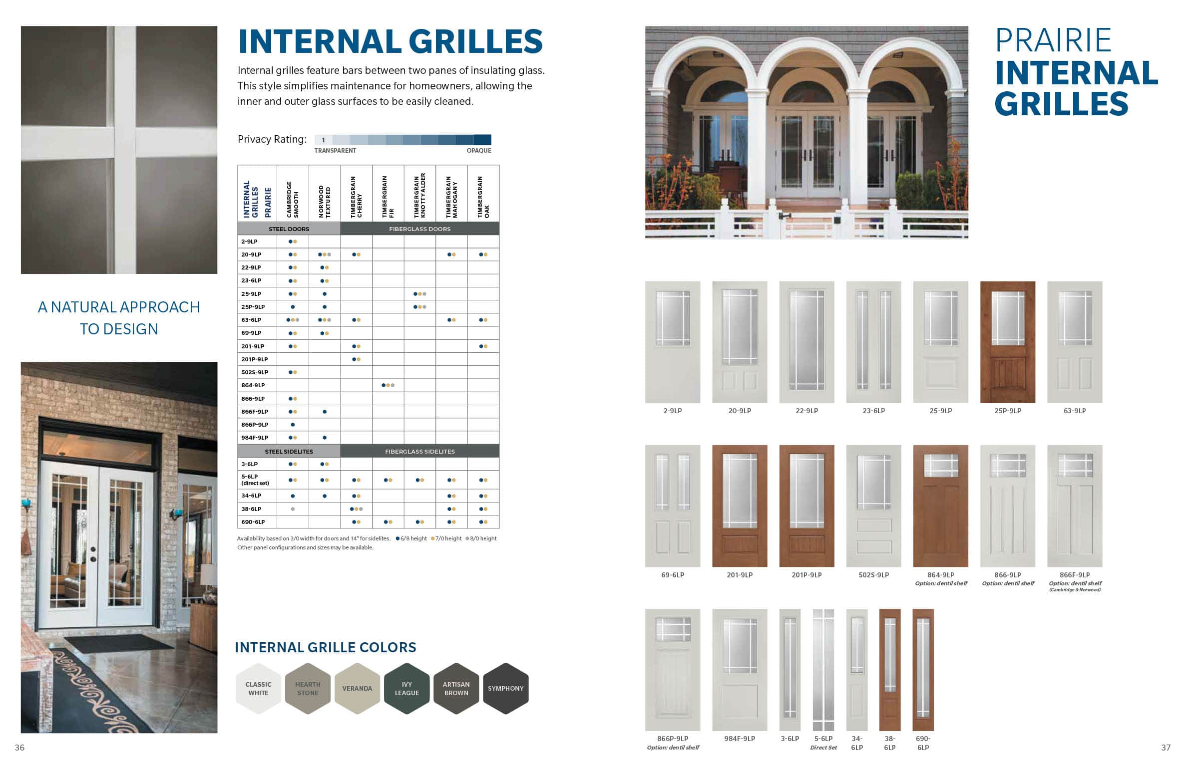
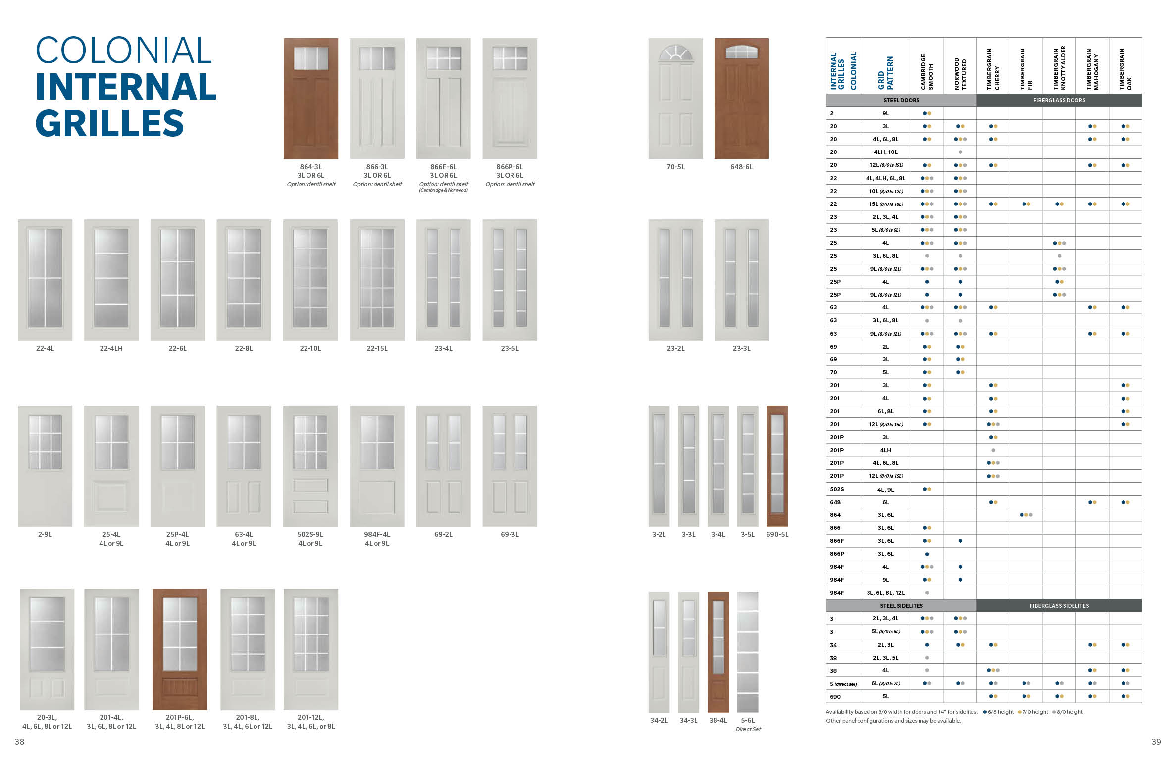
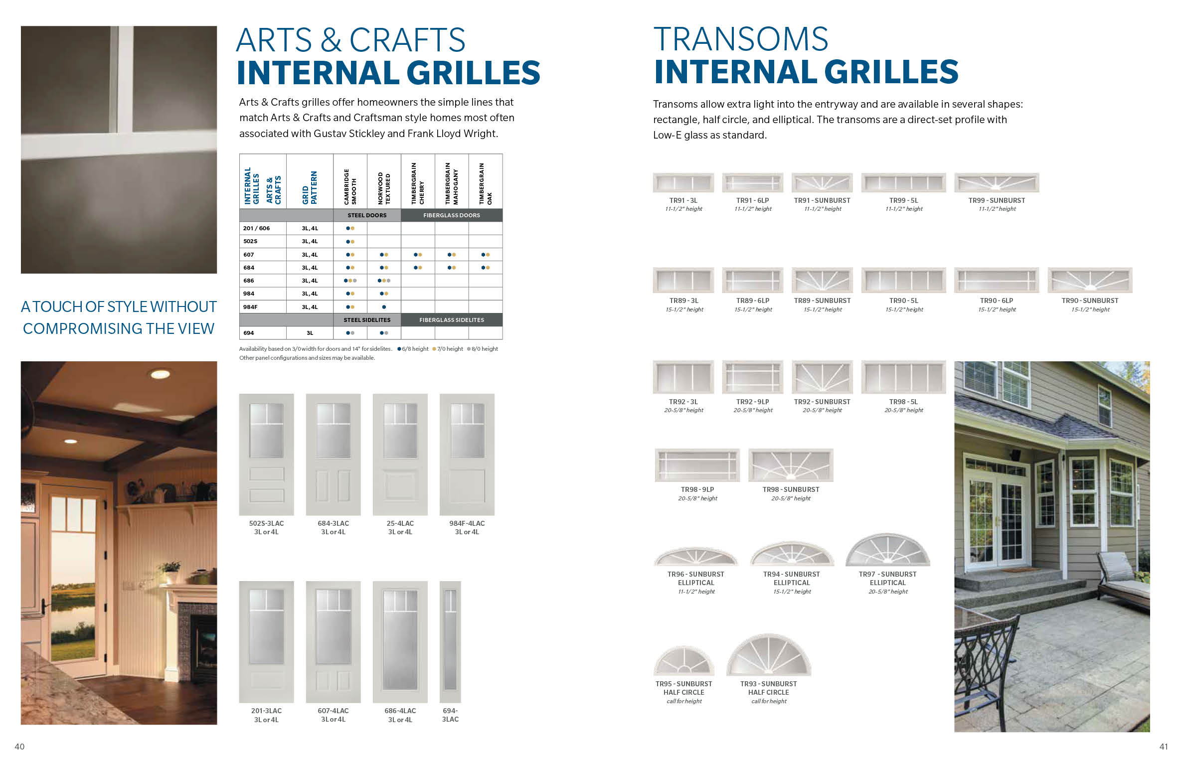

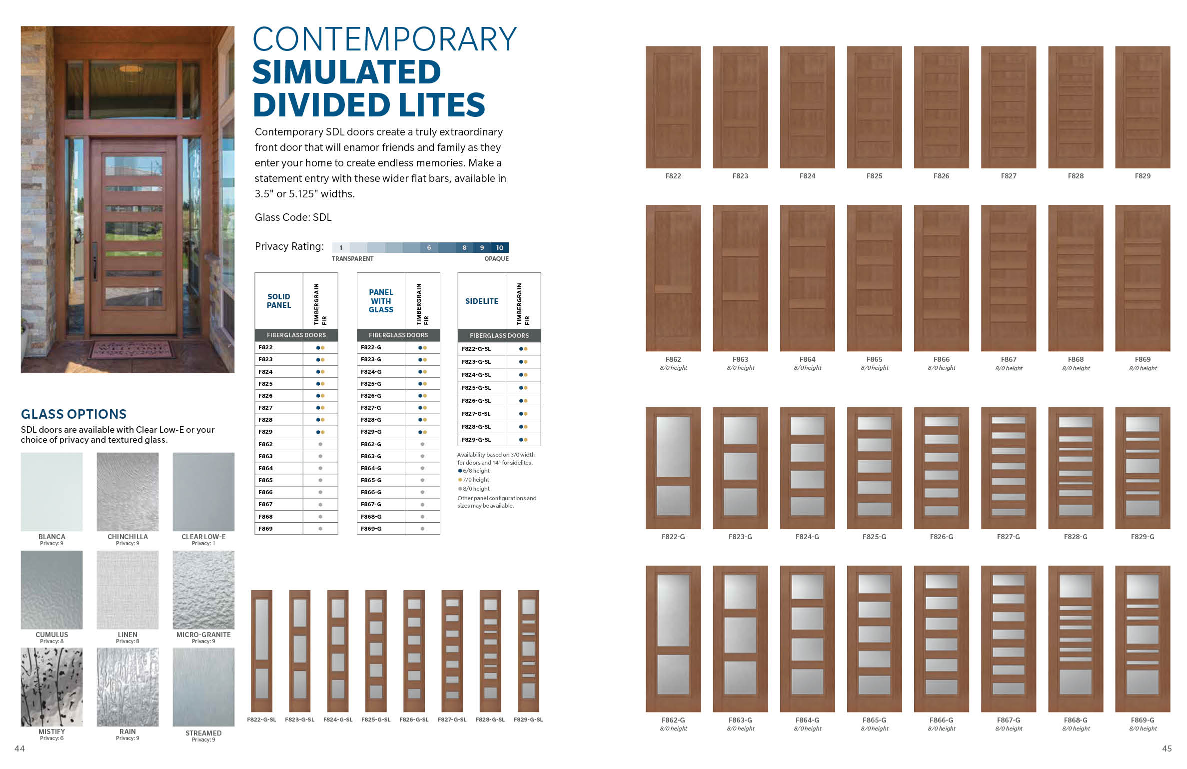
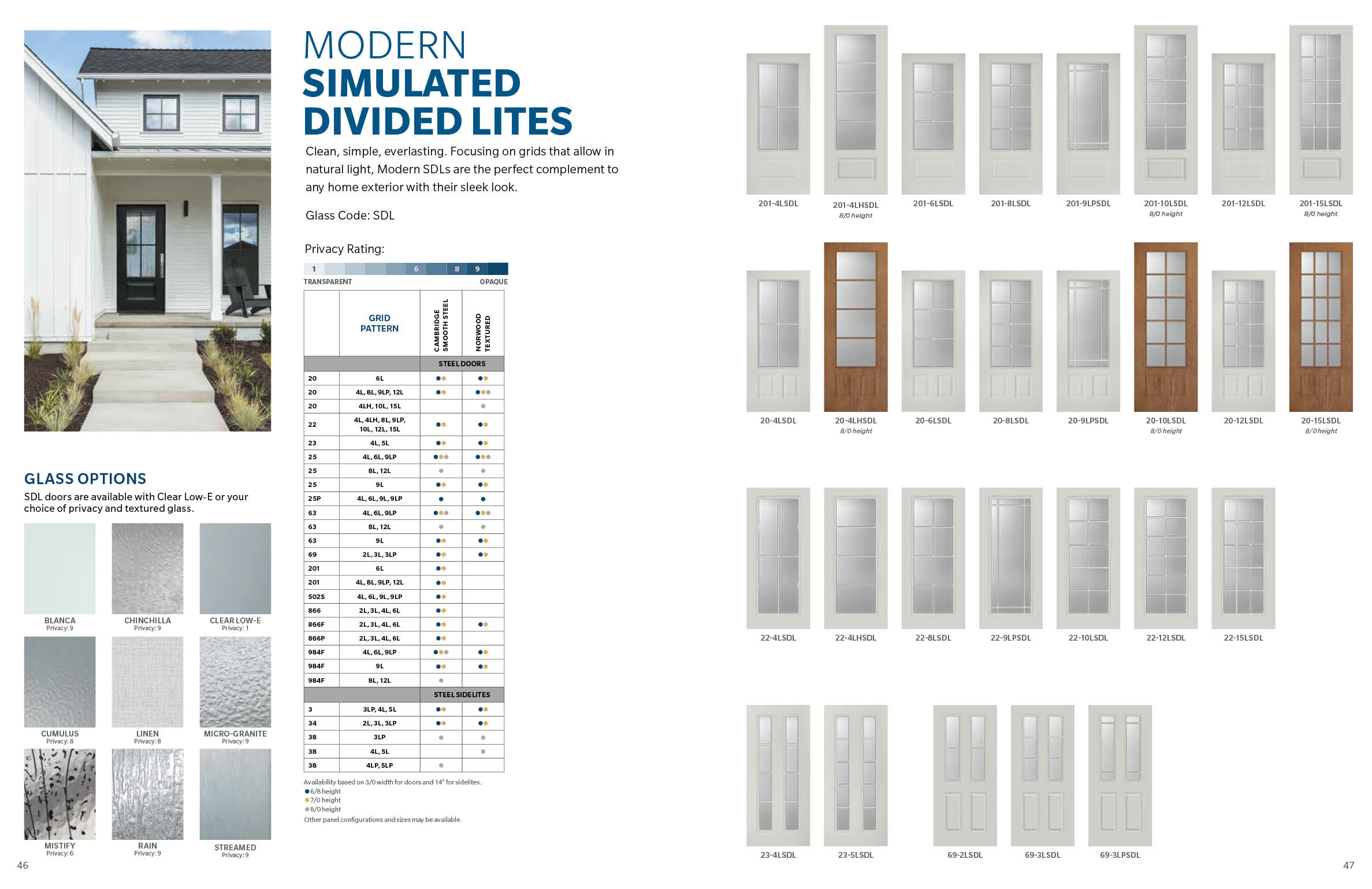
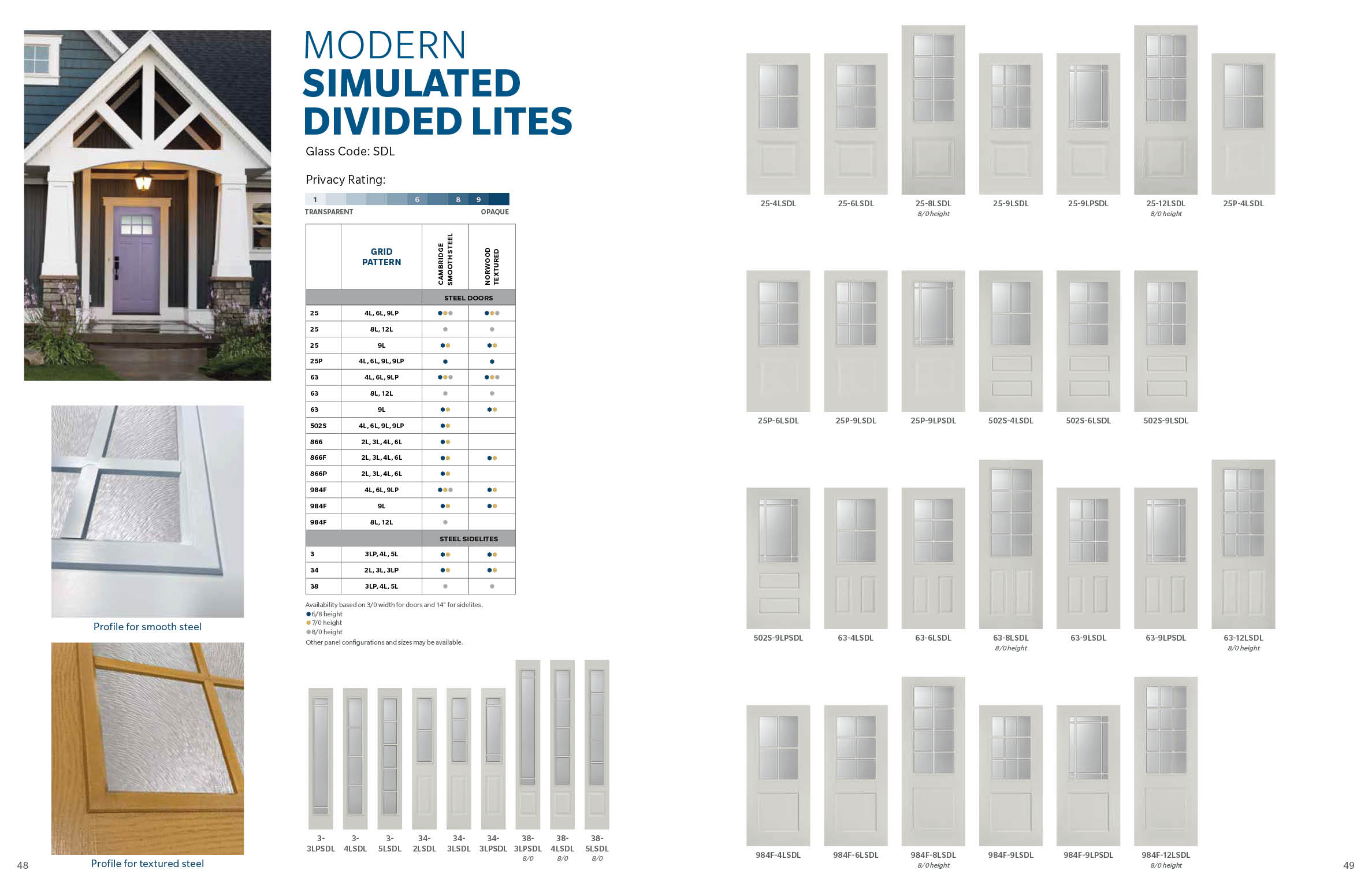
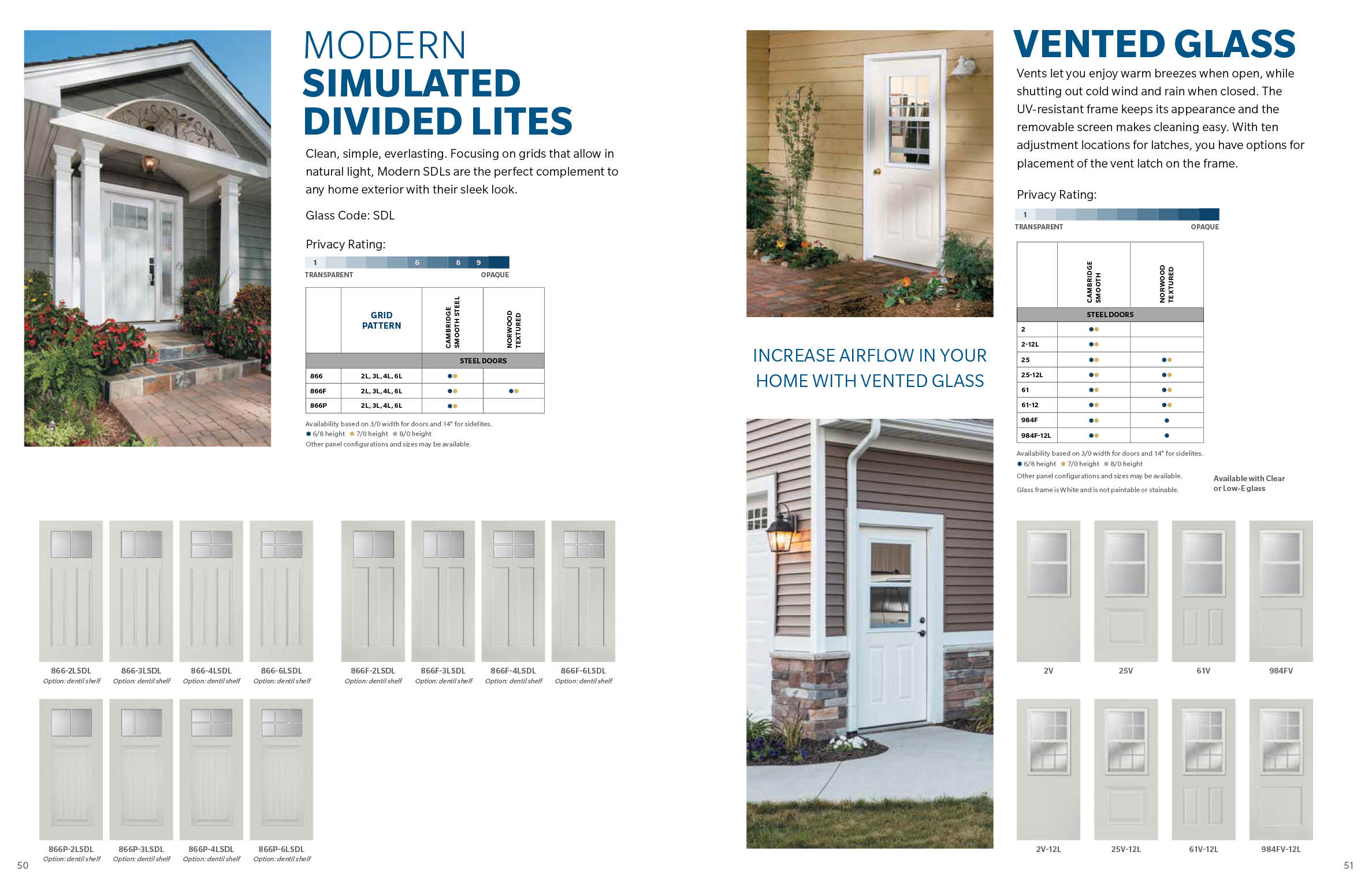
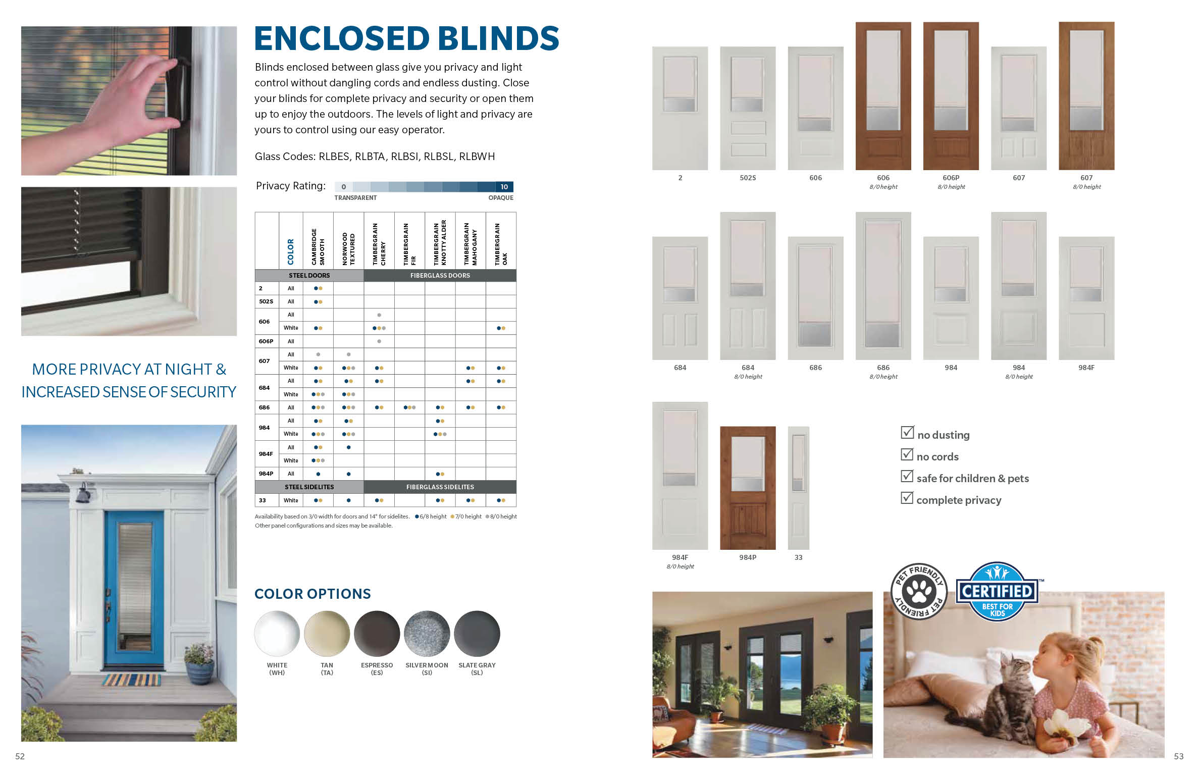
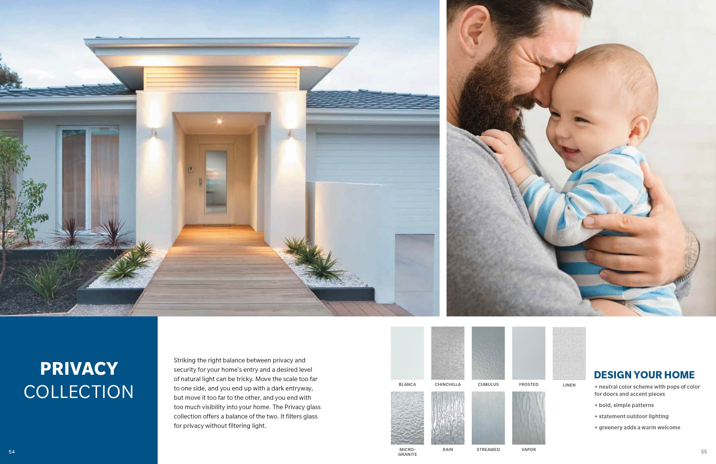
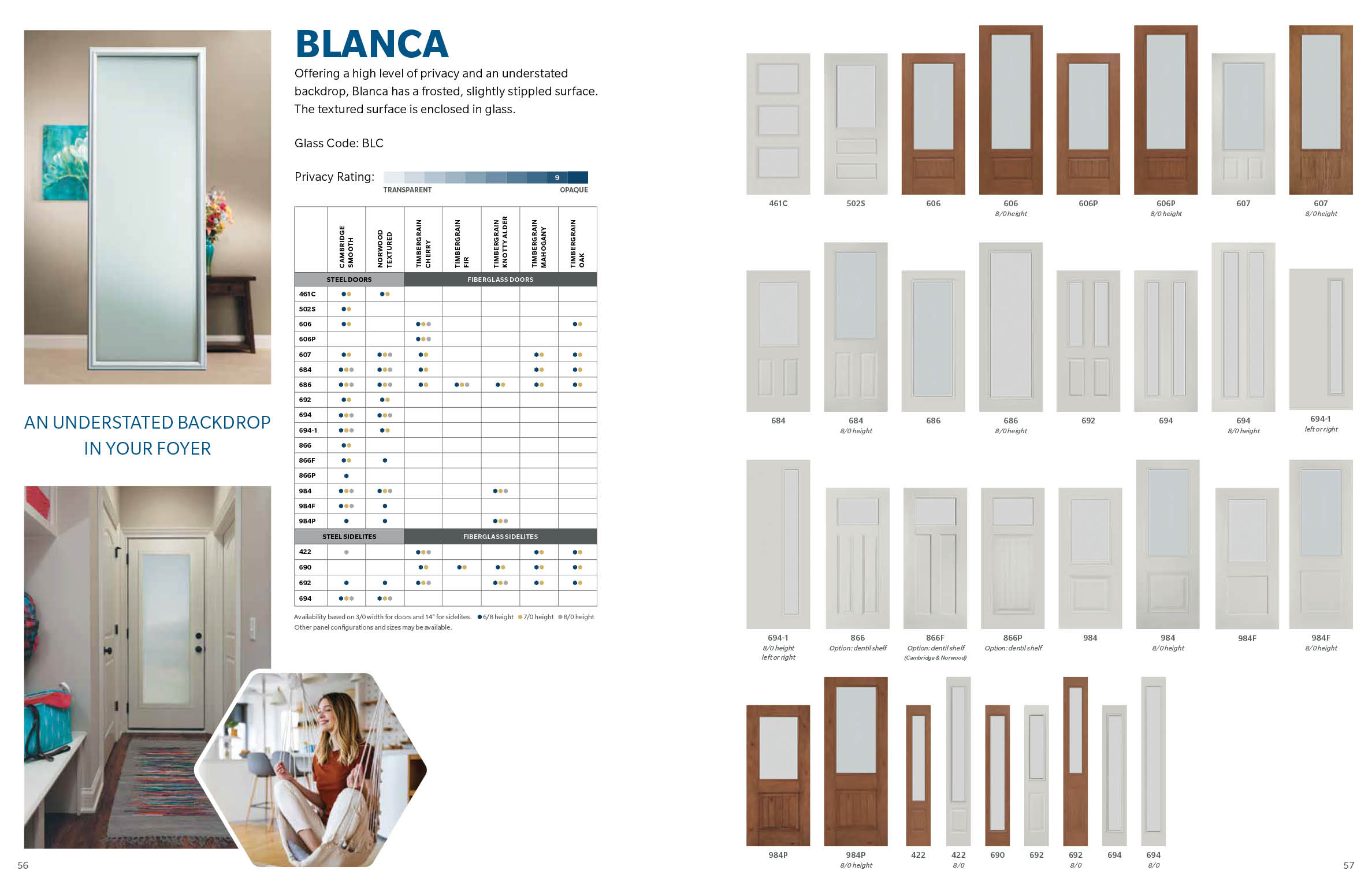
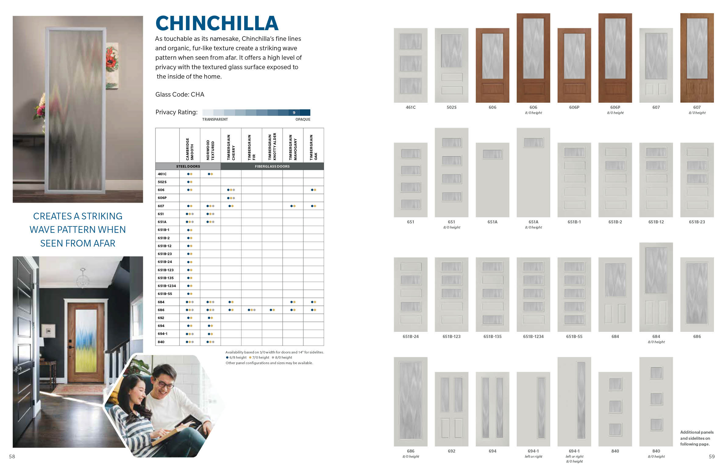
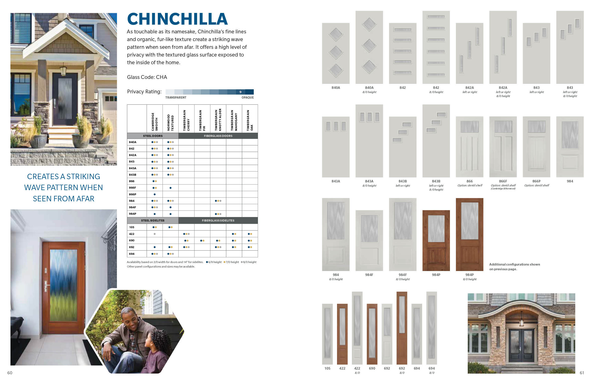
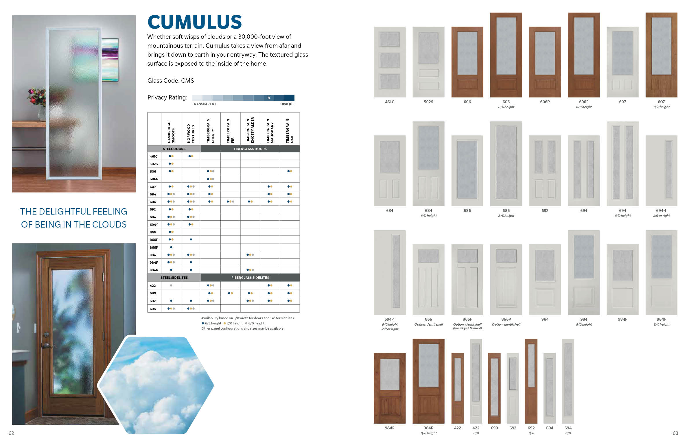
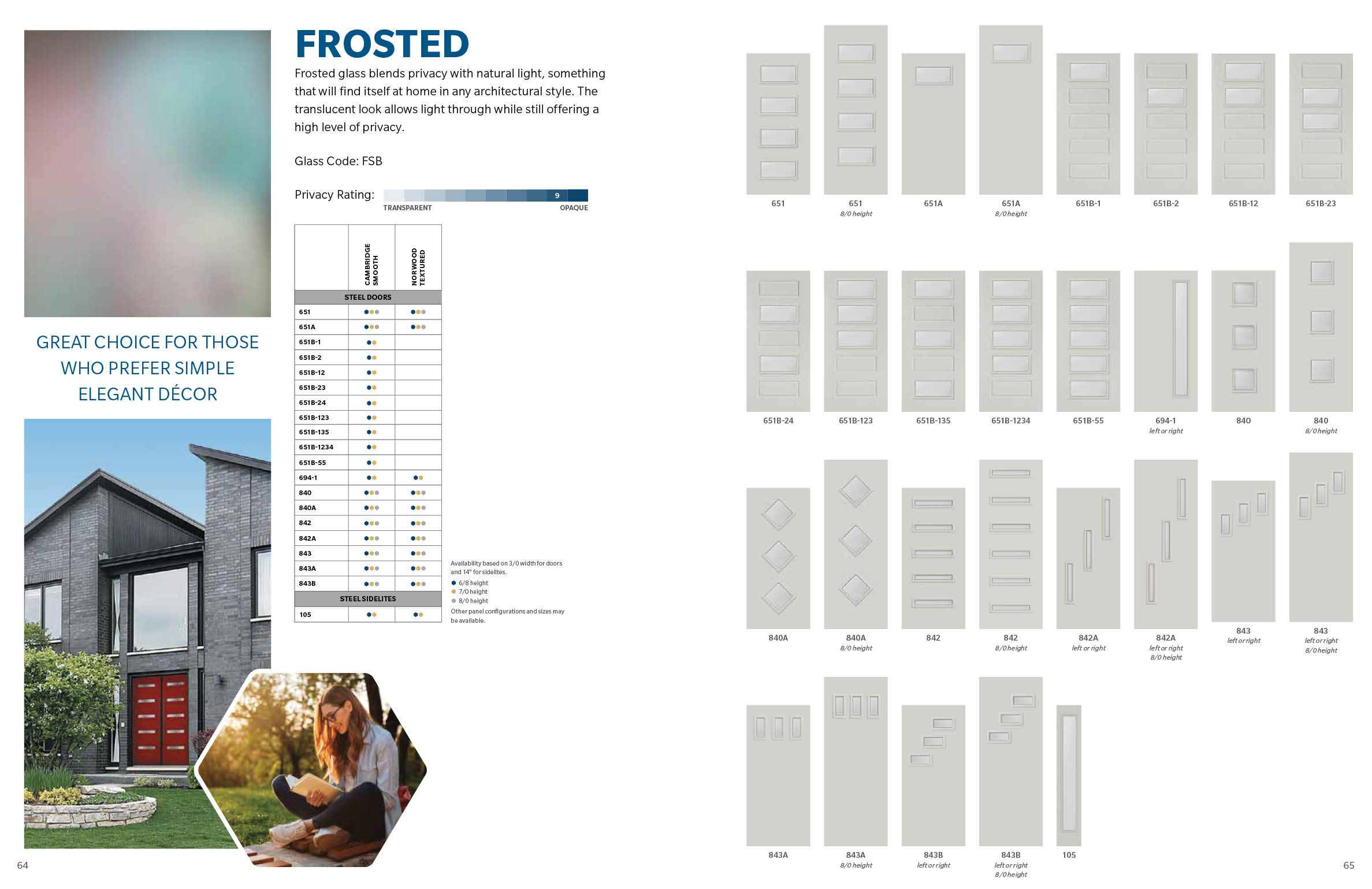

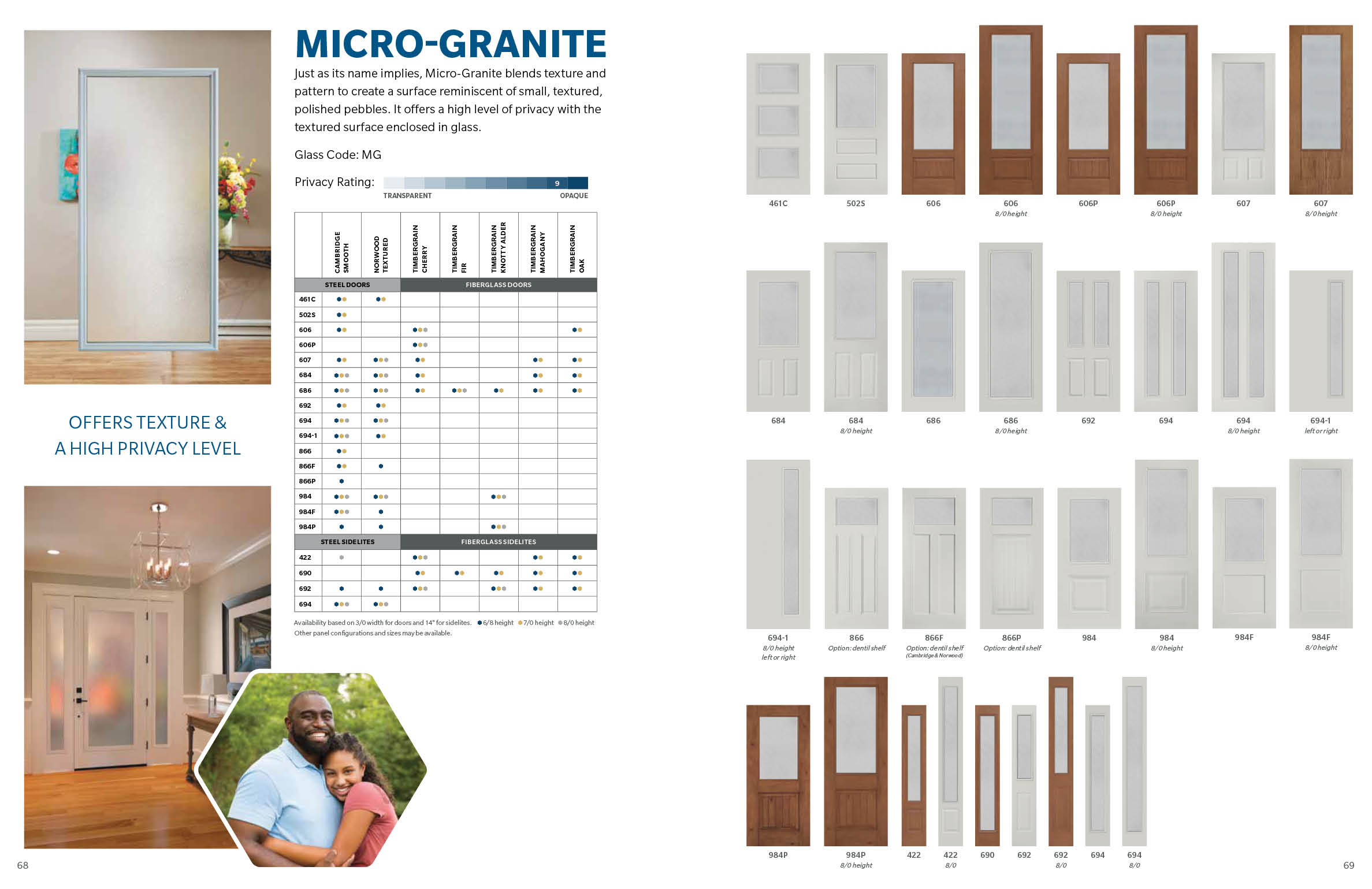
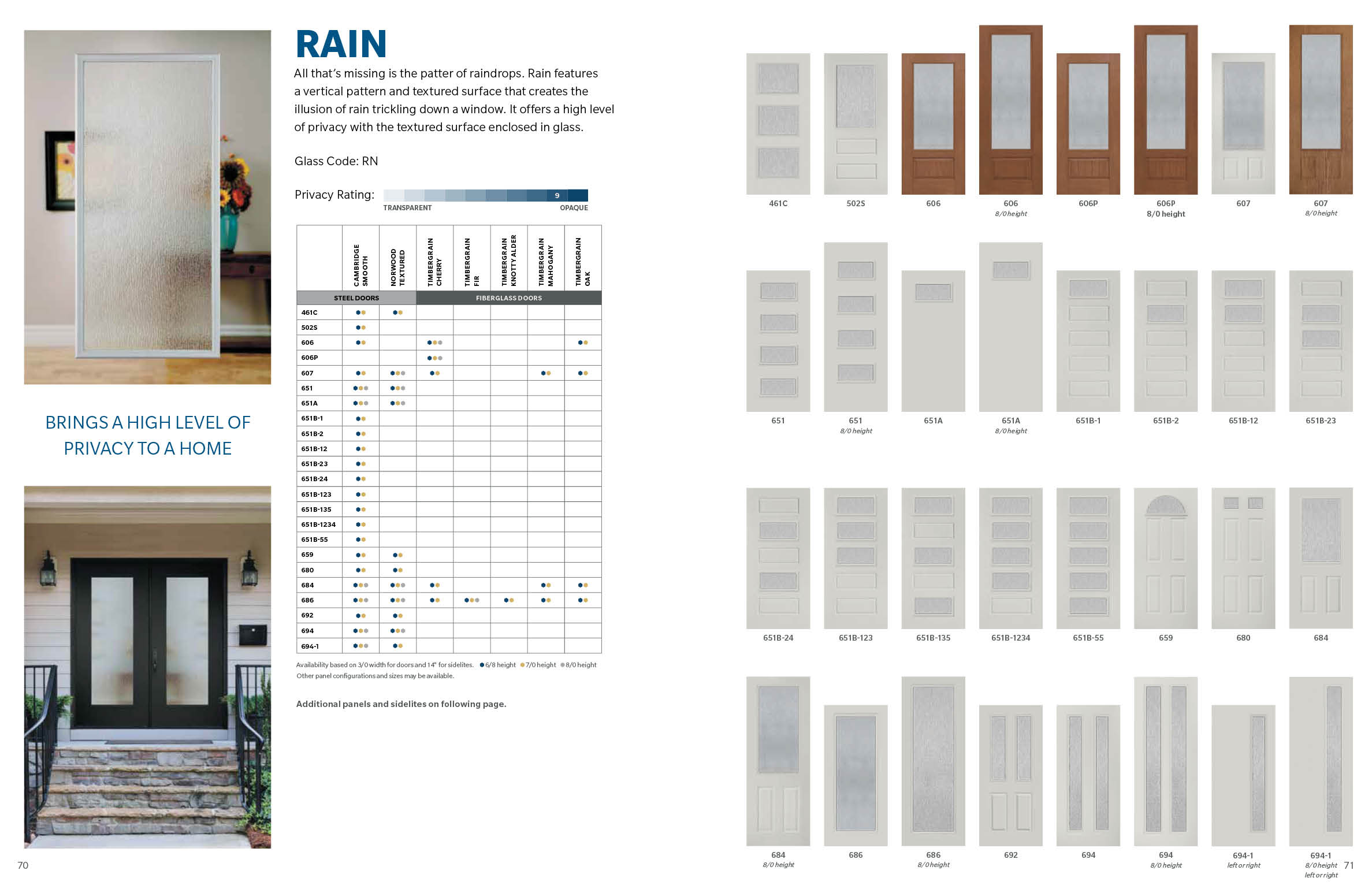
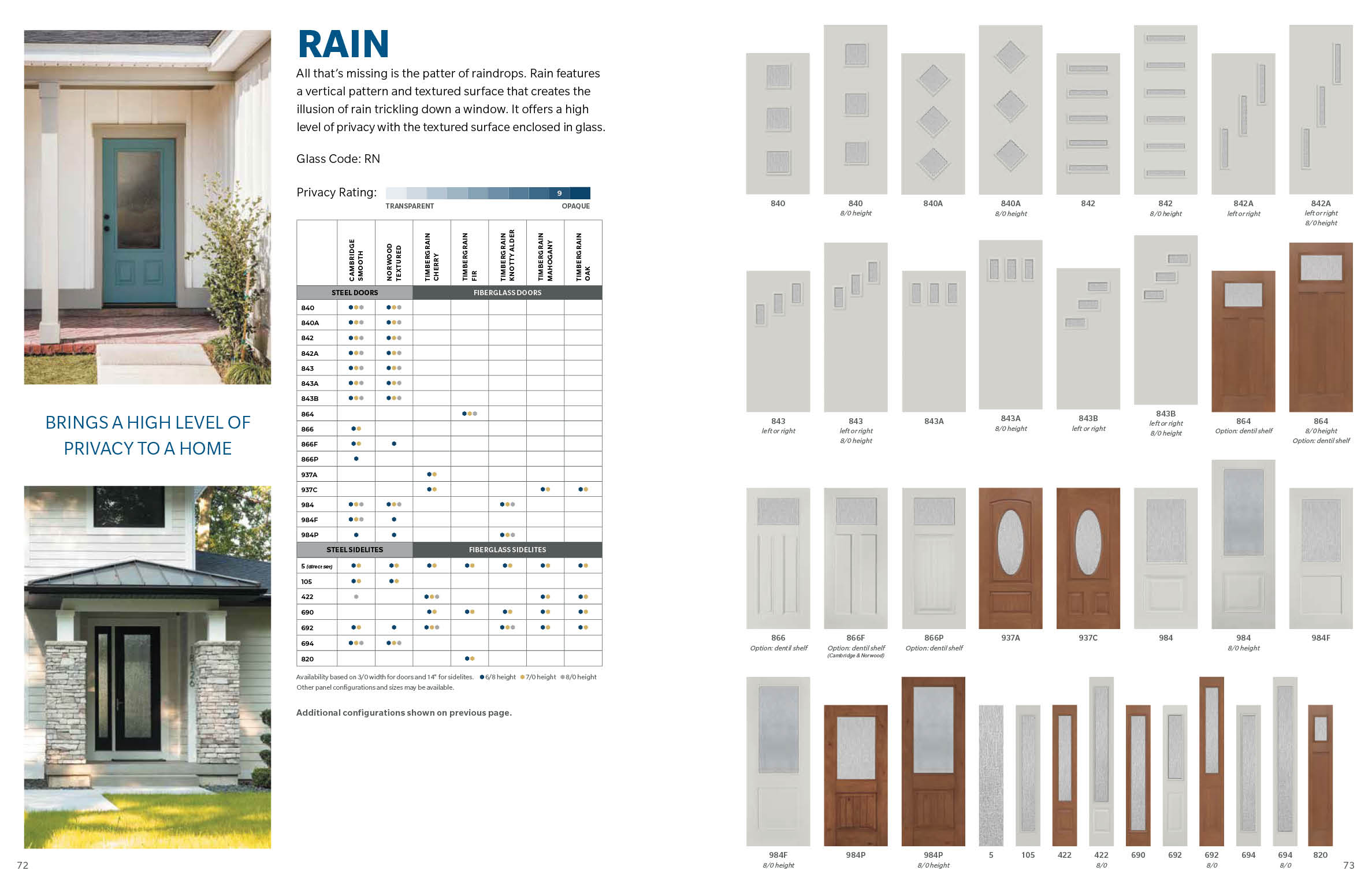
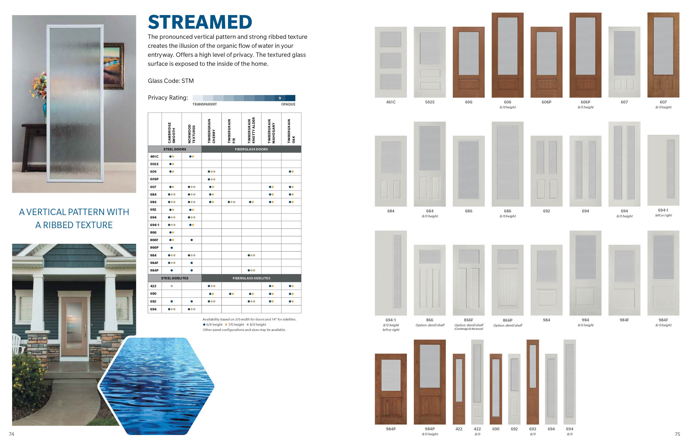
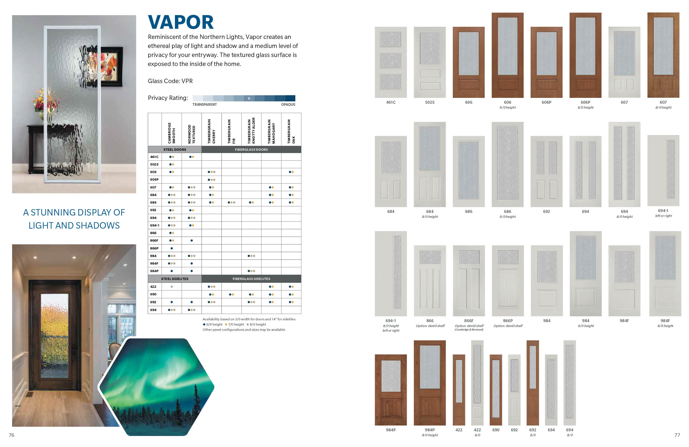
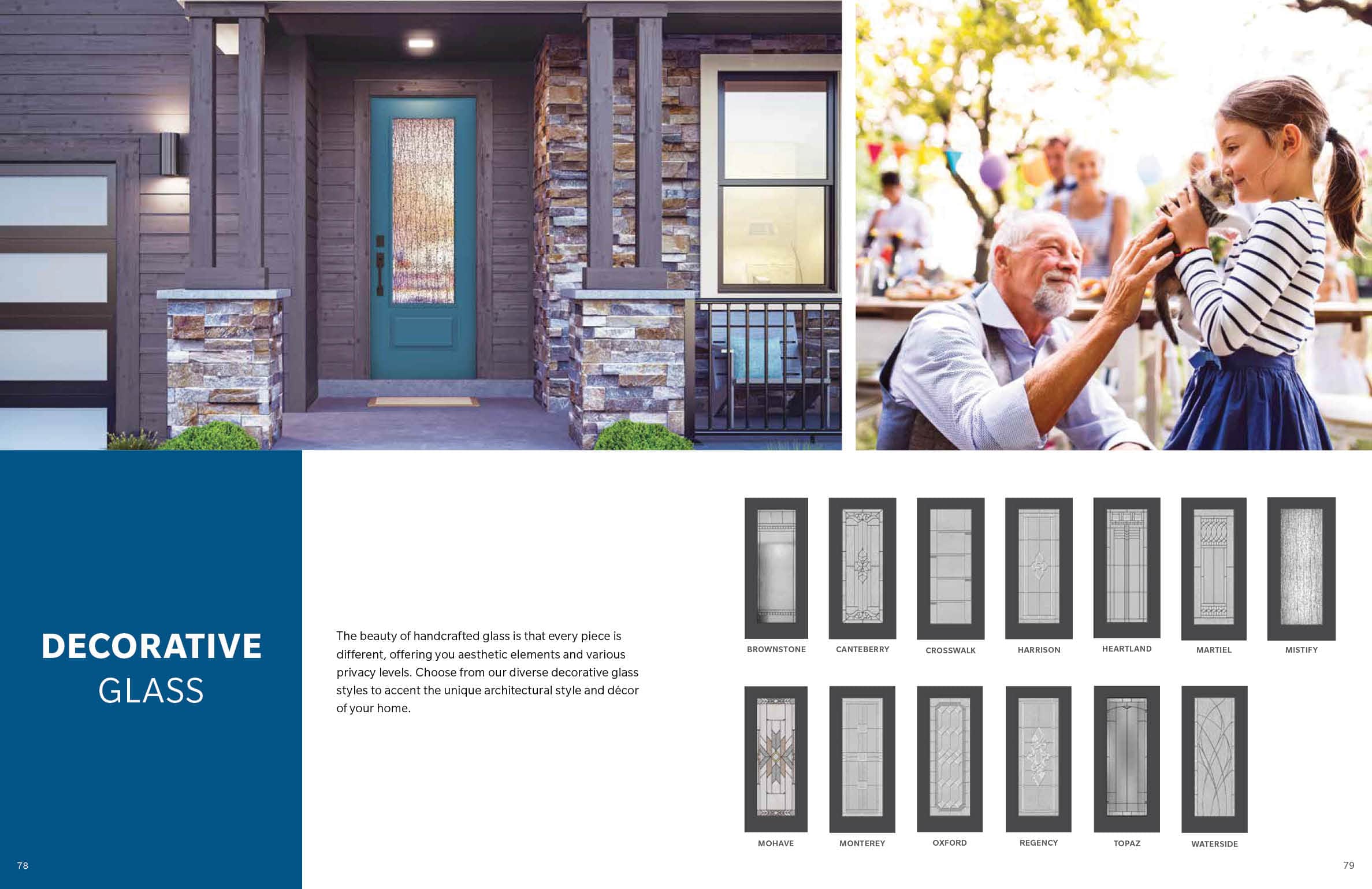


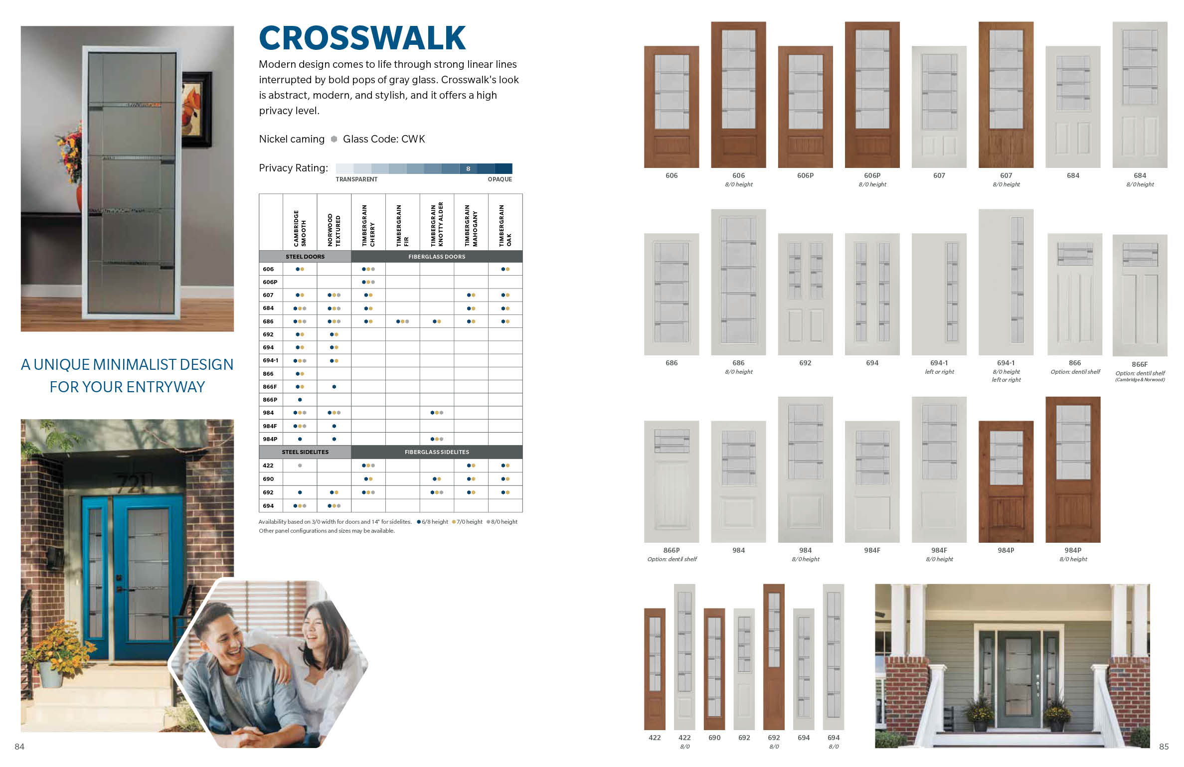
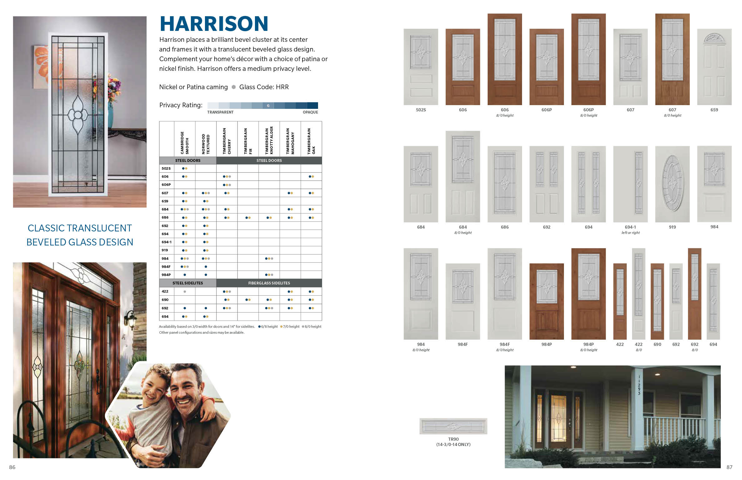
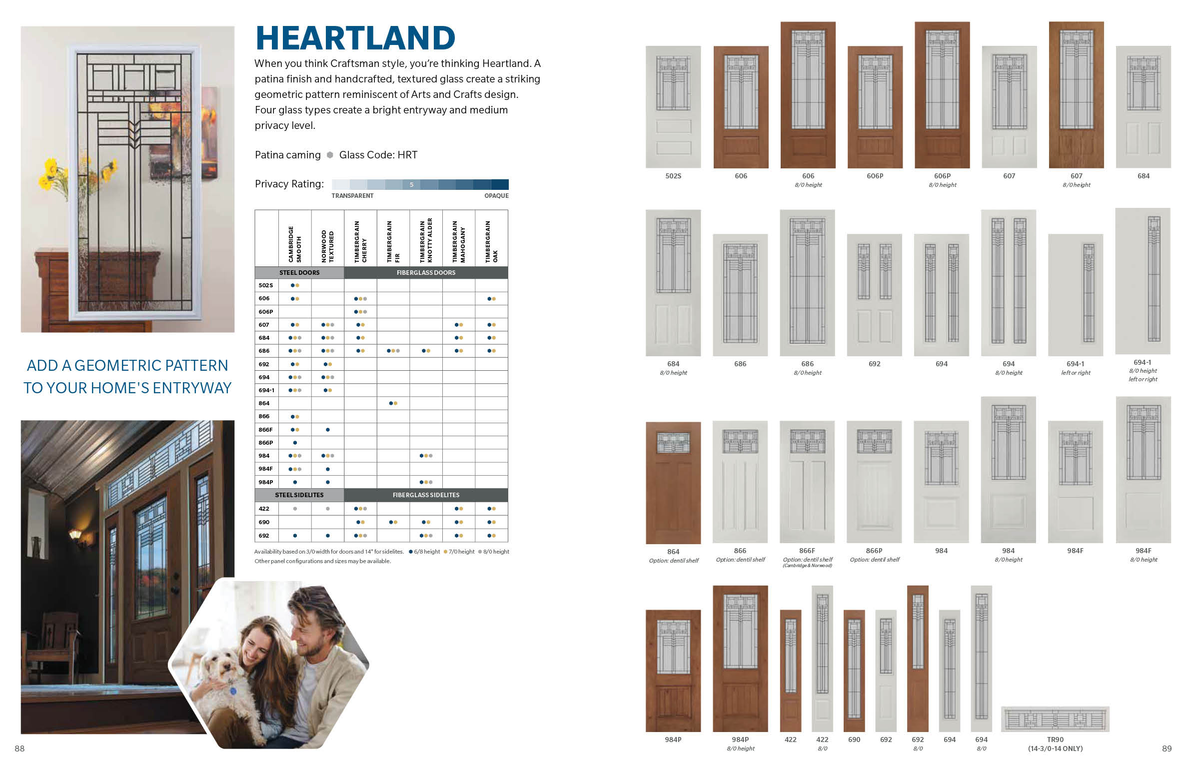
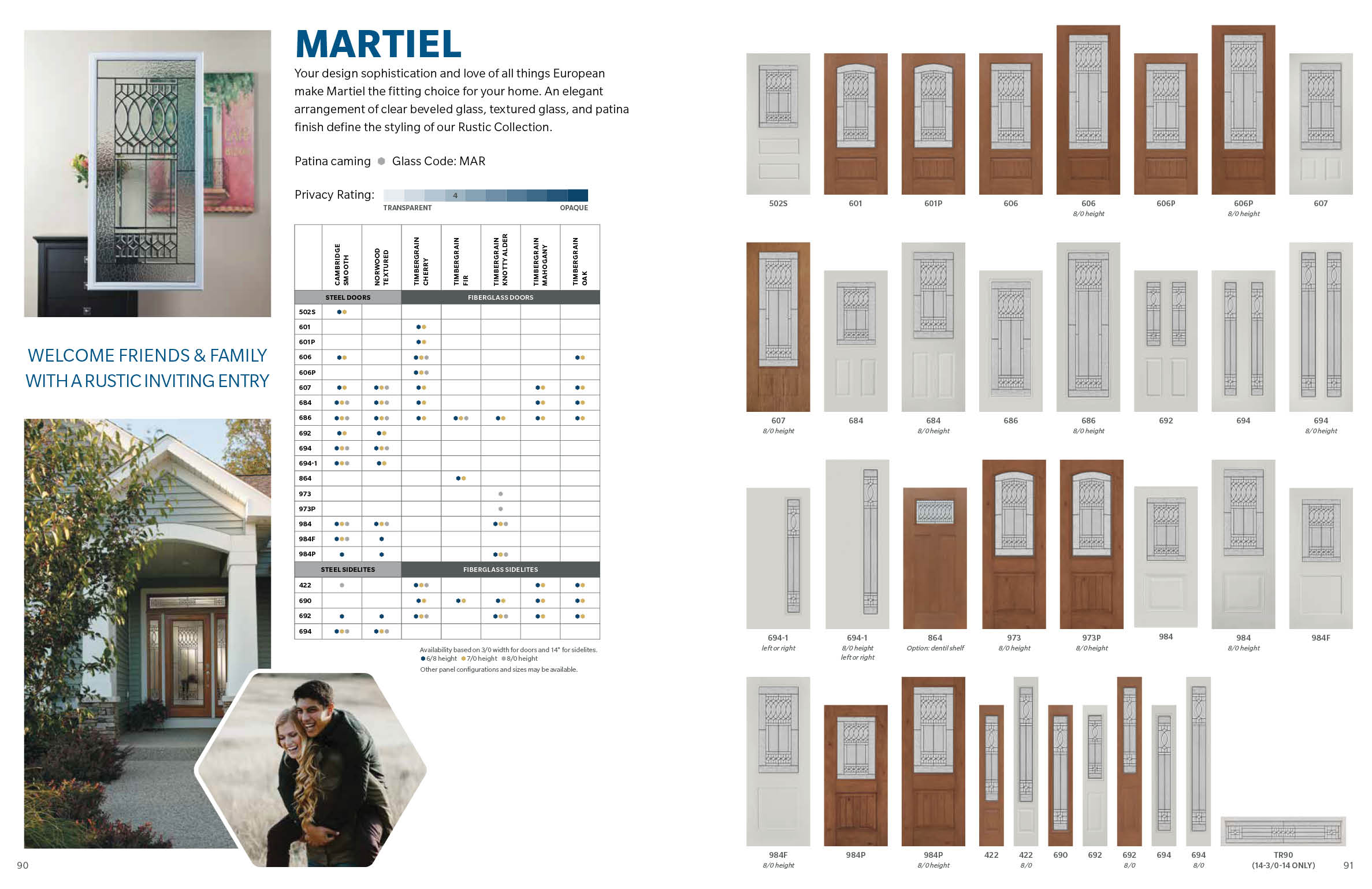
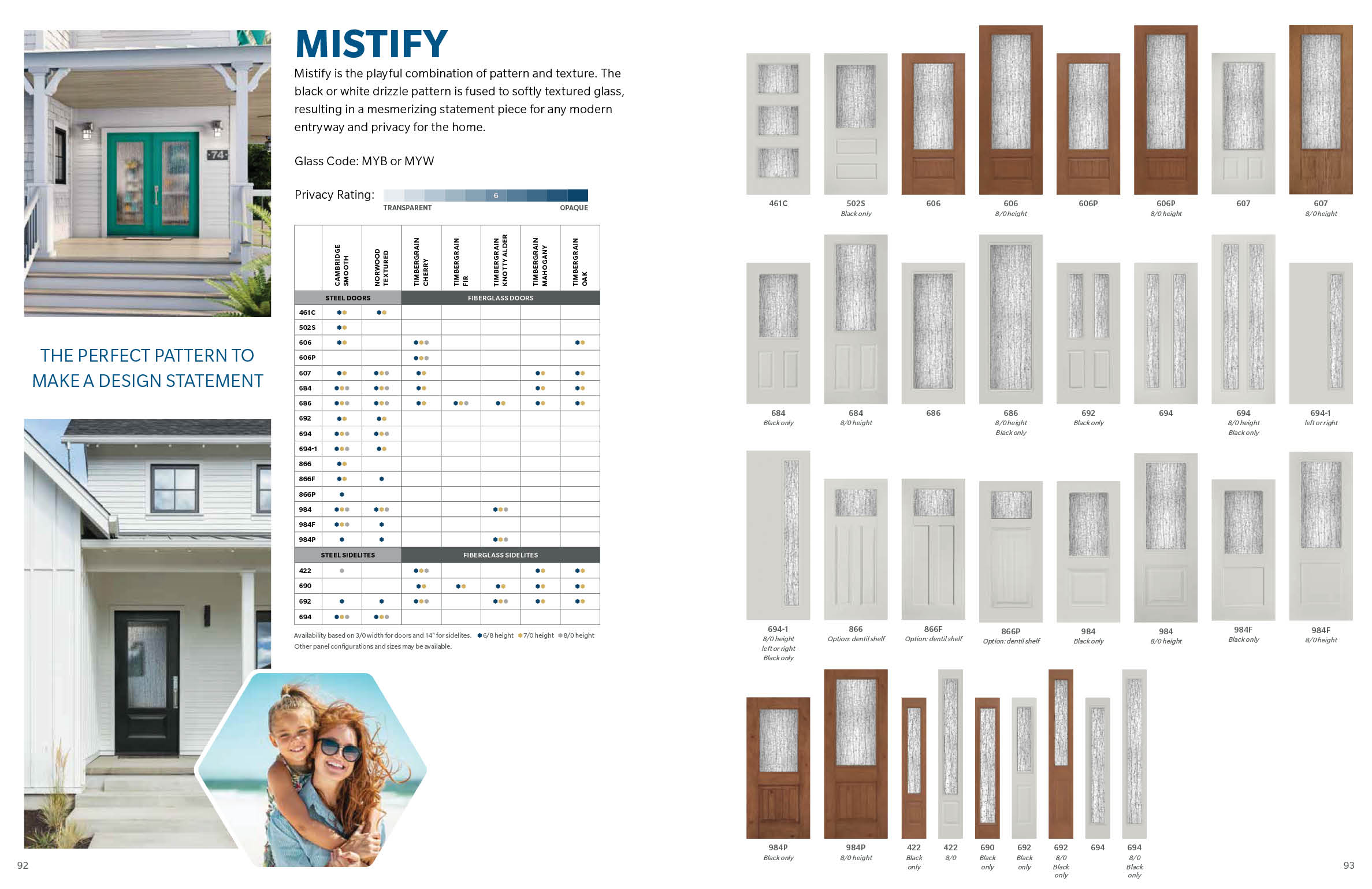
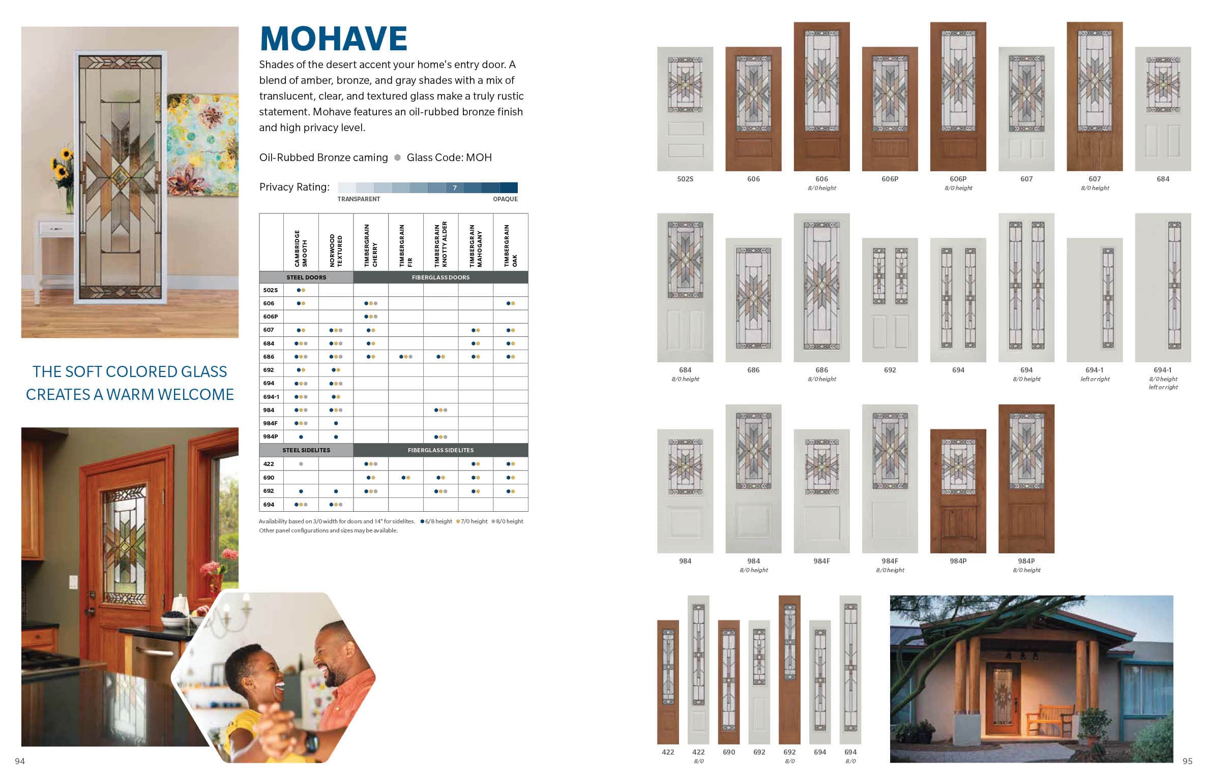
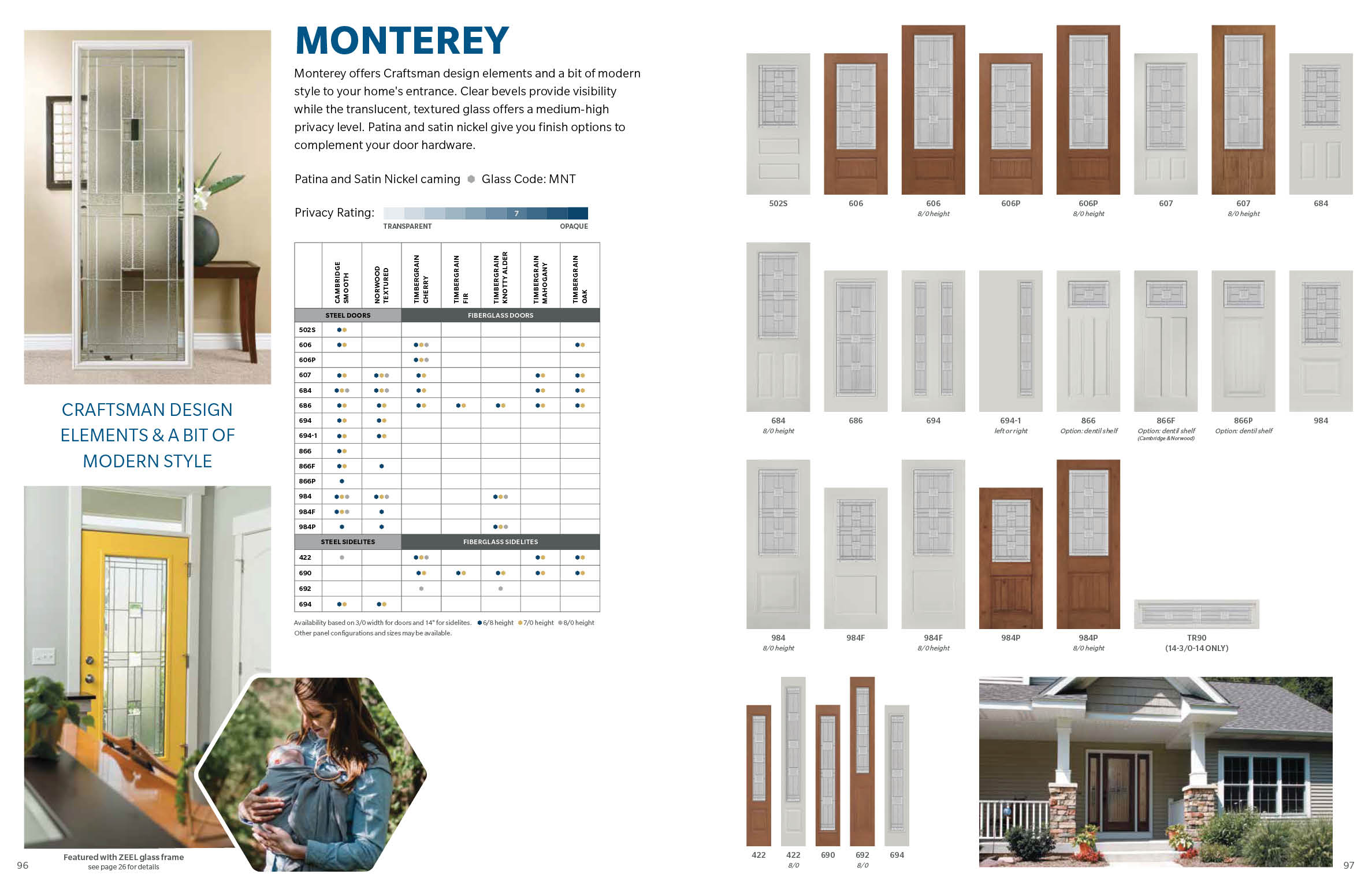
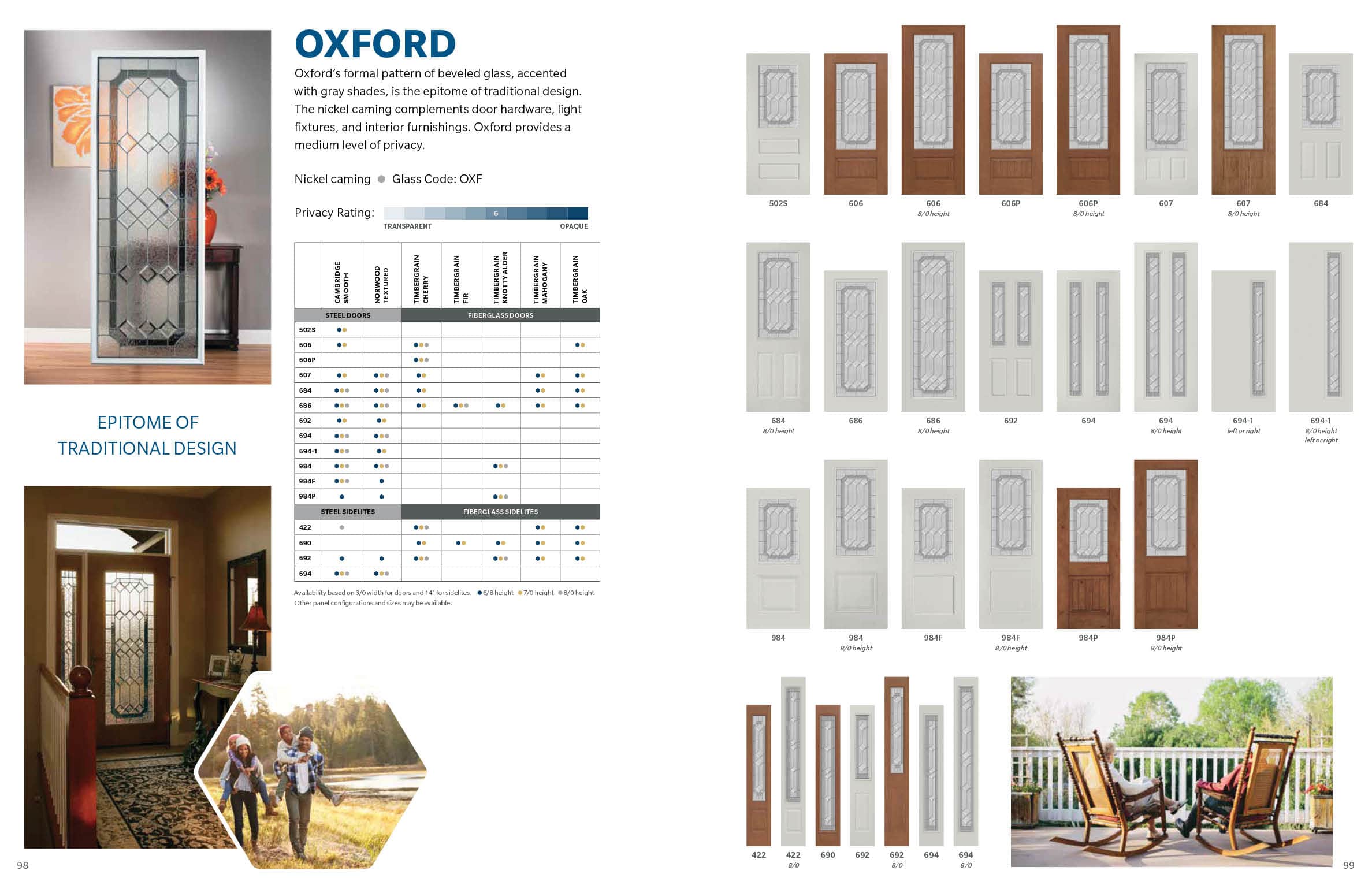

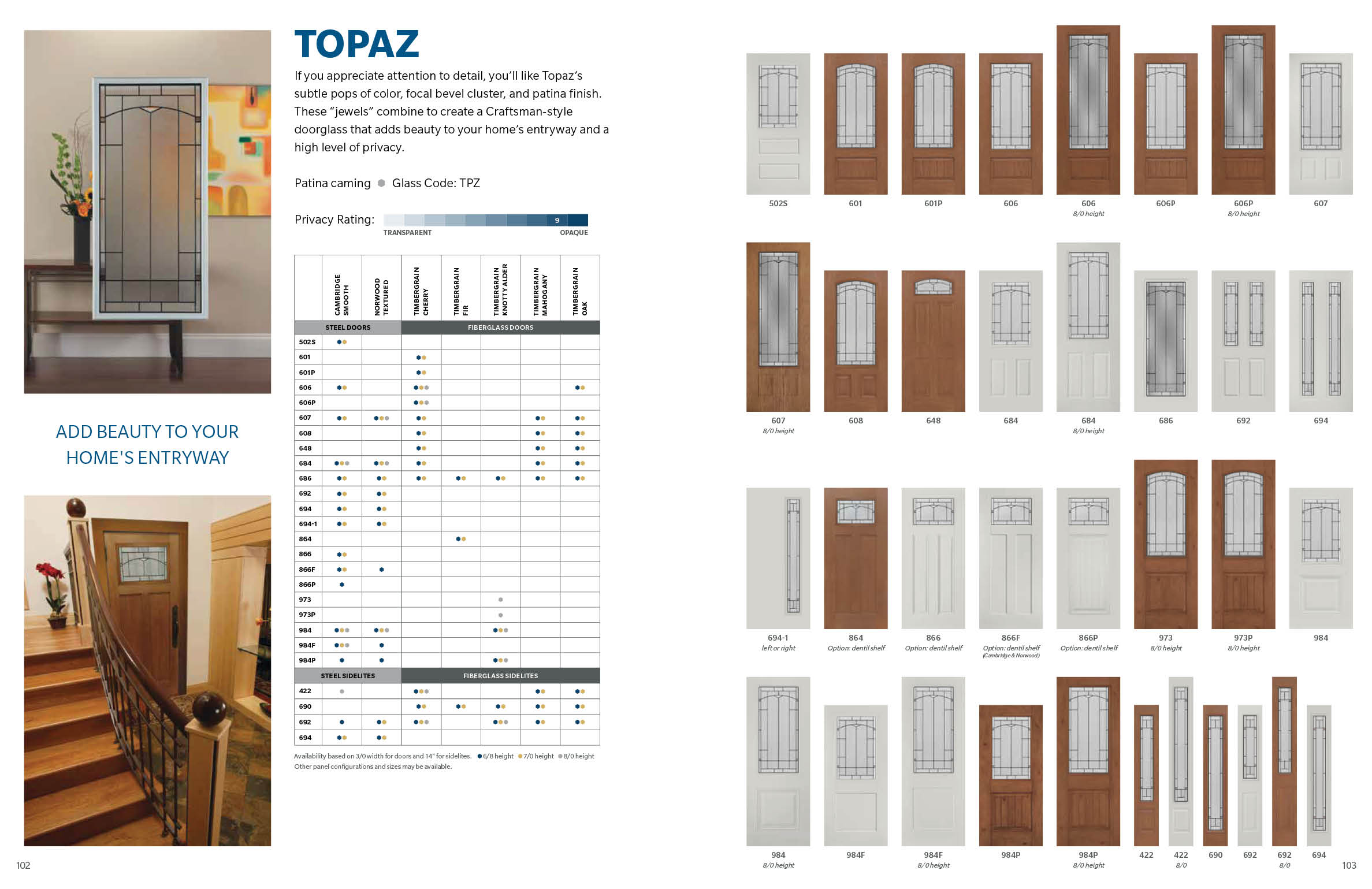
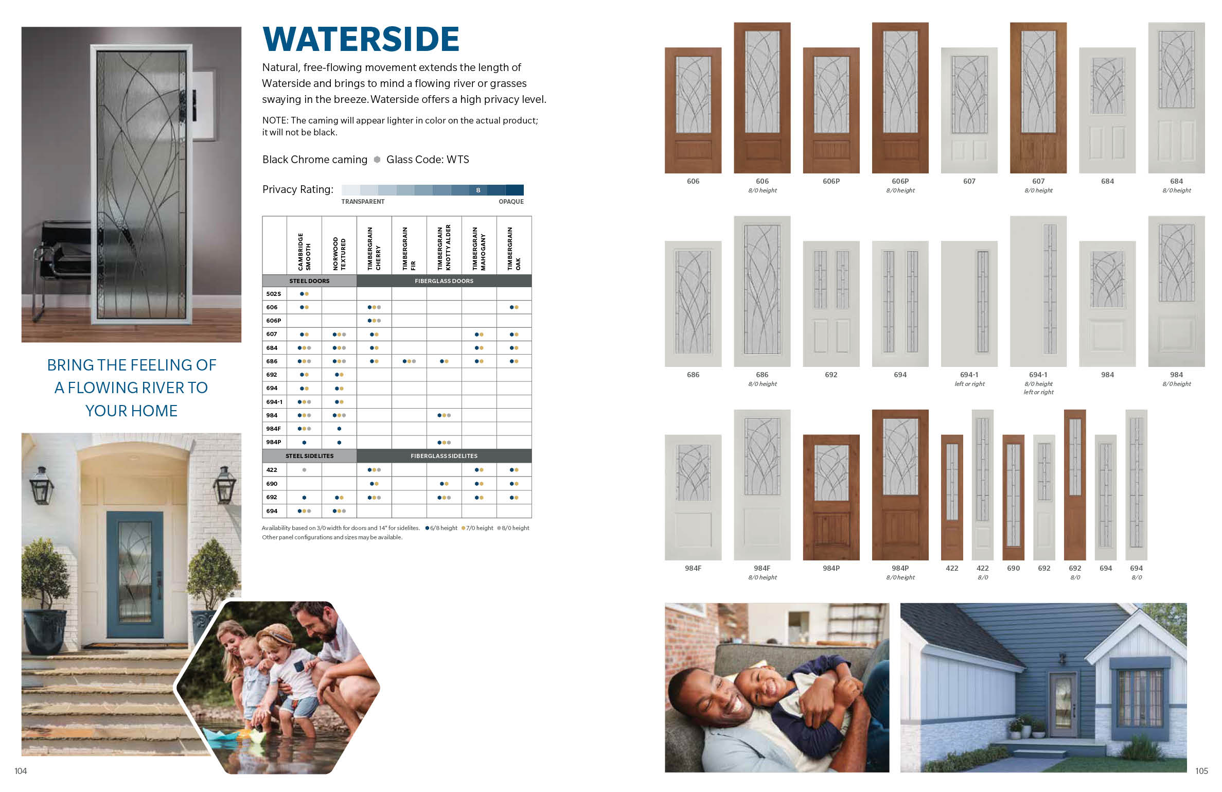

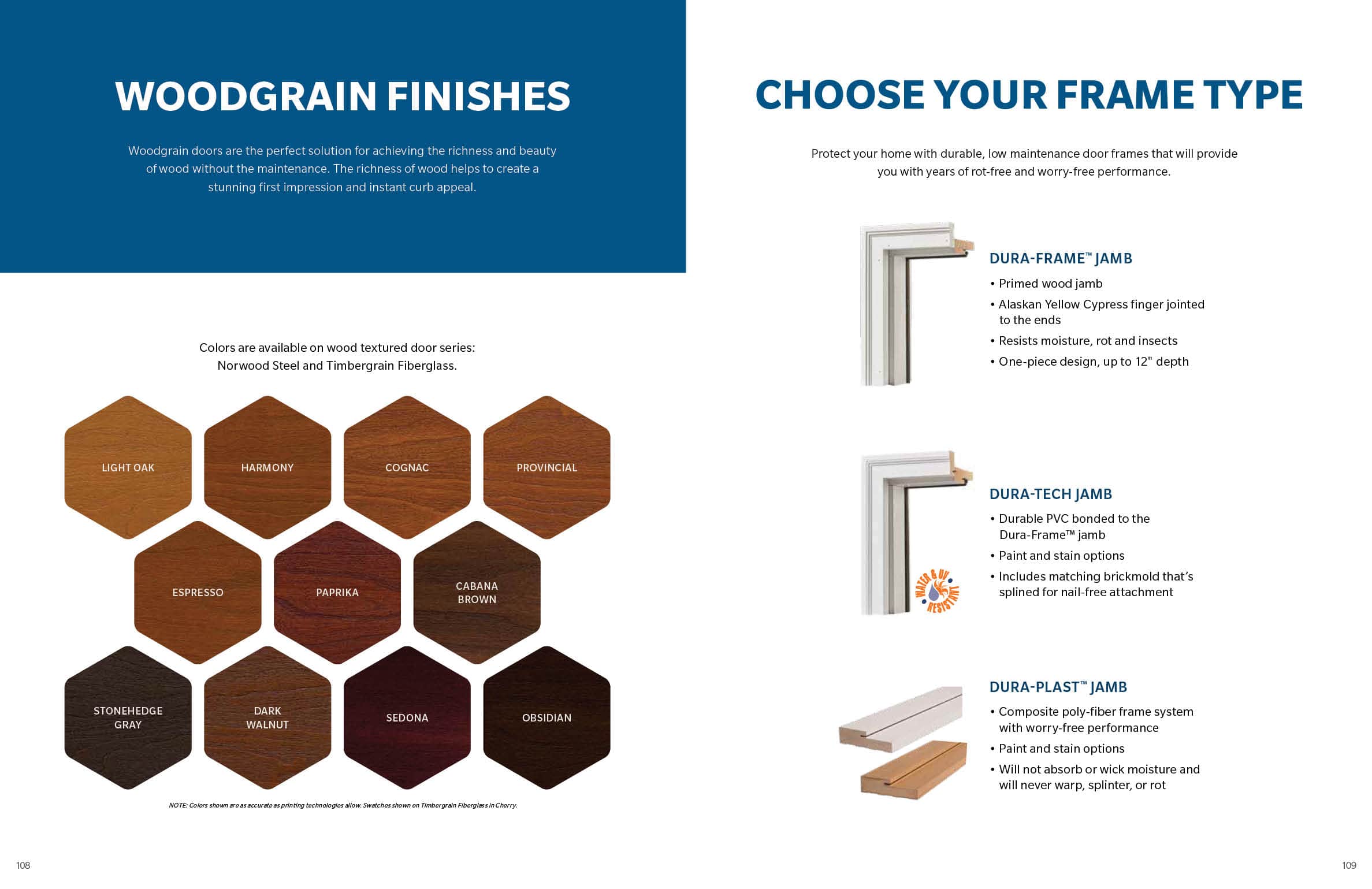


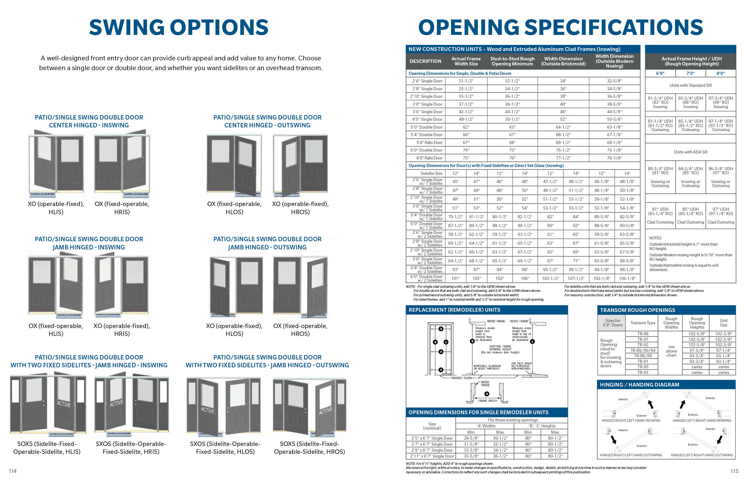
My task for this project was to create an exterior door catalog for Champion, a customer of Wausau Supply Co.’s door offering, Waudena. Update branding, colors, paragraph styles, and character styles to reflect brand specifics for Champion, in relation to font/color/etc. The contents will be a modified offering of the Waudena catalog. A marked-up PDF was provided as a guide. Additional customer-specific content pages were added. Overall catalog to be approximately 116 pages.


BRAND & WEB DESIGN
TOOLS USED: ILLUSTRATOR, PHOTOSHOP, INDESIGN, DREAMWEAVER, WORDPRESS
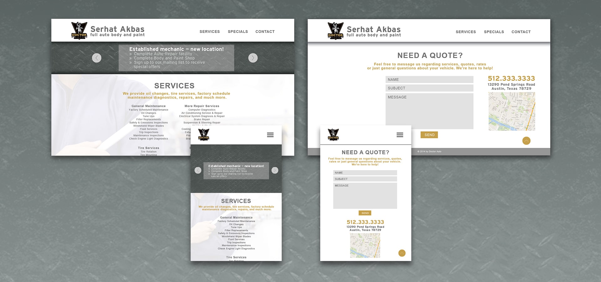
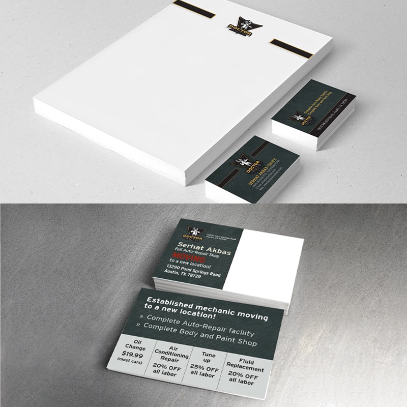
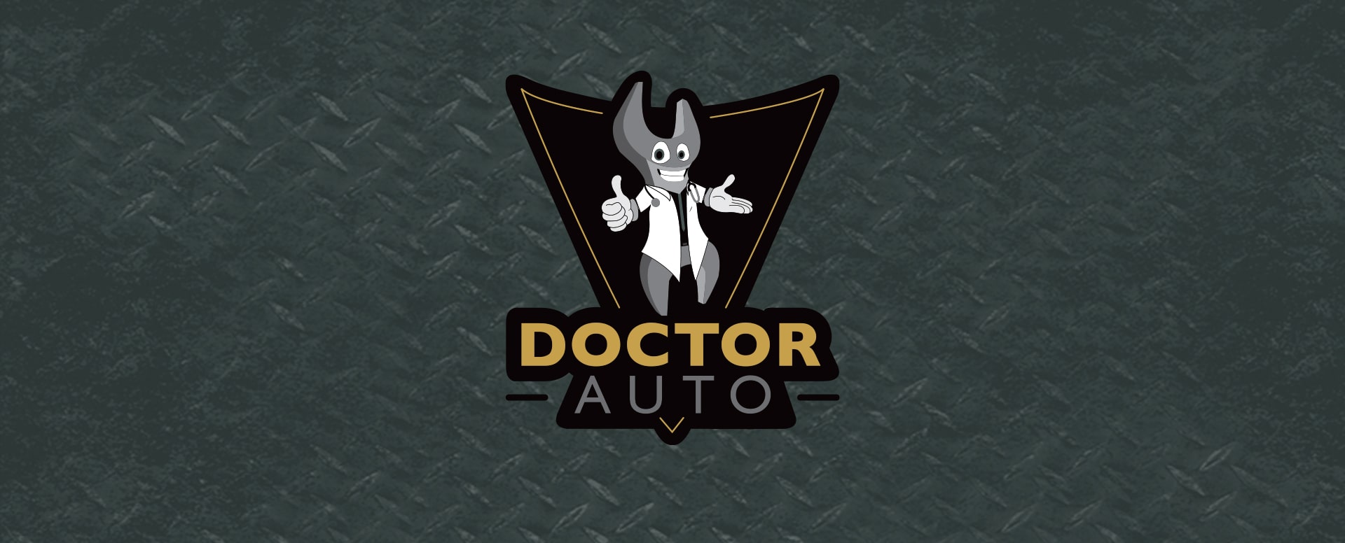
Doctor Auto is a one stop auto repair shop. I was asked to create their branding and website design. Their mission is to create a warm, welcoming, and friendly auto repair service with a user-friendly online presence.


PACKAGE DESIGN
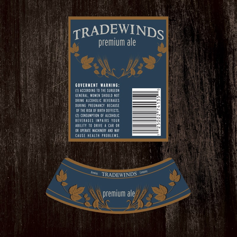
TOOLS USED: ILLUSTRATOR, PHOTOSHOP
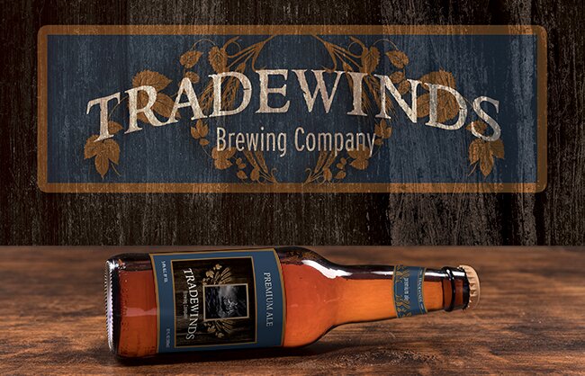
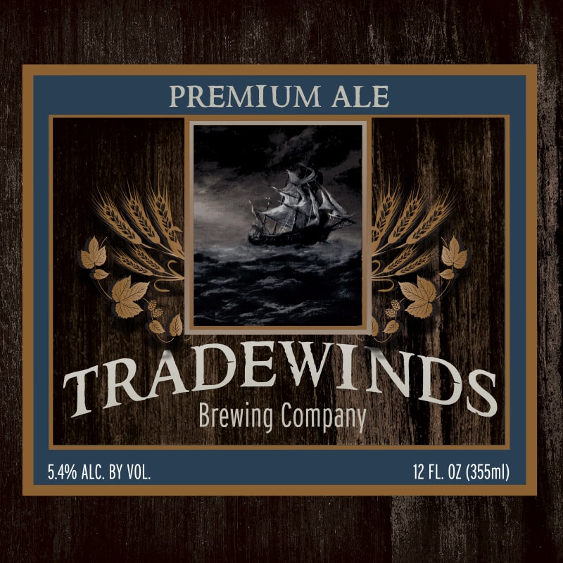
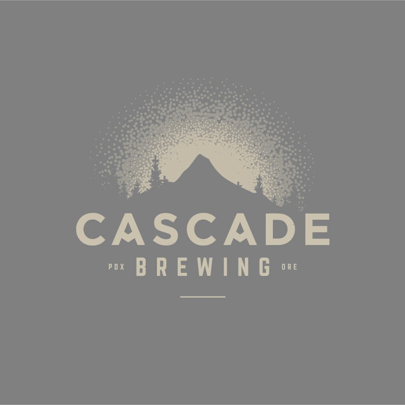
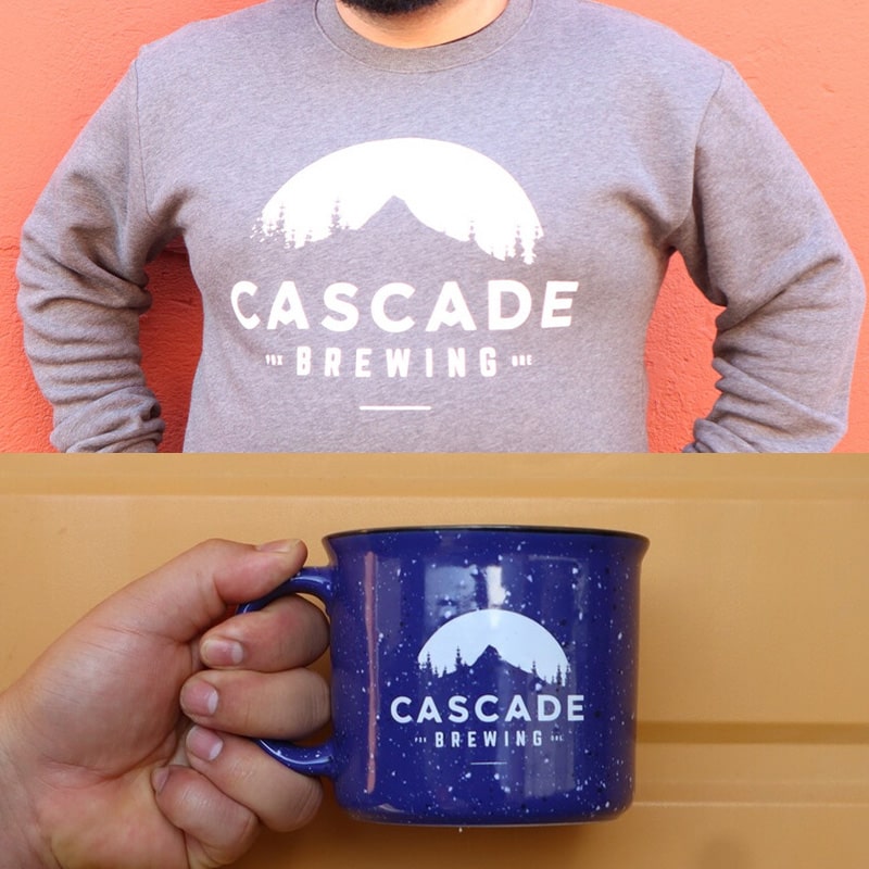
Tradewinds Brewing Company has jumped into the craft brewing market. I was tasked to create their brand, and packaging design. I used muted colors and wood textures to give off a distinctive and recognisable brand identity.

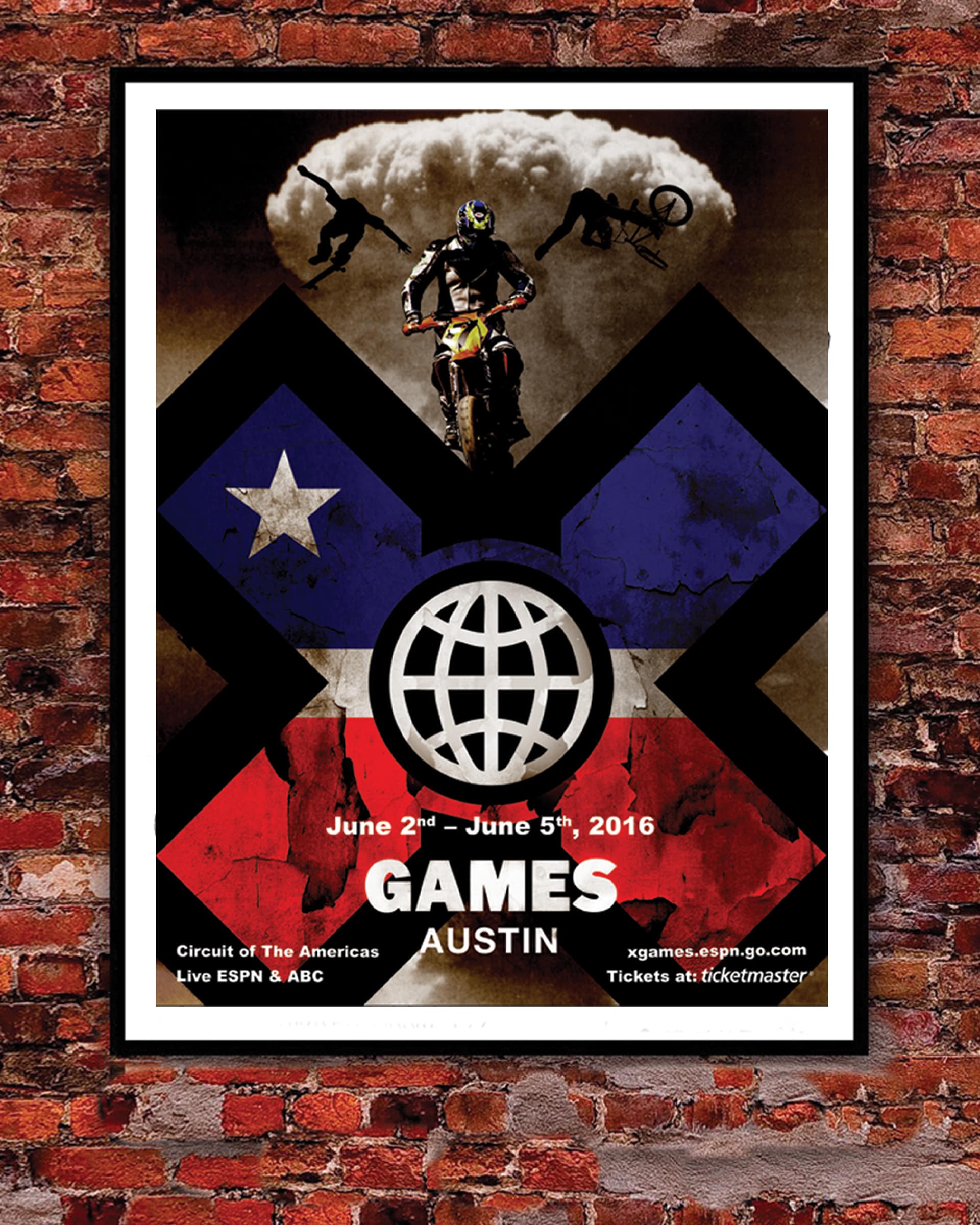
POSTER DESIGN
TOOLS USED: ILLUSTRATOR, PHOTOSHOP, INDESIGN
Poster design is something I really like to do and it gives me a certain calm within when I'm working on an idea. So I picked a few to share that I designed over the years that had a good final result.

ILLUSTRATION
TOOLS USED: ILLUSTRATOR, PHOTOSHOP
Tradewinds Brewing Company has jumped into the craft brewing market. I was tasked to create their brand, and packaging design. I used muted colors and wood textures to give off a distinctive and recognisable brand identity.
COLLECTION OF LOGOS
TOOLS USED: ILLUSTRATOR, PHOTOSHOP
Logos and marks that I've designed over the years. Each one of these started off in a sketchbook, or on a post-it note, and eventually made its way to my computer. This is where they are brought to life with vector magic. A great hand full of the work below was hand lettered and custom crafted to properly fit the aesthetic needs of the client.


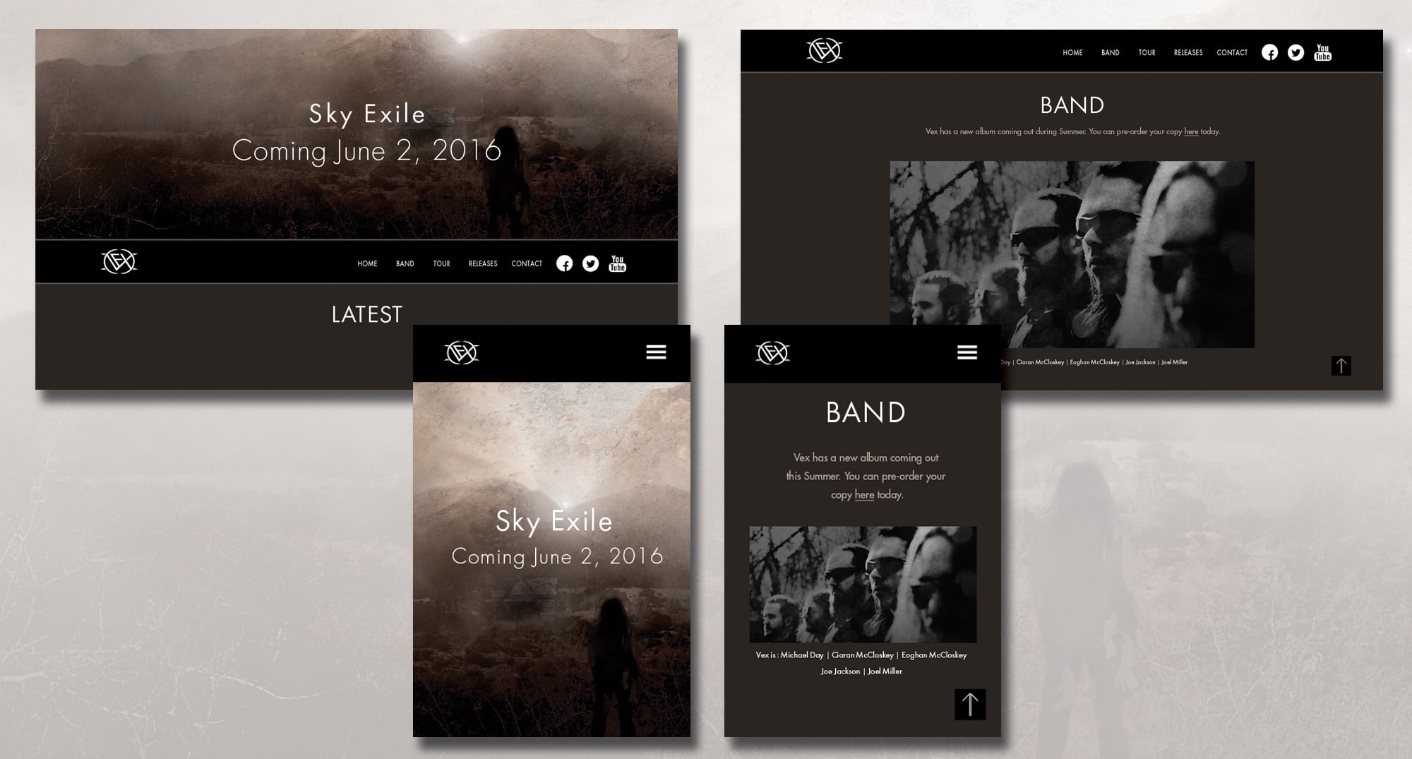
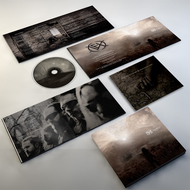
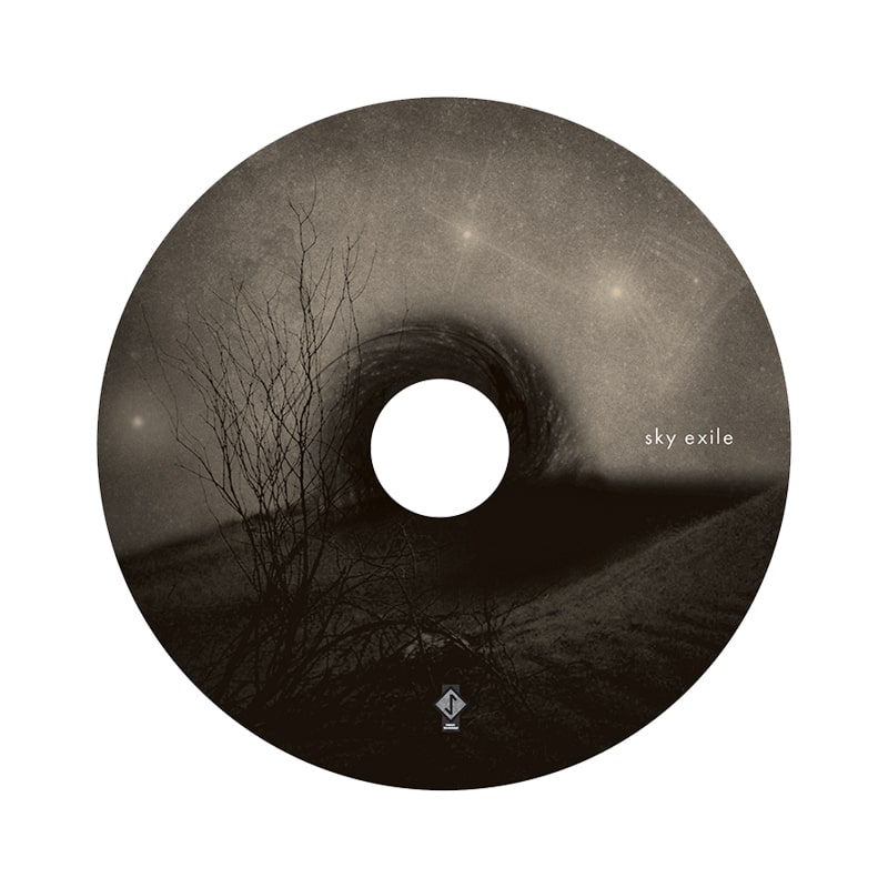
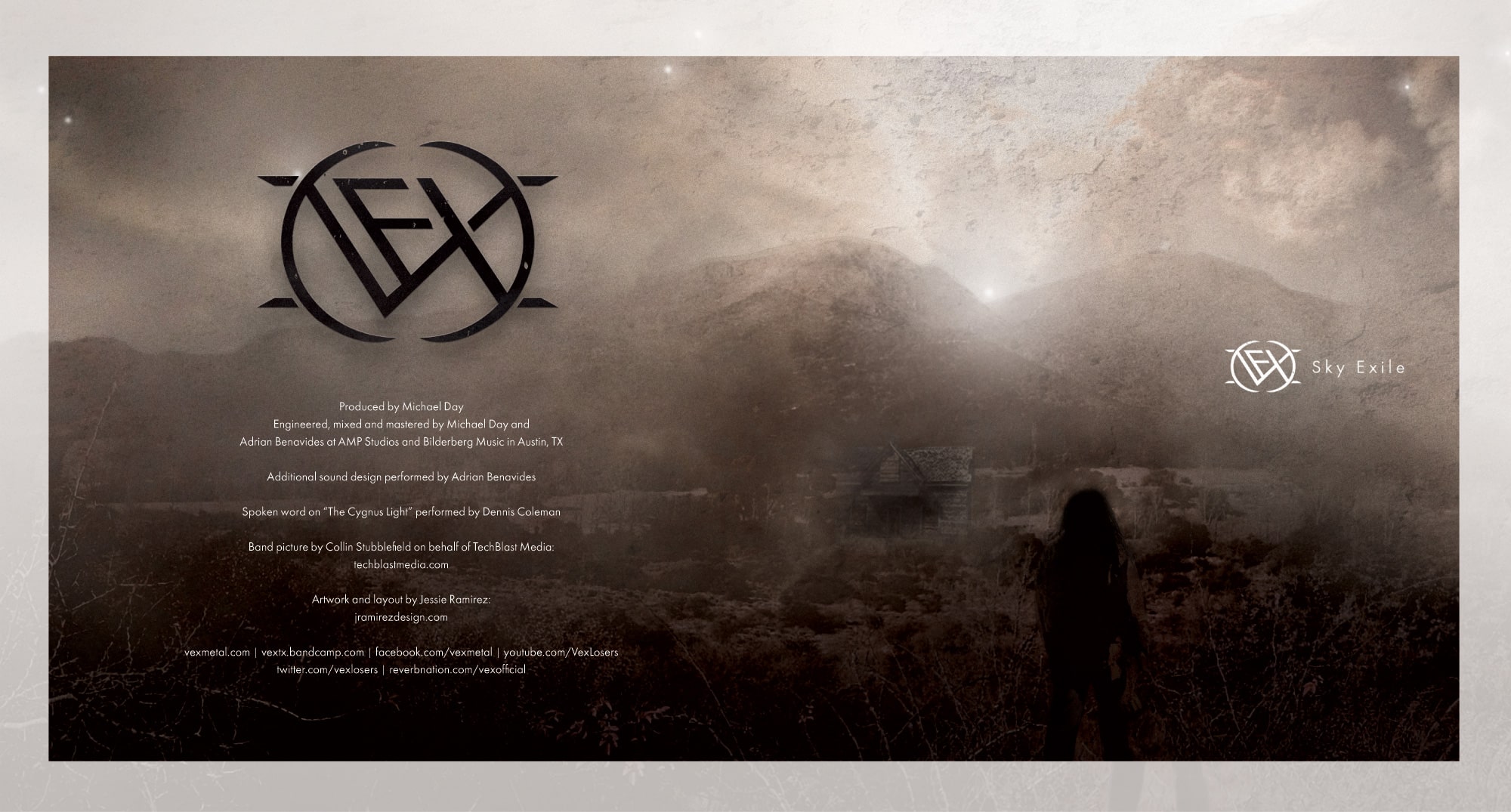
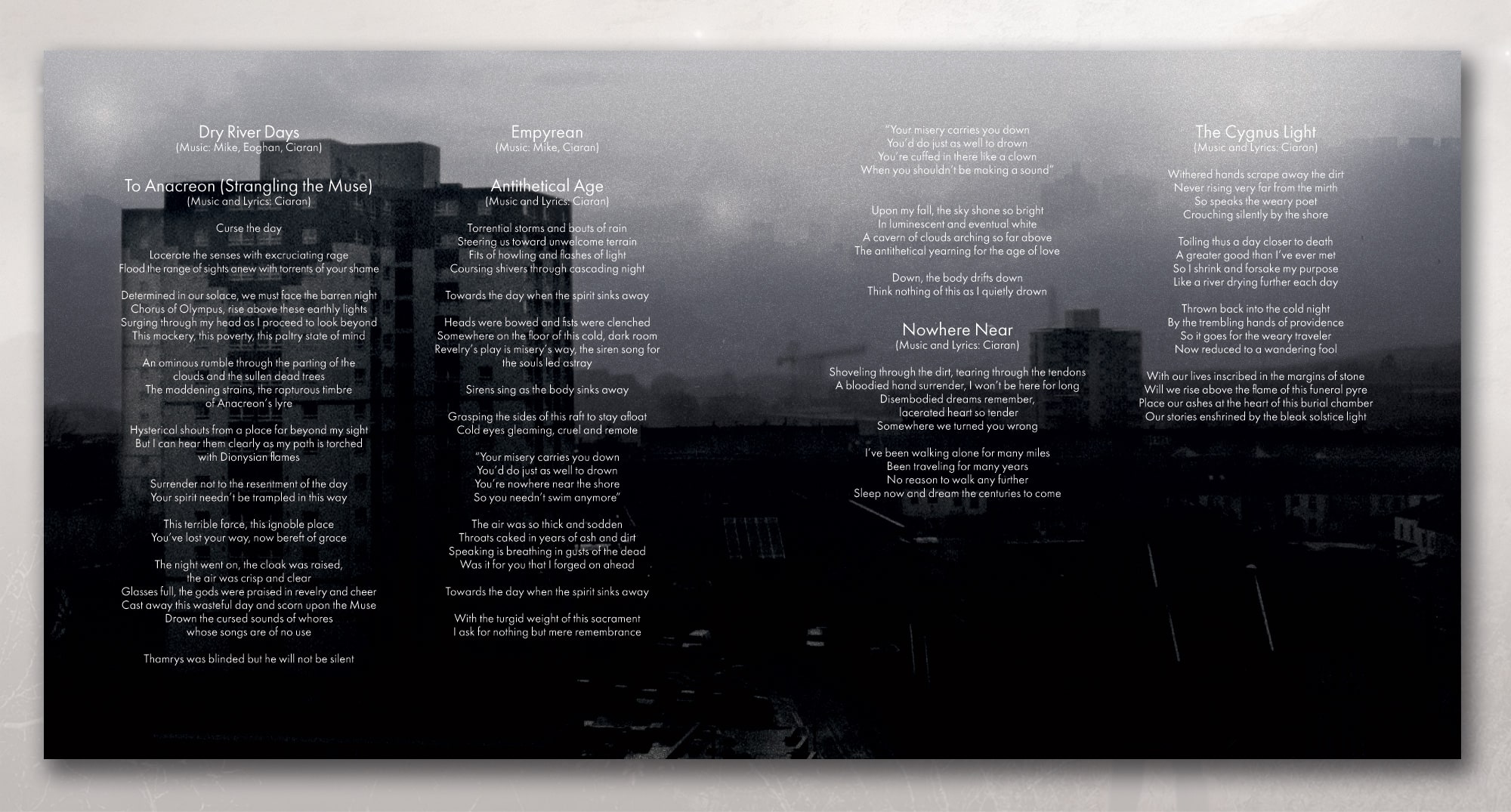
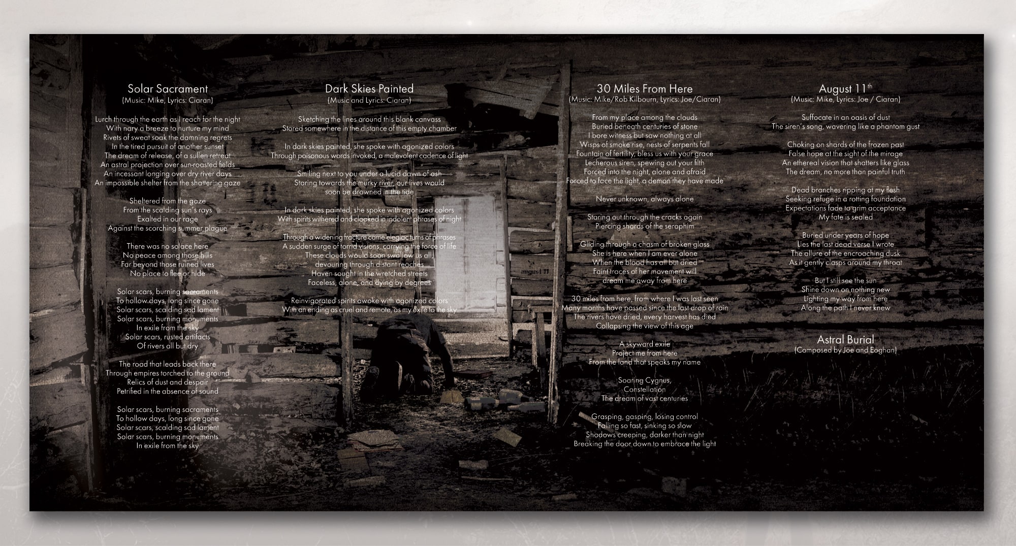
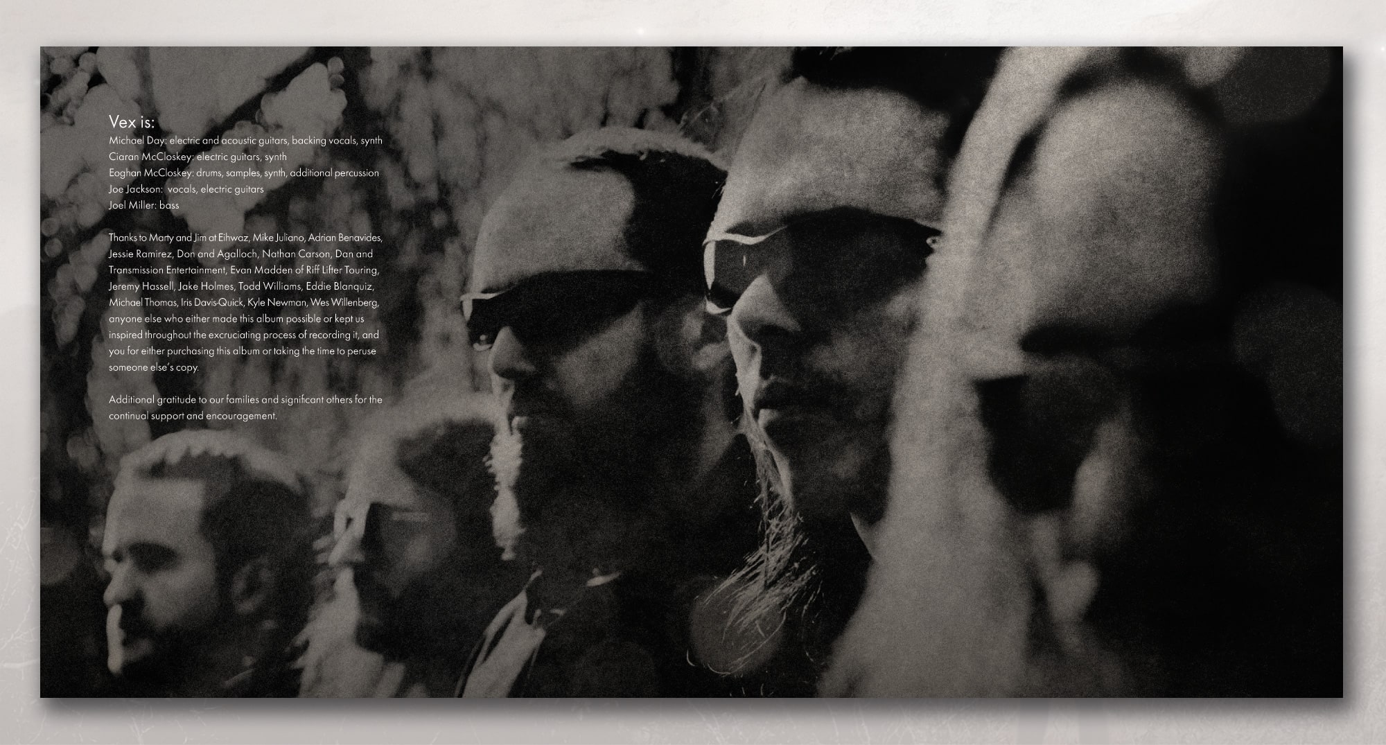
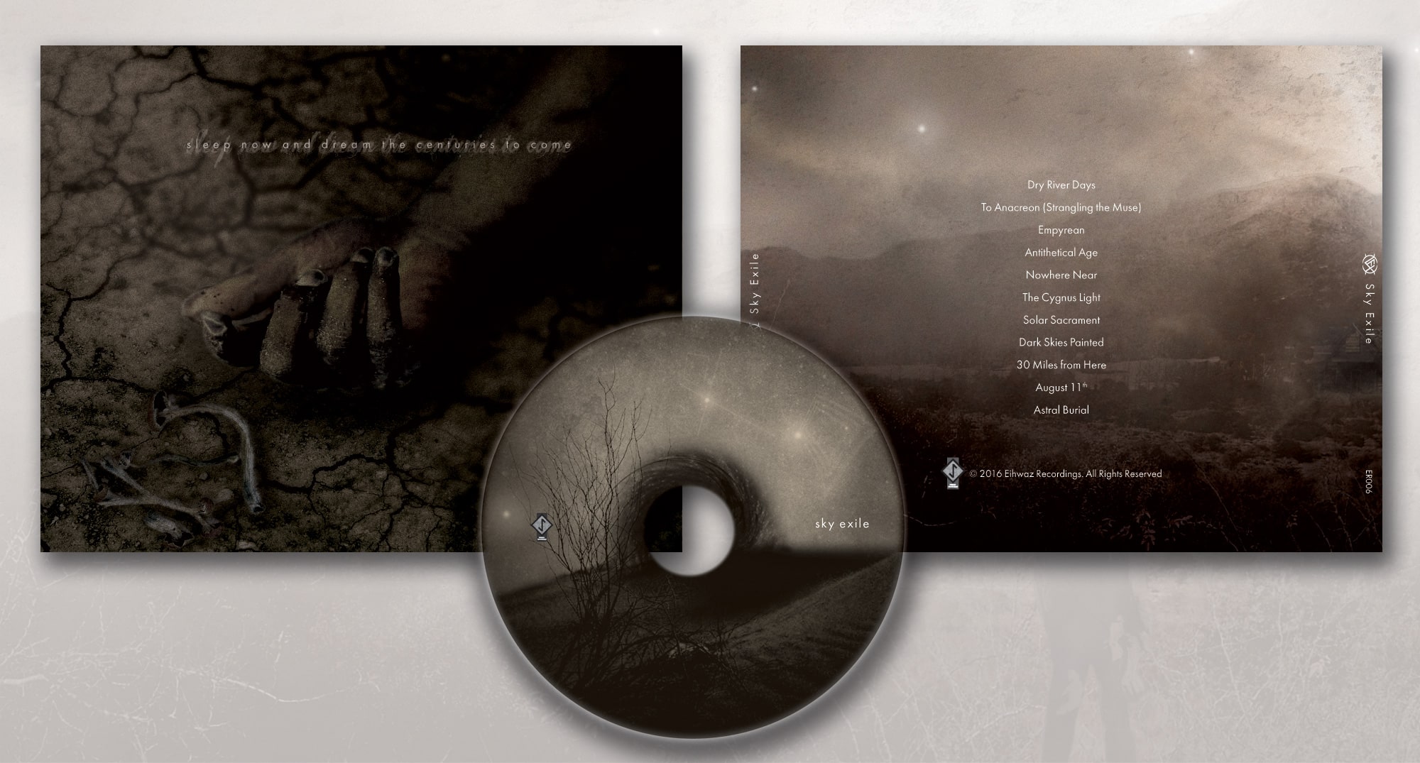
GRAPHIC DESIGN, WEB DESIGN, & ILLUSTRATION
TOOLS USED: ILLUSTRATOR, PHOTOSHOP, INDESIGN, DREAMWEAVER, WORDPRESS
Always excited for these projects. VEX is an Austin, TX based metal band. I was asked to handle the artwork for the cd booklet and web design for their new album 'Sky Exile'. I was given the theme and built around that with the help of the lyrics and music.